
Bayesian Linear Regression In Python Using Machine Learning To Predict Student Grades Part 1

Exploratory Data Analysis, Feature Selection, and Benchmarks
Even after struggling with the theory of Bayesian Linear Modeling for a couple weeks and writing a blog plot covering it, I couldn’t say I completely understood the concept. So, with the mindset that learn by doing is the most effective technique, I set out to do a data science project using Bayesian Linear Regression as my machine learning model of choice.
This post is the first of two documenting the project. I wanted to show an example of a complete data science pipeline, so this first post will concentrate on defining the problem, exploratory data analysis, and setting benchmarks. The second part will focus entirely on implementing Bayesian Linear Regression and interpreting the results, so if you already have EDA down, head on over there. If not, or if you just want to see some nice plots, stay here and we’ll walk through how to get started on a data science problem.
The complete code for this project is available as a Jupyter Notebook on GitHub. I encourage anyone interested to check it out and put their own spin on this project. Feel free to use, build on, and distribute the code in any way!
I like to focus on using real-world data, and in this project, we will be exploring student performance data collected from a Portuguese secondary (high) school. The data includes personal and academic characteristics of students along with final class grades. Our objective will be to create a model that can predict grades based on the student’s information. This dataset, along with many other useful ones for testing models or trying out data science techniques, is available on the UCI Machine Learning Repository.
Exploratory Data Analysis
The first step in solving a data science problem (once you have cleaned data) is exploratory data analysis (EDA). This is an open-ended process where we look for anomalies, interesting trends or patterns, and correlations in a dataset. These may be interesting in their own right and they can inform our modeling. Basically, we use EDA to find out what our data can tell us!
First off, let’s look at a snapshot of the data as a pandas dataframe:
import pandas as pd

df = pd.read_csv(‘data/student-mat.csv’)
df.head()
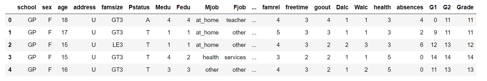 There are a total of 633 observations with 33 variables. Each row is one student with each column containing a difference characteristic. The Grade column is our target variable (also known as the response), which makes this a supervised, regression machine learning task. It’s supervised because we have a set of training data with known targets and, during training, we want our model to learn to predict the grade from the other variables. We will treat the grade as continuous which makes this a regression problem (technically the grade only takes on integer values so it is a nominal variable).
The primary variable of interest is the grade, so let’s take a look at the distribution to check for skew:
import matplotlib.pyplot as plt

# Histogram of grades
plt.hist(df['Grade'], bins = 14)
plt.xlabel('Grade')
plt.ylabel('Count')
plt.title('Distribution of Final Grades')
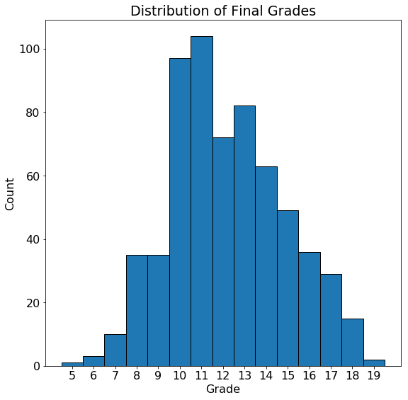 The grades are close to normally distributed with a mode at 11 (the grading scale in this school goes from 0–20). While the overall grades do not have a noticeable skew, it’s possible that students from certain categories will have skewed grades. To look at the effect of categorical variables on the grade we can make density plots of the grade distribution colored by the value of the categorical variable. For this we use the seaborn library and the
 kdeplot function. Here is the code to plot the distribution by location (urban or rural):
import seaborn as sns

# Make one plot for each different location
sns.kdeplot(df.ix[df['address'] == 'U', 'Grade'],
            label = 'Urban', shade = True)
sns.kdeplot(df.ix[df['address'] == 'R', 'Grade'],
            label = 'Rural', shade = True)

# Add labeling
plt.xlabel('Grade')
plt.ylabel('Density')
plt.title('Density Plot of Final Grades by Location')
We can use similar code to plot the distribution of grades by guardian with the resulting plots shown below:
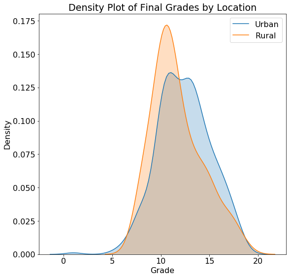
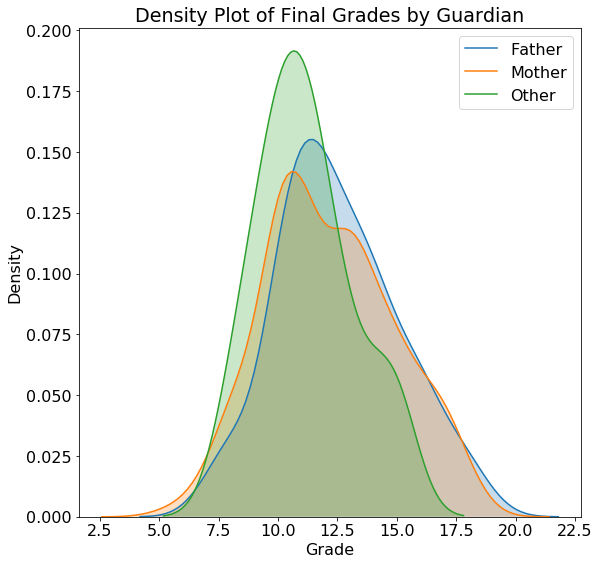 The actual values on a density plot are difficult to interpret, but we can use the shape of the plots for comparisons. The location does not seem to have a substantial impact on the student grades and neither does the guardian. Plots such as these can inform our modeling because they tell us if knowing the location or the guardian might be helpful for predicting final grades. Of course, we want to use a measure more rigorous than a single plot to make these conclusions, and later we will use statistics to back up our intuition!
Feature Selection
As we saw from the plots, we don’t expect every variable to be related to the final grade, so we need to perform feature selection (also called dimensionality reduction) to choose only the “relevant” variables. This depends on the problem, but because we will be doing linear modeling in this project, we can use a simple measure called the Correlation Coefficient to determine the most useful variables for predicting a grade. This is a value between -1 and +1 that measures the direction and strength of a linear relationship between two variables.
To select a limited number of variables, we can find those that have the greatest correlation (either negative or positive) with the final grade. Finding correlations in pandas is extremely simple:
# Find correlations and sort
df.corr()['Grade'].sort_values()

**failures     -0.384569
absences     -0.204230
Dalc         -0.196891
Walc         -0.178839
traveltime   -0.129654
goout        -0.111228
freetime     -0.105206
health       -0.096461
age          -0.042505
famrel        0.072888
Fedu          0.204392
studytime     0.249855
Medu          0.278690**
These correlations seem to make sense at least by my rudimentary social science knowledge! failures is the number of previous class failures and is negatively correlated with the grade, as is absences, the number of absences from school. This negative correlation indicates that as these variables increase, the final grade tends to decrease (although we can only say this is a correlation and not that one variable causes another to decrease). On the other hand, both studytime, the amount of studying per week, and Medu the mother’s level of education, are positively correlated with the grade.
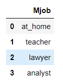
Correlations can only be calculated between numerical variables, so to find the relationship between categorical variables and grade, we have to one-hot encode the categorical variable and then calculate the correlation coefficient. One-hot encoding is a process that creates one column for every category within a categorical variable. Here is an example categorical column before and after one-hot encoding:
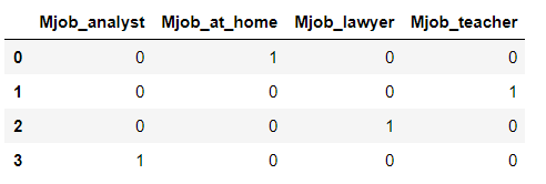 One-hot encoding is a standard step in machine learning pipelines and is very easy to do with the pandas library:
# Select only categorical variables
category_df = df.select_dtypes('object')

# One hot encode the variables
dummy_df = pd.get_dummies(category_df)

# Put the grade back in the dataframe
dummy_df['Grade'] = df['Grade']

# Find correlations with grade
dummy_df.corr()['Grade'].sort_values()

**higher_no           -0.343742
school_MS           -0.227632
Mjob_at_home        -0.158496
reason_course       -0.138195
internet_no         -0.131408
address_R           -0.128350
address_U            0.128350
internet_yes         0.131408
Fjob_teacher         0.160938
Mjob_teacher         0.173851
reason_reputation    0.185979
school_GP            0.227632
higher_yes           0.343742**
We again see relationships that intuitively make sense: higher_no represents the student does not want to go on to higher education and is negatively correlated with the grade with higher_yes indicating the student does want higher education and showing a positive correlation.Mjob_at_home means the mother stays at home, and is negatively correlated with the grade while Mjob_teacher indicates the mother teaches and has a positive correlation.
In this problem we will use these results to perform feature selection by retaining only the 6 variables that are most highly correlated with the final grade. 6 is sort of an arbitrary number that I found works well in the model, which shows that a lot of machine learning is just experimentation!
The final six variables we end up with after feature selection (see the Notebook for details) are shown in the snapshot of the new dataframe. (I renamed the columns so they are more intuitive):
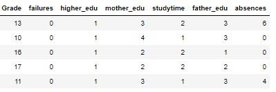 The complete descriptions of the variables are on the UCI machine learning repository, but here is a brief overview:
failures: previous class failureshigher_edu: binary for whether the student will pursue higher educationmother_edu: Mother’s level of educationstudytime: Amount of studying per weekfather_edu: Father’s level of educationabsences: Absences from school in the semester
While we are performing feature selection, we also split the data into a training and testing set using a Scikit-learn function. This is necessary because we need to have a hold-out test set to evaluate our model and make sure it is not overfitting to the testing data:
from sklearn.model_selection import train_test_split

# df is features and labels are the targets
# Split by putting 25% in the testing set
X_train, X_test, y_train, y_test = train_test_split(df, labels,
                                                   test_size = 0.25,
                                                    random_state=42)
This leaves us with 474 training observations and 159 testing data points.
Examine Selected Features
One of my favorite figures is the Pairs Plot, which is great for showing both distribution of variables and relations between pairs of variables. Here I use the seaborn PairGrid function to show a Pairs Plot for the selected features:
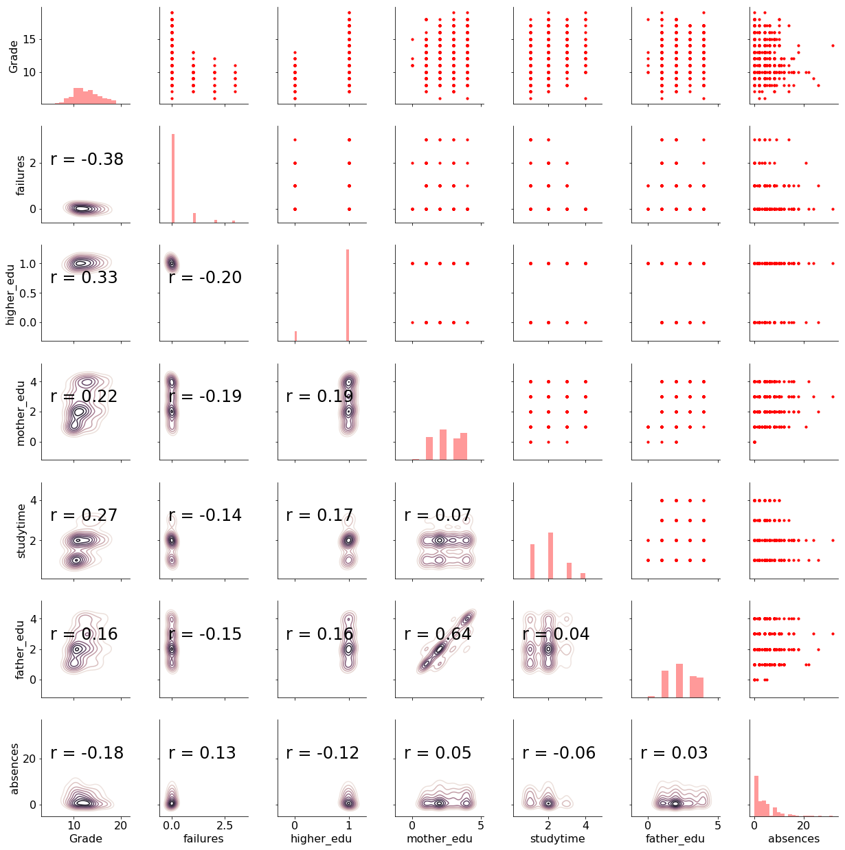 There is a lot of information encoded in this plot! On the upper triangle, we have scatterplots of every variable plotted against one another. Notice that most variables are discrete integers, meaning they only take on certain values. On the diagonal, we have histograms showing the distribution of a single variable. The lower right has both 2-D density plots and the correlation coefficient between variables.
To interpret the plot, we can select a variable and look at the row and column to find the relationships with all the other variables. For example, the first row shows the scatterplots of Grade , our target, with the other variables. The first column shows the correlation coefficient between the Grade and the other variables. We see that failures has the greatest correlation with the final grade in terms of absolute magnitude.
As another exploration of the selected data, we can make distribution plots of each variable, coloring the plot by if the grade is above the median score of 12. To make these plot, we create a column in our dataframe comparing the grade to to 12 and then plot all the values in density plots.
This yields the following plots:
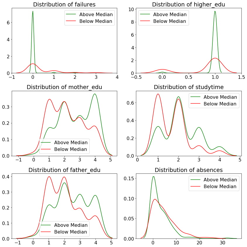 The green distributions represent students with grades at or above the median, and the red is students below. We can see that some variables are more positively correlated with grades (such as
 studytime), while others are indicators of low grades, such as low father_edu.
The EDA has given us a good sense of our dataset. We made figures, found relationships between variables, and used these to perform feature selection to retain only the variables most relevant for our task. While EDA is a precursor to modeling, it’s also useful on its own, and many data science problems can be solved solely through the plots and statistics we made here.
Establish Baselines Metrics
One of the most overlooked aspects of the machine learning pipeline is establishing a baseline. Yes, it might look impressive if your classification model achieves 99% accuracy, but what if we could get 98% accuracy just by guessing the same class every time? Would we really want to spend our time building a model for that problem? A good baseline allows us to assess whether or not our model (or any model) is applicable to the task.
For regression, a good naive baseline is simply to guess the median value of the target for every observation in the test data. In our problem, the median is 12, so let’s assess the accuracy of a model that naively predicts 12 for every student on the test set. We will use 2 metrics to evaluate predictions:
- Mean Absolute Error (MAE): The average of the absolute value of the differences between the predictions and true values.
- Root Mean Squared Error (RMSE): The square root of the average of the squared differences between the predictions and true values.
The mean absolute error is easily interpretable, as it represents how far off we are on average from the correct value. The root mean squared error penalizes larger errors more heavily and is commonly used in regression tasks. Either metric may be appropriate depending on the situation and we will use both for comparison. (Here is a discussion of the merits of these metrics.)
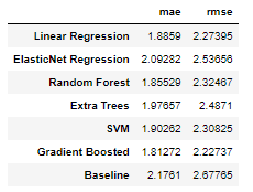
When we predict 12 for every example on the test set we get these results:
**Median Baseline  MAE: 2.1761
Median Baseline RMSE: 2.6777**
If our machine learning model cannot beat these metrics, then we either need to get more data, try another approach, or conclude that machine learning is not applicable to our problem!
Our modeling focus is on Bayesian Linear Regression, but it will be helpful to compare our results to those from standard techniques such as Linear Regression, Support Vector Machines, or tree-based methods. We will evaluate several of these methods on our dataset. Luckily, these are all very easy to implement with Python libraries such as Scikit-Learn. Check the Notebook for the code, but here are the results for 6 different models along with the naive baseline:
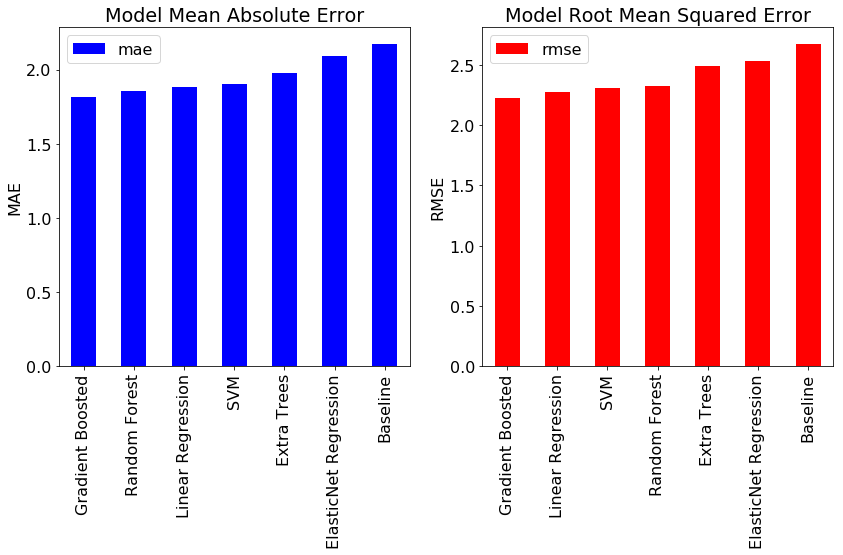 Fortunately, we see that all models best the baseline indicating that machine learning will work for this problem. Overall, the gradient boosted regression method performs the best although Ordinary Least Squares (OLS) Linear Regression (the frequentist approach to linear modeling) also does well.
 ** * **
As a final exercise, we can interpret the OLS Linear Regression model. Linear Regression is the simplest machine learning technique, and does not perform well on complex, non-linear problems with lots of features, but it has the benefit of being easily explained. We can extract the prediction formula from the linear regression using the trained model. Following is the formula:
**Grade = 9.19 - 1.32 * failures + 1.86 * higher_edu + 0.26 * mother_edu + 0.58 * studytime + 0.03 * father_edu - 0.07 * absences**
The intercept, 9.19, represents our guess if every variable of a student is 0. The coefficients (also known as the weights or model parameters) indicate the effect of a unit increase in the respective variable. For example, with every additional previous failure, the student’s score is expected to decrease by 1.32 points, and with every additional point increase in the mother’s education, the student’s grade increases by 0.26 points. I often like to start off with a linear regression when solving a problem, because if it works well enough, we have a completely explainable model that we can use to make predictions.
Conclusions
While machine learning gets all the attention, it often comprises a small part of a data science project. Most of the work — and most of the value — comes in obtaining, cleaning, and exploring the data. Only once we have a firm grasp on the structure of our data and the relationships within it should we proceed to building machine learning models. I wanted to show the entire process in for this project to demonstrate a typical data science workflow. In the first half of this project we:
- Explored the data to find interesting patterns, trends, or anomalies
- Examined correlations between the features and the target
- Performed feature selection using correlation values
- Established a baseline and benchmarked machine learning models
These techniques apply equally well to any machine learning problem, so feel free to use these as a starting point for your next project. While the exact implementation details of a particular machine learning model may differ, the general structure of a data science problem is fairly consistent.
In the next half of this series, we will implement a Bayesian Linear Regression model using PyMC3 in Python. We’ll build the model, train the model (which in this case means sampling from the posterior), inspect the model for inferences, and make predictions using the results. I’ll see you there!
As always, I welcome feedback and constructive criticism. I can be reached on Twitter @koehrsen_will.