NYSERDA Tenant Energy Data Challenge

Presented in this article are my answers to the NYSERDA Tenant Energy Data Challenge.

The GitHub Repo contains the code used in this project.

Problem Statements

1 What is your forecasted consumption across all 18 tenant usage meters for the 24 hours of 8/31/20 in 15 minute intervals (1728 predictions)?

The forecasted consumption is submitted as a csv to the challenge submission form.

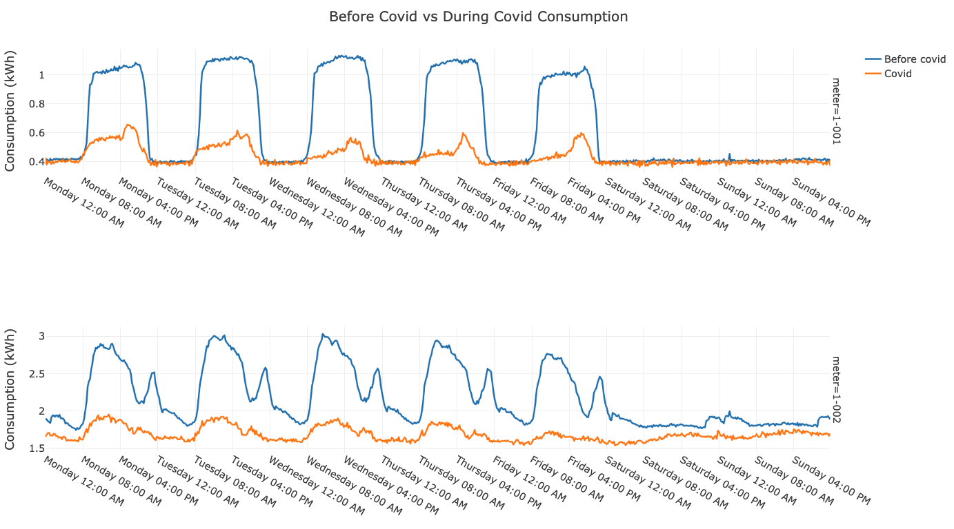
2 How correlated are building-wide occupancy and tenant consumption?

For every 10% decrease in occupancy, the consumption is expected to decrease by 3.1%.

  • While some tenant meters surprisingly show an increase in consumption with a reduction in occupancy, the majority display the expected decrease in consumption.
  • We can quantify this observation by stating the percentage decrease in consumption for every percentage decrease in occupancy, which, averaged over all the tenant meters, is 0.31.
  • For every 10% decrease in occupancy, the consumption is expected to decrease by 3.1%.

The below stats show the expected change in consumption (positive values indicate a decrease in consumption) for every 10% decrease in occupancy.

Tenant Meter Consumption Decrease for 10% Occupancy Decrease (%)
Average 3.10
1-001 4.15
1-002 2.77
1-003 2.97
1-004 3.55
1-005 1.61
1-006 4.47
1-007 3.31
1-008 2.47
1-009 1.27
1-010 3.15
1-011 6.66
1-012 -0.66
1-013 -0.99
1-014 2.43
1-015 3.88
1-016 5.89
1-017 0.13
1-018 5.87
Building 3.05

On a technical note, the average Pearson’s correlation coefficient (a standard method of measuring correlations) between the building-wide reduction in occupancy and tenant consumption is 0.60, a strongly positive correlation (as the reduction in occupancy increases, the reduction in consumption increases). As an interesting note, this value is negative for some meters, which display an increase in consumption with decreases in occupancy.

Read More

Most People Screw Up Multiple Percent Changes. Here's How To Get Them Right.

(Source)

Solving a Common Math Problem with Everyday Applications

Incredibly, after 16 years of schooling, the majority of American college students get this question wrong:

What is the total percentage change in the following situation?

Decrease of 40% followed by an increase of 60%.

A. Increase of 10%

B. Increase of 20%

C. Decrease of 4%

D. None of the above.

The answer, of course, is C, an overall decrease of 4%. Not only did the majority of college students get this question wrong, they did not even get the correct direction, with over half guessing this was an increase. The common error is taking the percentages at face value and adding them together to get the overall percentage change. We thus have another entry in the long list of things people aren’t very good at, combining multiple percentage changes.

Read More

How To Access Pages Missing From The Internet

(Source)

Using the Wayback Machine to Find Lost Pages

404 pages have gotten more creative over the years:

404 pages from GitHub (left) and HopperMagic (right) (Source)

However, that does not make them less annoying, especially when searching for critical data. Pages can disappear for many reasons: someone forgot to pay hosting fees, governments deemed the info subversive, individuals try to scrub records from the web, or mundane infrastructure problems. The average life of a webpage has been variously reported as 44, 75, and 100 days; whatever the exact number, one thing is clear: the Internet is leaky and content is not guaranteed to stay around forever.

Enter the Wayback Machine: simply install this chrome extension, and unlock those disappeared pages that have been saved in the Internet Archive:

Wayback Machine in operation on a missing page using the chrome extension.

Read More

Lessons From How To Lie With Statistics

(Source)

Timeless Data Literacy Advice

How to Lie With Statistics is a 65-year-old book that can be read in an hour and will teach you more practical information you can use every day than any book on “big data” or “deep learning.” For all promised by machine learning and petabyte-scale data, the most effective techniques in data science are still small tables, graphs, or even a single number that summarize a situation and help us — or our bosses — make a decision informed by data.

Time and again, I’ve seen thousands of work hours on complex algorithms summarized in a single number. Ultimately, that’s how the biggest decisions are made: with a few pieces of data a human can process. This is why lessons from “How to Lie with Statistics” (by Darell Huff) are relevant even though each of us probably generates more data in a single day than existed in the entire world at the writing of the book. As producers of tables and graphs, we need to effectively present valid summaries. As consumers of information, we need to spot misleading/exaggerated statistics which manipulate us to take action that benefits someone else at our expense.

These skills fall under a category called “data literacy”: the ability to read, understand, argue with, and make decisions from information. Compared to algorithms or big data processing, data literacy may not seem exciting, but it should form the basis for any data science education. Fortunately, these core ideas don’t change much over time and often the best books on the subject (such as The Visual Display of Quantitative Information) are decades old. The classic book discussed in this article addresses responsible consumption of data in a concise, effective, and enjoyable format. Here are my lessons learned from “How to Lie with Statistics” with commentary from my experiences.

Read More

How 90% Of Drivers Can Be Above Average Or Why You Need To Be Careful When Talking Statistics

(Source)

Means, Medians, and Skewed Distributions in the Real World

Most people see the headline “90% of Drivers Consider Themselves Above Average” and think “wow, other people are terrible at evaluating themselves objectively.” What you should think is “that doesn’t sound so implausible if we’re using the mean for average in a heavily negative-skewed distribution.”

Although a headline like this is often used to illustrate the illusion of superiority, (where people overestimate their competence) it also provides a useful lesson in clarifying your assertions when you talk statistics about data. In this particular case, we need to differentiate between the mean and median of a set of values. Depending on the question we ask, it is possible for 9/10 drivers to be above average. Here’s the data to prove it:

Driver Skill Dataset and Dot Plot with Mean and Median

The distinction is whether we use mean or median for “average” driver skill. Using the mean, we add up all the values and divide by the number of values, giving us 8.03 for this dataset. Since 9 of the 10 drivers have a skill rating greater than this, 90% of the drivers could be considered above average!

The median, in contrast, is found by ordering the values from lowest to highest and selecting the value where half the data points are smaller and half are larger. Here it’s 8.65 with 5 drivers below and 5 above. By definition, 50% of drivers are below the median and 50% exceed the median. If the question is “do you consider yourself better than 50% of other drivers?” than 90+% of drivers cannot truthfully answer in the affirmative.

(The median is a particular case of a percentile (also called a quantile), a value at which the given % of numbers are smaller. The median is the 50th quantile: 50% of numbers in a dataset are smaller. We could also find the 90th quantile, where 90% of values are smaller or the 10th quantile, where 10% of values are smaller. Percentiles are an intuitive way to describe a dataset.)

Read More