
Time Series Analysis In Python An Introduction

Additive models for time series modeling
Time series are one of the most common data types encountered in daily life. Financial prices, weather, home energy usage, and even weight are all examples of data that can be collected at regular intervals. Almost every data scientist will encounter time series in their daily work and learning how to model them is an important skill in the data science toolbox. One powerful yet simple method for analyzing and predicting periodic data is the additive model. The idea is straightforward: represent a time-series as a combination of patterns at different scales such as daily, weekly, seasonally, and yearly, along with an overall trend. Your energy use might rise in the summer and decrease in the winter, but have an overall decreasing trend as you increase the energy efficiency of your home. An additive model can show us both patterns/trends and make predictions based on these observations.
The following image shows an additive model decomposition of a time-series into an overall trend, yearly trend, and weekly trend.
 Example of Additive Model Decomposition
This post will walk through an introductory example of creating an additive model for financial time-series data using Python and the Prophet forecasting package developed by Facebook. Along the way, we will cover some data manipulation using pandas, accessing financial data using the Quandl library and, and plotting with matplotlib. I have included code where it is instructive, and I encourage anyone to check out the Jupyter Notebook on GitHub for the full analysis. This introduction will show you all the steps needed to start modeling time-series on your own!
Disclaimer: Now comes the boring part when I have to mention that when it comes to financial data, past performance is no indicator of future performance and you cannot use the methods here to get rich. I chose to use stock data because it is easily available on a daily frequency and fun to play around with. If you really want to become wealthy, learning data science is a better choice than playing the stock market!
Retrieving Financial Data
Usually, about 80% of the time spent on a data science project is getting and cleaning data. Thanks to the quandl financial library, that was reduced to about 5% for this project. Quandl can be installed with pip from the command line, lets you access thousands of financial indicators with a single line of Python, and allows up to 50 requests a day without signing up. If you sign up for a free account, you get an api key that allows unlimited requests.
First, we import the required libraries and get some data. Quandl automatically puts our data into a pandas dataframe, the data structure of choice for data science. (For other companies, just replace the ‘TSLA’ or ‘GM’ with the stock ticker. You can also specify a date range).
# quandl for financial data
import quandl
# pandas for data manipulation
import pandas as pd

quandl.ApiConfig.api_key = 'getyourownkey!'

# Retrieve TSLA data from Quandl
tesla = quandl.get('WIKI/TSLA')

# Retrieve the GM data from Quandl
gm = quandl.get('WIKI/GM')
gm.head(5)
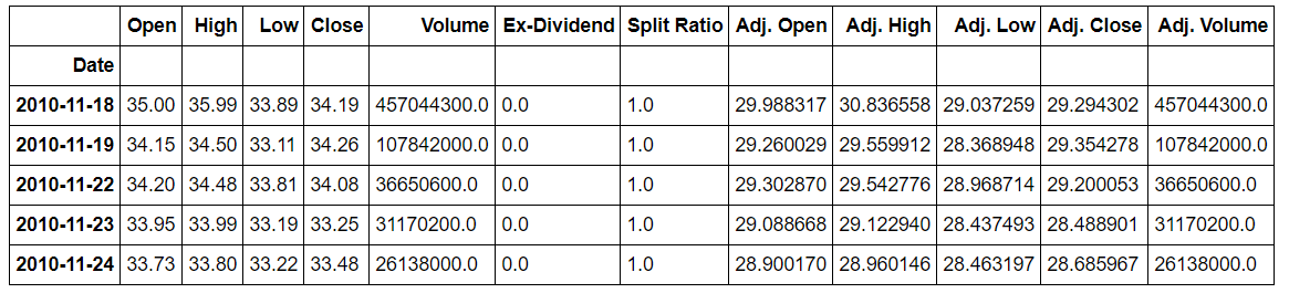 Snapshot of GM data from quandl
There is an almost unlimited amount of data on quandl, but I wanted to focus on comparing two companies within the same industry, namely Tesla and General Motors. Tesla is a fascinating company not only because it is the first successful American car start-up in 111 years, but also because at times in 2017 it was the most valuable car company in America despite only selling 4 different cars. The other contender for the title of most valuable car company is General Motors which recently has shown signs of embracing the future of cars by building some pretty cool (but not cool-looking) all-electric vehicles.
 Not a very hard choice
We could easily have spent hours searching for this data and downloading it as csv spreadsheet files, but instead, thanks to quandl, we have all the data we need in a few seconds!
Data Exploration
Before we can jump into modeling, it’s best to get an idea of the structure and ranges by making a few exploratory plots. This will also allows us to look for outliers or missing values that need to be corrected.
Pandas dataframes can be easily plotted with matplotlib. If any of the graphing code looks intimidating, don’t worry. I also find matplotlib to be unintuitive and often copy and paste examples from Stack Overflow or documentation to get the graph I want. One of the rules of programming is don’t reinvent a solution that already exists!
# The adjusted close accounts for stock splits, so that is what we should graph
plt.plot(gm.index, gm['Adj. Close'])
plt.title('GM Stock Price')
plt.ylabel('Price ($)');
plt.show()

plt.plot(tesla.index, tesla['Adj. Close'], 'r')
plt.title('Tesla Stock Price')
plt.ylabel('Price ($)');
plt.show();
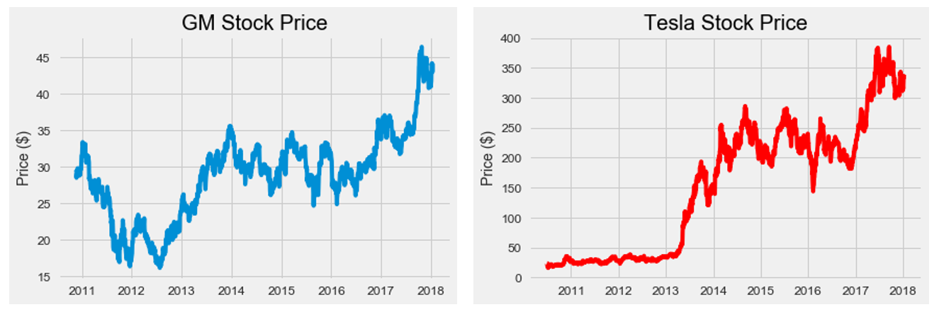 Raw Stock Prices
Comparing the two companies on stock prices alone does not show which is more valuable because the total value of a company (market capitalization) also depends on the number of shares (Market cap= share price * number of shares). Quandl does not have number of shares data, but I was able to find average yearly stock shares for both companies with a quick Google search. Is is not exact, but will be accurate enough for our analysis. Sometimes we have to make do with imperfect data!
To create a column of market cap in our dataframe,we use a few tricks with pandas, such as moving the index to a column (reset_index) and simultaneously indexing and altering values in the dataframe using ix.
# Yearly average number of shares outstanding for Tesla and GM
tesla_shares = {2018: 168e6, 2017: 162e6, 2016: 144e6, 2015: 128e6, 2014: 125e6, 2013: 119e6, 2012: 107e6, 2011: 100e6, 2010: 51e6}

gm_shares = {2018: 1.42e9, 2017: 1.50e9, 2016: 1.54e9, 2015: 1.59e9, 2014: 1.61e9, 2013: 1.39e9, 2012: 1.57e9, 2011: 1.54e9, 2010:1.50e9}

# Create a year column
tesla['Year'] = tesla.index.year

# Take Dates from index and move to Date column
tesla.reset_index(level=0, inplace = True)
tesla['cap'] = 0

# Calculate market cap for all years
for i, year in enumerate(tesla['Year']):
    # Retrieve the shares for the year
    shares = tesla_shares.get(year)

    # Update the cap column to shares times the price
    tesla.ix[i, 'cap'] = shares * tesla.ix[i, 'Adj. Close']
This creates a ‘cap’ column for Tesla. We do the same process with the GM data and then merge the two. Merging is an essential part of a data science workflow because it allows us to join datasets on a shared column. In this case, we have stock prices for two different companies on the same dates and we therefore want to join the data on the date column. We perform an ‘inner’ merge to save only Date entries that are present in both dataframes. After merging, we rename the columns so we know which one goes with which car company.
# Merge the two datasets and rename the columns
cars = gm.merge(tesla, how='inner', on='Date')

cars.rename(columns={'cap_x': 'gm_cap', 'cap_y': 'tesla_cap'}, inplace=True)

# Select only the relevant columns
cars = cars.ix[:, ['Date', 'gm_cap', 'tesla_cap']]

# Divide to get market cap in billions of dollars
cars['gm_cap'] = cars['gm_cap'] / 1e9
cars['tesla_cap'] = cars['tesla_cap'] / 1e9

cars.head()
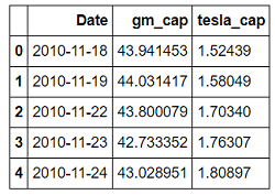 Merged Market Capitalization Dataframe
The market cap is in billions of dollars. We can see General Motors started off our period of analysis with a market cap about 30 times that of Tesla! Do things stay that way over the entire timeline?
plt.figure(figsize=(10, 8))
plt.plot(cars['Date'], cars['gm_cap'], 'b-', label = 'GM')
plt.plot(cars['Date'], cars['tesla_cap'], 'r-', label = 'TESLA')
plt.xlabel('Date'); plt.ylabel('Market Cap (Billions $)'); plt.title('Market Cap of GM and Tesla')
plt.legend();
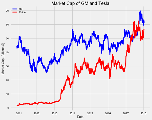 Market Capitalization Historical Data
We observe a meteoric rise for Tesla and a minor increase for General Motors over the course of the data. Tesla even surpasses GM in value during 2017!
import numpy as np

# Find the first and last time Tesla was valued higher than GM
first_date = cars.ix[np.min(list(np.where(cars['tesla_cap'] > cars['gm_cap'])[0])), 'Date']
last_date = cars.ix[np.max(list(np.where(cars['tesla_cap'] > cars['gm_cap'])[0])), 'Date']

print("Tesla was valued higher than GM from {} to {}.".format(first_date.date(), last_date.date()))

**Tesla was valued higher than GM from 2017-04-10 to 2017-09-21.**
During that period, Tesla sold about 48,000 cars while GM sold 1,500,000. GM was valued less than Tesla during a period in which it sold 30 times more cars! This definitely displays the power of a persuasive executive and a high-quality — if extremely low-quantity — product. Although the value of Tesla is now lower than GM, a good question might be, can we expect Tesla to again surpass GM? When will this happen? For that we turn to additive models for forecasting, or in other words, predicting the future.
Modeling with Prophet
The Facebook Prophet package was released in 2017 for Python and R, and data scientists around the world rejoiced. Prophet is designed for analyzing time series with daily observations that display patterns on different time scales. It also has advanced capabilities for modeling the effects of holidays on a time-series and implementing custom changepoints, but we will stick to the basic functions to get a model up and running. Prophet, like quandl, can be installed with pip from the command line.
We first import prophet and rename the columns in our data to the correct format. The Date column must be called ‘ds’ and the value column we want to predict ‘y’. We then create prophet models and fit them to the data, much like a Scikit-Learn machine learning model:
import fbprophet

# Prophet requires columns ds (Date) and y (value)
gm = gm.rename(columns={'Date': 'ds', 'cap': 'y'})

# Put market cap in billions
gm['y'] = gm['y'] / 1e9

# Make the prophet model and fit on the data
gm_prophet = fbprophet.Prophet(changepoint_prior_scale=0.15)
gm_prophet.fit(gm)
When creating the prophet models, I set the changepoint prior to 0.15, up from the default value of 0.05. This hyperparameter is used to control how sensitive the trend is to changes, with a higher value being more sensitive and a lower value less sensitive. This value is used to combat one of the most fundamental trade-offs in machine learning: bias vs. variance.
If we fit too closely to our training data, called overfitting, we have too much variance and our model will not be able to generalize well to new data. On the other hand, if our model does not capture the trends in our training data it is underfitting and has too much bias. When a model is underfitting, increasing the changepoint prior allows more flexibility for the model to fit the data, and if the model is overfitting, decreasing the prior limits the amount of flexibility. The effect of the changepoint prior scale can be illustrated by graphing predictions made with a range of values:
 The higher the changepoint prior scale, the more flexible the model and the closer it fits to the training data. This may seem like exactly what we want, but learning the training data too well can lead to overfitting and an inability to accurately make predictions on new data. We therefore need to find the right balance of fitting the training data and being able to generalize to new data. As stocks vary from day-to-day, and we want our model to capture this, I increased the flexibility after experimenting with a range of values.
In the call to create a prophet model, we can also specify changepoints, which occur when a time-series goes from increasing to decreasing, or from increasing slowly to increasing rapidly (they are located where the rate change in the time series is greatest). Changepoints can correspond to significant events such as product launches or macroeconomic swings in the market. If we do not specify changepoints, prophet will calculate them for us.
To make forecasts, we need to create what is called a future dataframe. We specify the number of future periods to predict (two years) and the frequency of predictions (daily). We then make predictions with the prophet model we created and the future dataframe:
# Make a future dataframe for 2 years
gm_forecast = gm_prophet.make_future_dataframe(periods=365 * 2, freq='D')

# Make predictions
gm_forecast = gm_prophet.predict(gm_forecast)
Our future dataframes contain the estimated market cap of Tesla and GM for the next two years. We can visualize predictions with the prophet plot function.
gm_prophet.plot(gm_forecast, xlabel = 'Date', ylabel = 'Market Cap (billions $)')
plt.title('Market Cap of GM');
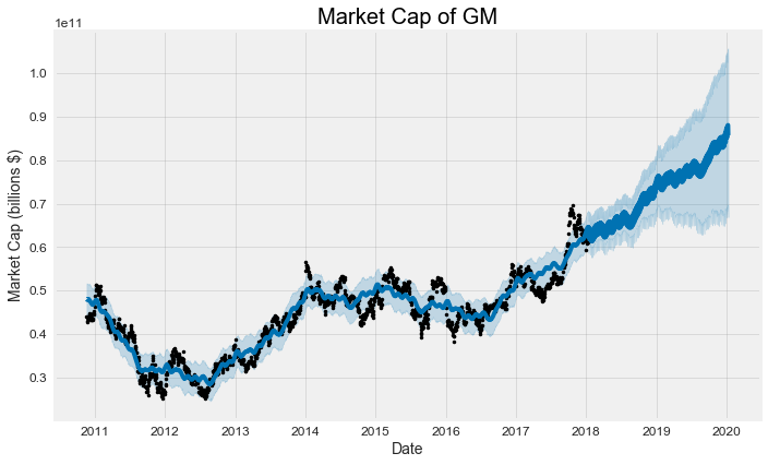 The black dots represent the actual values (notice how they stop at the beginning of 2018), the blue line indicates the forecasted values, and the light blue shaded region is the uncertainty (always a critical part of any prediction). The region of uncertainty increases the further out in the future the prediction is made because initial uncertainty propagates and grows over time. This is observed in weather forecasts which get less accurate the further out in time they are made.
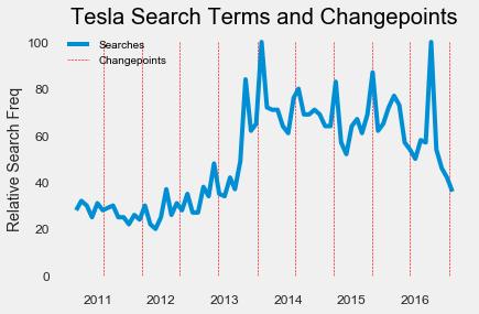
We can also inspect changepoints identified by the model. Again, changepoints represent when the time series growth rate significantly changes (goes from increasing to decreasing for example).
tesla_prophet.changepoints[:10]

**61    2010-09-24
122   2010-12-21
182   2011-03-18
243   2011-06-15
304   2011-09-12
365   2011-12-07
425   2012-03-06
486   2012-06-01
547   2012-08-28
608   2012-11-27**
For comparison, we can look at the Google Search Trends for Tesla over this time range to see if the changes line up. We plot the changepoints (vertical lines) and search trends on the same graph:
# Load in the data
tesla_search = pd.read_csv('data/tesla_search_terms.csv')

# Convert month to a datetime
tesla_search['Month'] = pd.to_datetime(tesla_search['Month'])
tesla_changepoints = [str(date) for date in tesla_prophet.changepoints]

# Plot the search frequency
plt.plot(tesla_search['Month'], tesla_search['Search'], label = 'Searches')

# Plot the changepoints
plt.vlines(tesla_changepoints, ymin = 0, ymax= 100, colors = 'r', linewidth=0.6, linestyles = 'dashed', label = 'Changepoints')

# Formatting of plot
plt.grid('off'); plt.ylabel('Relative Search Freq'); plt.legend()
plt.title('Tesla Search Terms and Changepoints');
 Tesla Search Frequency and Stock Changepoints
Some of the changepoints in the market value of Tesla align with changes in frequency of Tesla searches, but not all of them. From this, I would say that relative Google search frequency is not a great indicator of stock changes.
We still need to figure out when the market capitalization of Tesla will surpass that of General Motors. Since we have both predictions for the next two years we can plot both companies on the same graph after merging the dataframes. Before merging, we rename the columns to keep track of the data.
gm_names = ['gm_%s' % column for column in gm_forecast.columns]
tesla_names = ['tesla_%s' % column for column in tesla_forecast.columns]

# Dataframes to merge
merge_gm_forecast = gm_forecast.copy()
merge_tesla_forecast = tesla_forecast.copy()

# Rename the columns
merge_gm_forecast.columns = gm_names
merge_tesla_forecast.columns = tesla_names

# Merge the two datasets
forecast = pd.merge(merge_gm_forecast, merge_tesla_forecast, how = 'inner', left_on = 'gm_ds', right_on = 'tesla_ds')

# Rename date column
forecast = forecast.rename(columns={'gm_ds': 'Date'}).drop('tesla_ds', axis=1)
First we will plot just the estimate. The estimate (called ‘yhat’ in the prophet package) smooths out some of the noise in the data so it looks a little different than the raw plots. The level of smoothness will depend on the changepoint prior scale — higher priors mean a more flexible model and more ups and downs.
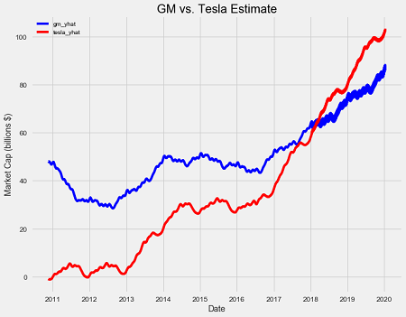 GM and Tesla Predicted Market Capitalization
Our model thinks the brief surpassing of GM by Tesla in 2017 was just noise, and it is not until early 2018 that Tesla beats out GM for good in the forecast. The exact date is January 27, 2018, so if that happens, I will gladly take credit for predicting the future!
When making the above graph, we left out the most important part of a forecast: the uncertainty! We can use matplotlib (see notebook) to show the regions of doubt:
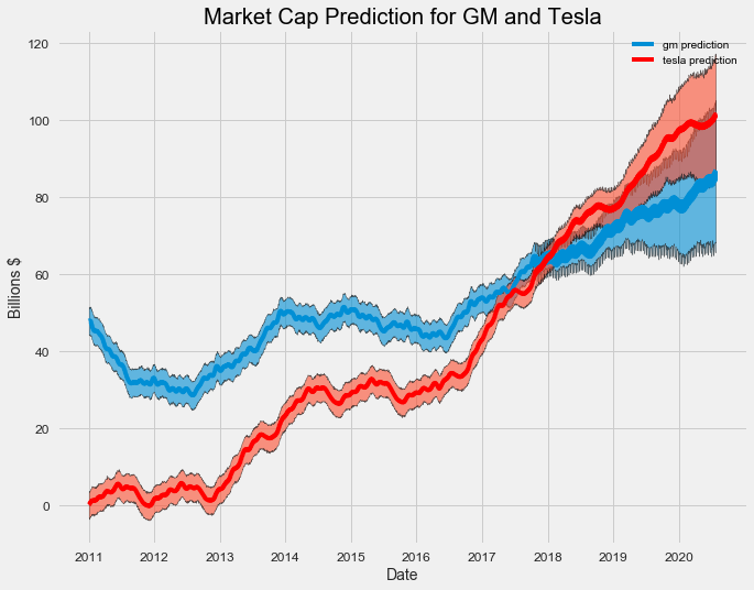 This is a better representation of the prediction. It shows the value of both companies is expected to increase, but Tesla will increase more rapidly than General Motors. Again, the uncertainty increases over time as expected for a prediction and the lower bound of Tesla is below the upper bound of GM in 2020 meaning GM might retain the lead.
Trends and Patterns
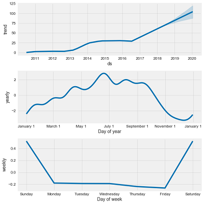
The last step of the market capitalization analysis is looking at the overall trend and patterns. Prophet allows us to easily visualize the overall trend and the component patterns:
# Plot the trends and patterns
gm_prophet.plot_components(gm_forecast)
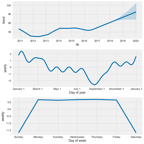 General Motors Time Series Decomposition
The trend is pretty clear: GM stock is rising and going to keep rising. The yearly pattern is interesting because it seems to suggest GM increases in value at the end of the year with a long slow decline into the summer. We can try to determine if there is a correlation between the yearly market cap and the average monthly sales of GM over the time period. I first gathered the monthly vehicle sales from Google and then averaged over the months using groupby. This is another critical data science operation, because often we want to compare stats between categories, such as users of a specific age group, or vehicles from one manufacturer. In this case, we want to calculate average sales in each month, so we group the months together and then average the sales.
gm_sales_grouped = gm_sales.groupby('Month').mean()
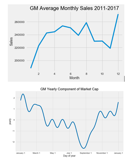 It does not look like monthly sales are correlated with the market cap. The monthly sales are second highest in August, which is right at the lowest point for the market cap!
Looking at the weekly trend, there does not appear to be any meaningful signal (there are no stock prices recorded on the weekends so we look at the change during the week).This is to be expected as the random walk theory in economics states there is no predictable pattern in stock prices on a daily basis. As evidenced by our analysis, in the long run, stocks tend to increase, but on a day-to-day scale, there is almost no pattern that we can take advantage of even with the best models.
A simple look at the Dow Jones Industrial Average (a market index of the 30 largest companies on the stock exchange) nicely illustrates this point:
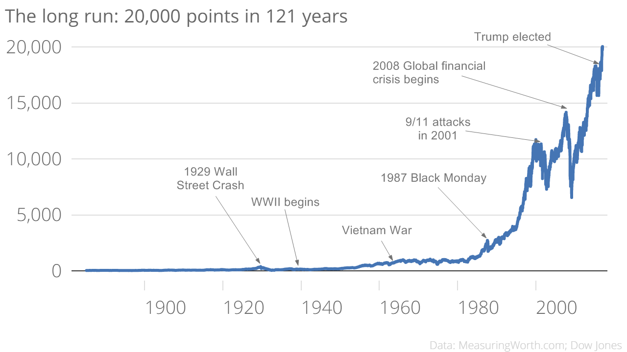 Dow Jones Industrial Average (Source)
Clearly, the message is to go back to 1900 and invest your money! Or in reality, when the market drops, don’t withdraw because it will go back up according to history. On the overall scale, the day-to-day fluctuations are too small to even be seen and if we are thinking like data scientists, we realize that playing daily stocks is foolish compared to investing in the entire market and holding for long periods of time.
Prophet can also be applied to larger-scale data measures, such as Gross Domestic Product, a measure of the overall size of a country’s economy. I made the following forecast by creating prophet models based on the historical GDP of the US and China.
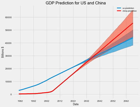 The exact date China will surpass the US in GDP is 2036! This model is limited because of the low frequency of the observations (GDP is measured once per quarter but prophet works best with daily data), but it provides a basic prediction with no macroeconomic knowledge required.
There are many ways to model time-series, from simple linear regression to recurrent neural networks with LSTM cells. Additive Models are useful because they are quick to develop, fast to train, provide interpretable patterns, and make predictions with uncertainties. The capabilities of Prophet are impressive and we have only scratched the surface here. I encourage you to use this article and the notebook to explore some of the data offered by Quandl or your own time series. Stay tuned for future work on time series analysis, and for an application of prophet to my daily life, see my post on using these techniques to model and predict weight change. As a first step in exploring time-series, additive models in Python are the way to go!
As always, I welcome feedback and constructive criticism. I can be reached at wjk68@case.edu.