
Analyzing Medium Story Stats With Python

A Python toolkit for data science with Medium article statistics
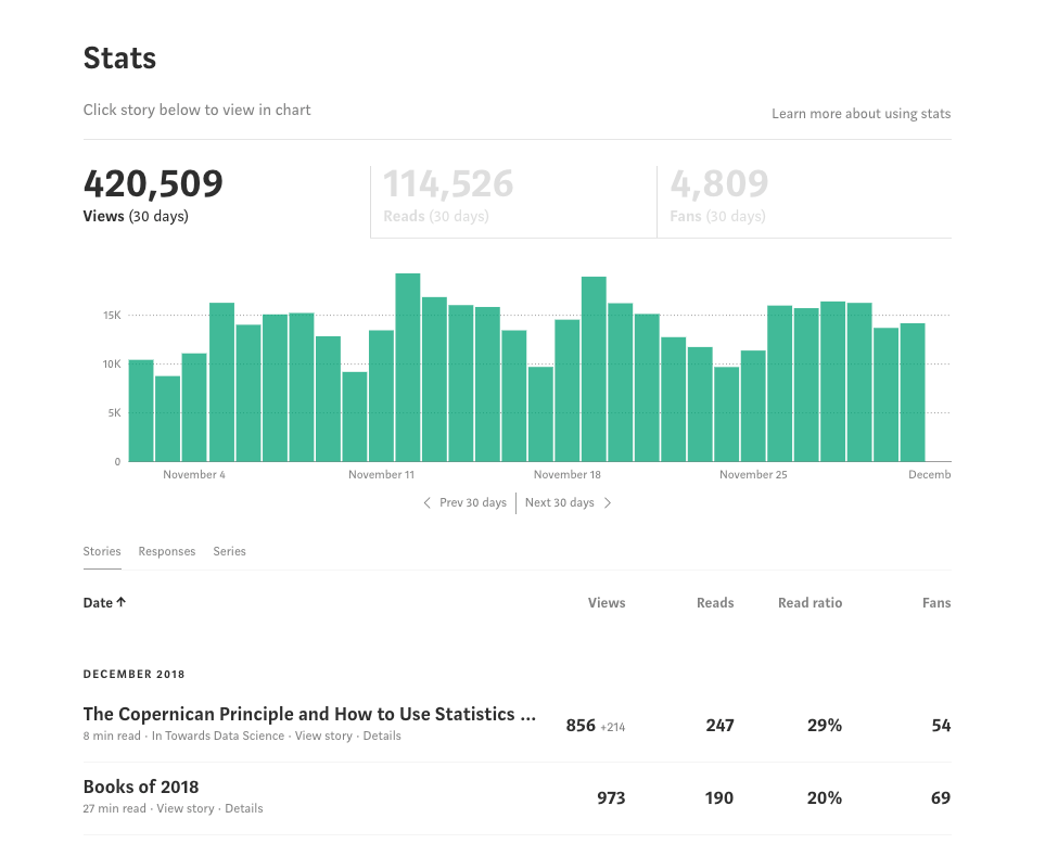
Medium is a great place to write: no distracting features, a large — yet civil — readership, and, best of all, no advertisements. However, one aspect where it falls short is in the statistics you can see for your articles. Sure, you can go to the stats page, but all you get to see is some plain numbers and a bar chart in an awful shade of green. There’s no in-depth analysis of any kind and no way to make sense of the data generated by your articles.
 It’s nice when you reach the point where it’s more than your mom reading your articles.
It’s as if Medium said: “let’s build a great blogging platform, but make it as difficult as possible for writers to get insights from their stats.” Although I don’t care about using stats to maximize views (if I wanted to get the most views, all my articles would be 3-minute lists), as a data scientist, I can’t bear the thought of data going unexamined.
Instead of just complaining about the poor state of Medium’s stats, I decidedto do something about it and wrote a Python toolkit to allow anyone to quickly retrieve, analyze, interpret, and make beautiful, interactive plots of their Medium statistics. In this article, I’ll show how to use the tools, discuss how they work, and we’ll explore some insights from my Medium story stats.
The full toolkit for you to use is on GitHub. You can see a usage Jupyter Notebook on GitHub here (unfortunately interactive plots don’t work on GitHub’s notebook viewer) or in full interactive glory on NBviewer here. Contributions to this toolkit are welcome!
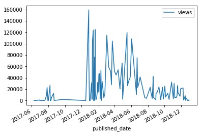
 Example plot from Python toolkit for analyzing Medium articles
Getting Started in 1 Minute
First, we need to retrieve some stats. When writing the toolkit, I spent 2 hours trying to figure out how to auto login to Medium in Python before deciding on the 15-second solution listed below. If you want to use y included in the toolkit, otherwise, follow the steps to use your data:
- Go to your Medium Stats Page.
- Scroll down to the bottom so all the stories’ stats are showing.
- Right click and save the page as
stats.htmlin the toolkitdata/directory
This is demonstrated in the following clip:
 Sometimes the best solution is manual!
Next, open a Jupyter Notebook or Python terminal in the toolkit’s medium/ directory and run (again, you can use my included data):
from retrieval import get_datadf = get_data(fname='stats.html')
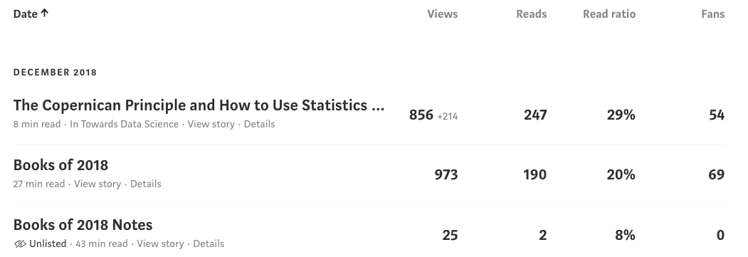
This will not only parse stats.html file and extracts all the information, it also goes online to every article, retrieves the entire article and metadata, and stores the results in a dataframe. For my 121 articles, this process took about 5 seconds! Now, we have a dataframe with complete info about our articles:
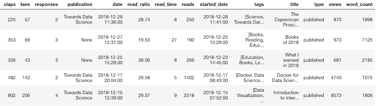 Sample of dataframe with medium article statistics
(I’ve cut off the dataframe for display so there is even more data than shown.) Once we have this information, we can analyze it using any data science methods we know or we can use the tools in the code. Included in the Python toolkit are methods for making interactive plots, fitting the data with machine learning, interpreting relationships and generating future predictions.
As a quick example, we can make a heatmap of the correlations in the data:
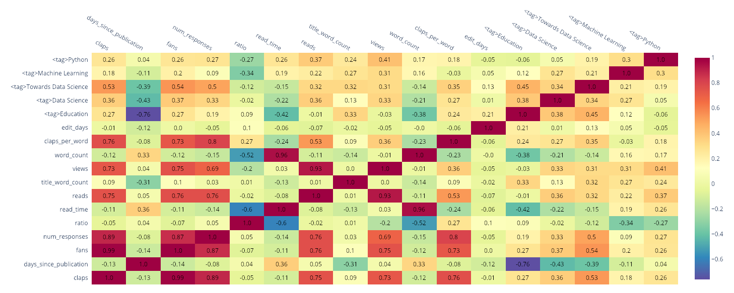 Heatmap of correlations
The <tag> columns indicate whether the story has a specific tag. We can see the tag “Towards Data Science” has a 0.54 correlation with the number of “fans” indicating that attaching this tag to a story is positively correlated with the number of fans (as well as the number of claps). Most of these relationships are obvious (claps is positively correlated with fans) but if you want to maximize story views, you may be able to find some hints here.
Another plot we can make in a single line of code is a scatterplot matrix (also affectionately called a “splom”) colored by the publication:
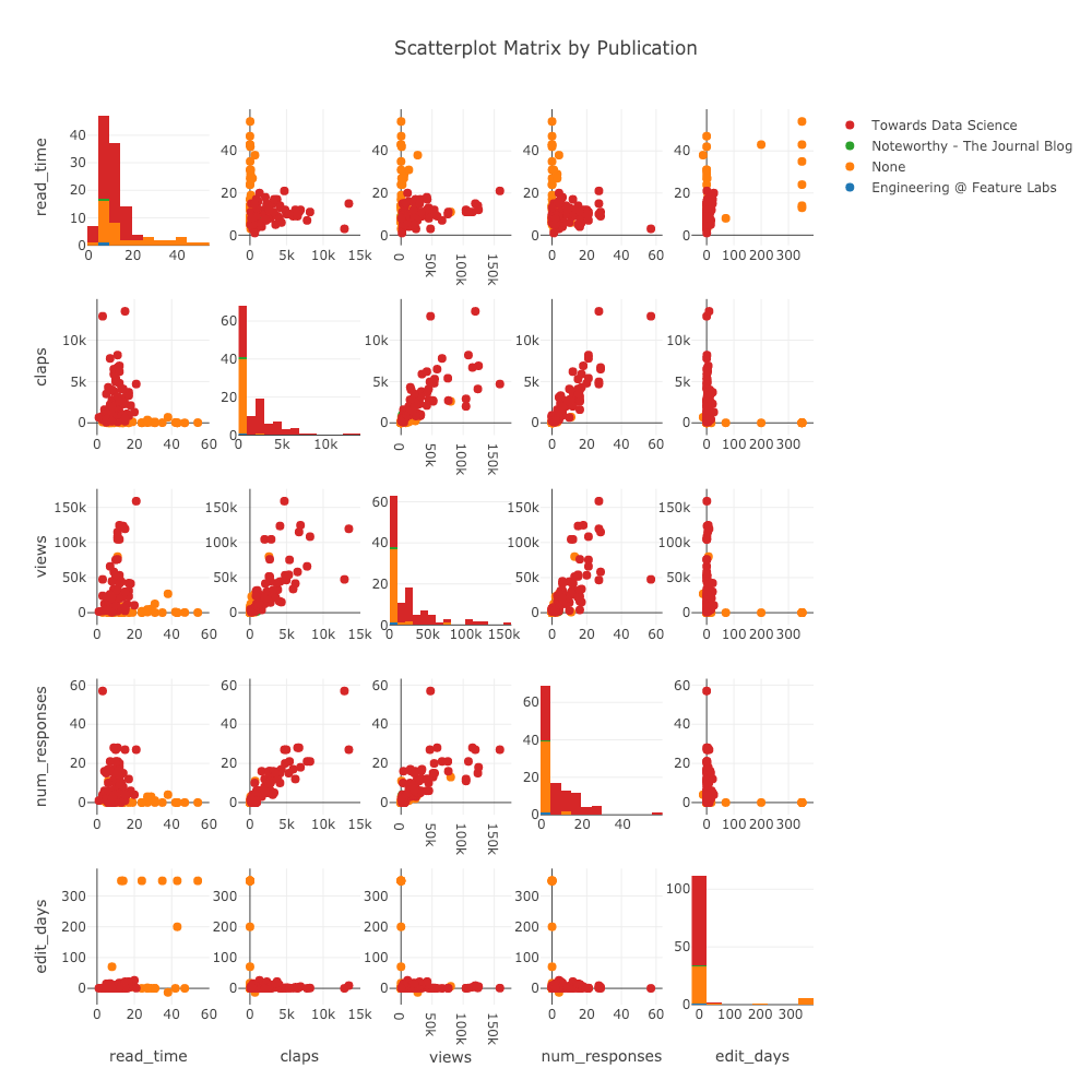 Scatterplot matrix of article stats
(These plots are interactive which can be seen in NBviewer here).
How it Works
Before we get back to the analysis (there are a lot more plots to look forward to), it’s worth briefly discussing how these Python tools get and display all the data. The workhorses of the code are BeautifulSoup, requests, and plotly, which in my opinion, are as important for data science as the well-known pandas + numpy + matplotlib trio (as we’ll see, it’s time to retire matplotlib).
Data Retrieval
From a first look at the Medium stats page, it doesn’t seem very structured.
However, hidden beneath every page on the internet is HyperText Markup Language (HTML), a structured language for rendering web pages. Without Python, we might be forced to open up excel and start typing in those numbers (when I was at the Air Force, no joke, this would have been the accepted method) but, thanks to the BeautifulSoup library, we can make use of the structure to extract data. For example, to find the above table within the downloaded stats.html we use:
Once we have a soup object, we step through it, at each point getting the data we need (HTML has a hierarchical tree structure referred to as a Document Object Model — DOM). From the table, we take out an individual row — representing one article — and extract a few pieces of data as follows:
This might appear tedious, and it is when you have to do it by hand. It involves a lot of using the developer tools in Google Chrome to find the information you want within the HTML. Fortunately, the Python Medium stats toolkit does all this for you behind the scenes. You just need to type two lines of code!
From the stats page, the code extracts metadata for each article, as well as the article link. Then, it grabs the article itself (not just the stats) using the requests library and it parses the article for any relevant data, also with BeautifulSoup. All of this is automated in the toolkit, but it’s worth taking a look at the code. Once you get familiar with these Python libraries, you start to realize how much data there is on the web just waiting for you to grab it.
As a side note, the entire code takes about 2 minutes to run sequentially, but since waiting is unproductive, I wrote it to use multiprocessing and reduced the run time to about 10 seconds. The source code for data retrieval is here.
Plotting and Analysis
This is a highly unscientific chart of my enjoyment of Python plots over time:
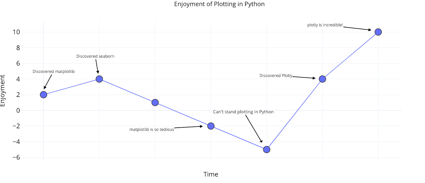 Python plotting enjoyment over time.
The plotly library (with the cufflinks wrapper) has made plotting in Python enjoyable once again! It enables single-line-of-code fully-interactive charts that are so easy to make I have vowed to never write another line of matplotlib again. Contrast the two plots below both made with one line of code:
 Matplotlib and plotly charts made in one line of code.
On the left is matplotlib's effort— a static, boring chart — while on the right is plotly's work — a nice interactive chart which, critically, lets you make sense of your data quickly.
All of the plotting in the toolkit is done with plotly which means much better charts in much less code. What’s more, plots in the notebook can be opened in the online plotly chart editor so you can add your own touches such as notes and final edits for publication:
 Plot from the toolkit touched up in the online editor
The analysis code implements univariate linear regressions, univariate polynomial regressions, multivariate linear regressions, and forecasting. This is done with standard data science tooling: numpy, statsmodels, scipy, and sklearn. For the full visualization and analysis code, see this script.
Analyzing Medium Articles
Back to the analysis! I usually like to start off by looking at univariate — single variables — distributions. For this, we can use the following code:
from plotly.offline import iplot
from visuals import make_hist

iplot(make_hist(df, x='views', category='publication'))
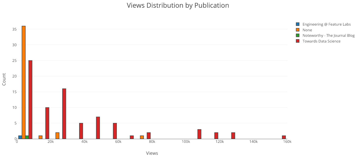 Clearly, I should keep publications in “Towards Data Science”! Most of my articles that are not in any publication are unlisted meaning they can only be viewed if you have the link (for that you need to follow me on Twitter).
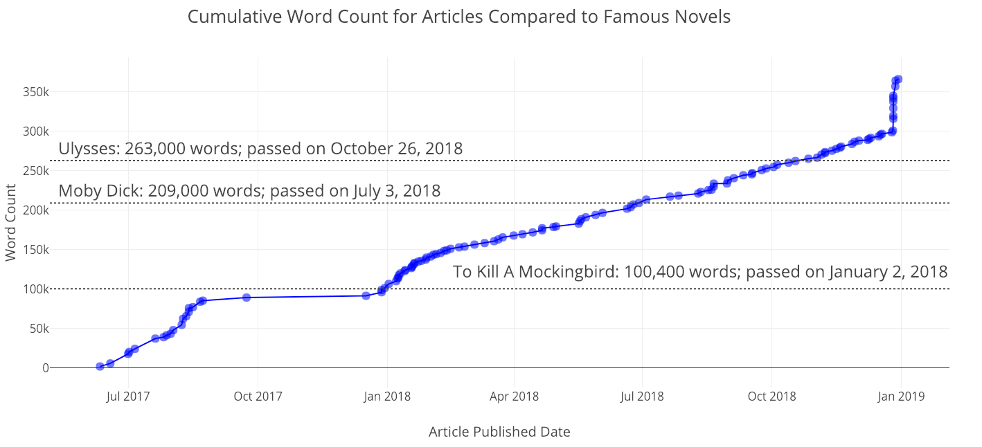
Since all of the data is time-based, there is also a method for making cumulative graphs showing your stats piling up over time:
from visuals import make_cum_plot

iplot(make_cum_plot(df, y=['word_count', 'views']))
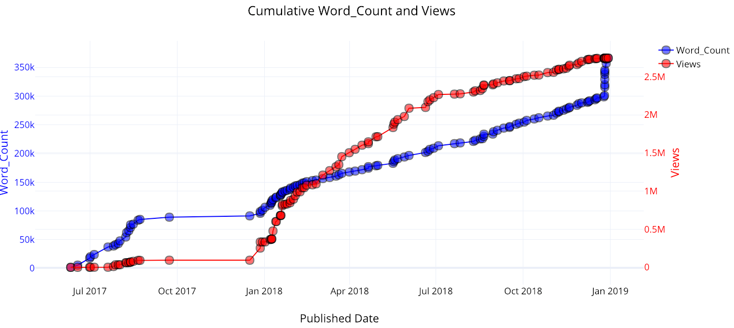
Recently, I’ve had a massive spike in word count, because I released a bunch of articles I’ve been working on for a while. My views started to take off when I published my first articles on Towards Data Science.
(As a note, the views aren’t quite correct because this assumes that all the views for a given article occur at one point in time, when the article is published. However, this is fine as a first approximation).
Interpreting Relationships between Variables
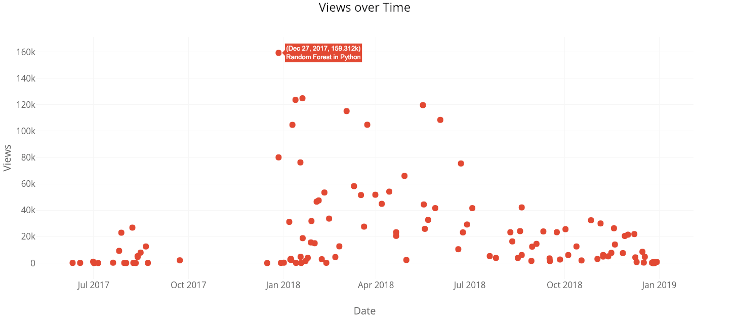
The scatterplot is a simple yet effective method for visualizing relationships between two variables. A basic question we might want to ask is: does the percentage of people who read an article decrease with article length? The straightforward answer is yes:
from visuals import make_scatter_plot

iplot(make_scatter_plot(df, x='read_time', y='ratio'))
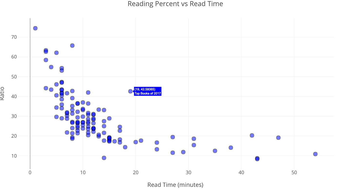
As the length of the article — reading time — increases, the number of people who make it through the article clearly decreases and then levels out.
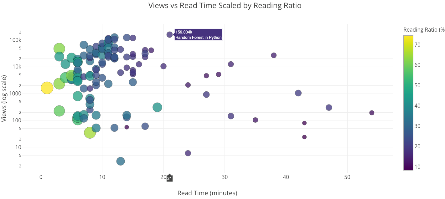
With the scatterplot, we can make either axis a log scale and include a third variable on the plot by sizing or coloring the points according to a number or category. This is also done in one line of code:
iplot(make_scatter_plot(df, x='read_time', y='views', ylog=True,
                        scale='ratio'))
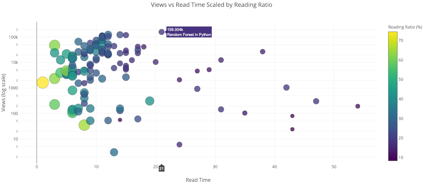
The “Random Forest in Python” article is in many ways an outlier. It has the most views of any of my articles, yet takes 21 minutes to read!
Do Views Decrease with Article Length?
Although the reading ratio decreases with the length of the article, does the number of people reading or viewing the article as well? While our immediate answer would be yes, on closer analysis, it seems that the number of views may not decrease with reading time. To determine this, we can use the fitting capabilities of the tools.
In this analysis, I limited the data to my articles published in Towards Data Science that are shorter than 5000 words and performed a linear regression of views (dependent variable) onto word count (independent variable). Because views can never be negative, the intercept is set to 0:
from visuals import make_linear_regression

figure, summary = make_linear_regression(tds_clean, x='word_count',
                                     y='views', intercept_0=True)
iplot(figure)
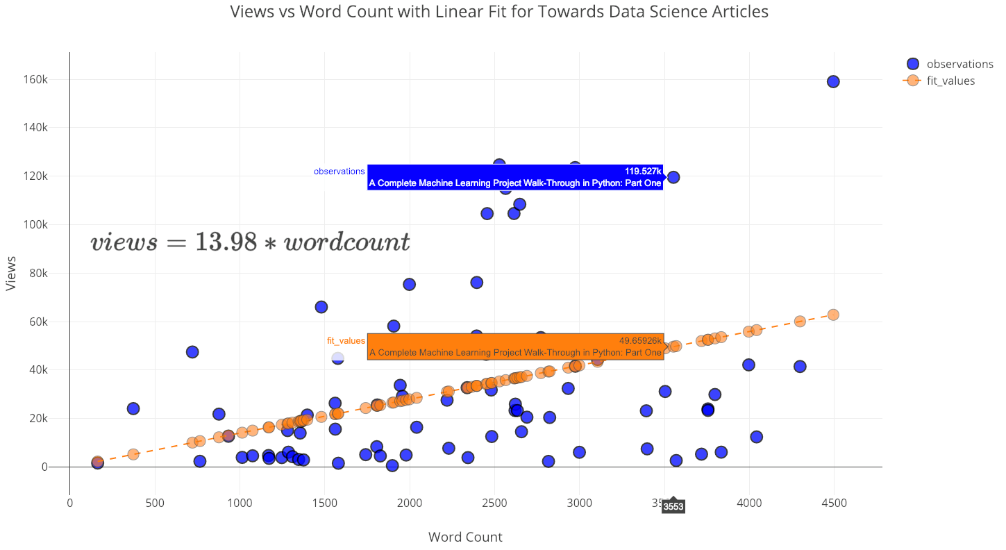
Contrary to what one might think, as the number of words increases (up to 5000) the number of views also increases! The summary for this fit shows the positive linear relationship and that the slope is statistically significant:
 Summary statistics for linear regression.
There was once a private note left on one of my articles by a very nice lady which said essentially: “You write good articles, but they are too long. You should write shorter articles with bullet points instead of complete sentences.”
Now, as a rule of thumb, I assume my readers are smart and can handle complete sentences. Therefore, I politely replied to this women (in bullet points) that I would continue to write articles that are exceedingly long. Based on this analysis, there is no reason to shorten articles (even if my goal were to maximize views), especially for the type of readers who pay attention to Towards Data Science. In fact, every word I add results in 14 more views!
Beyond Univariate Linear Regression
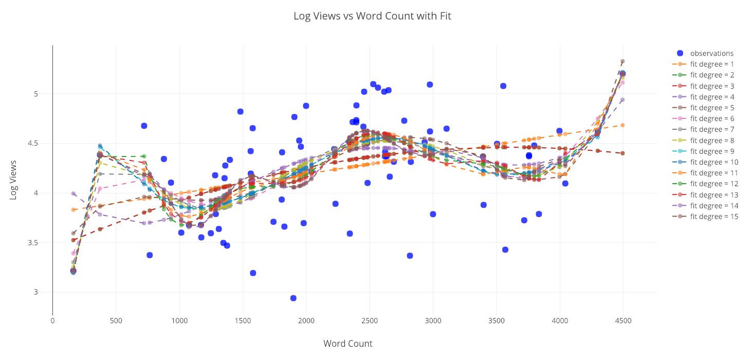
We are not limited to regressing one variable onto another in a linear manner. Another method we can use is polynomial regression where we allow higher degrees of the independent variable in our fit. However, we want to be careful as the increased flexibility can lead to overfitting especially with limited data. As a good point to keep in mind: when we have a flexible model, a closer fit to the data does not mean an accurate representation of reality!
from visuals import make_poly_fit

figure, fit_stats = make_poly_fits(tds_clean, x='word_count',
                                   y='reads', degree=6)
iplot(figure)
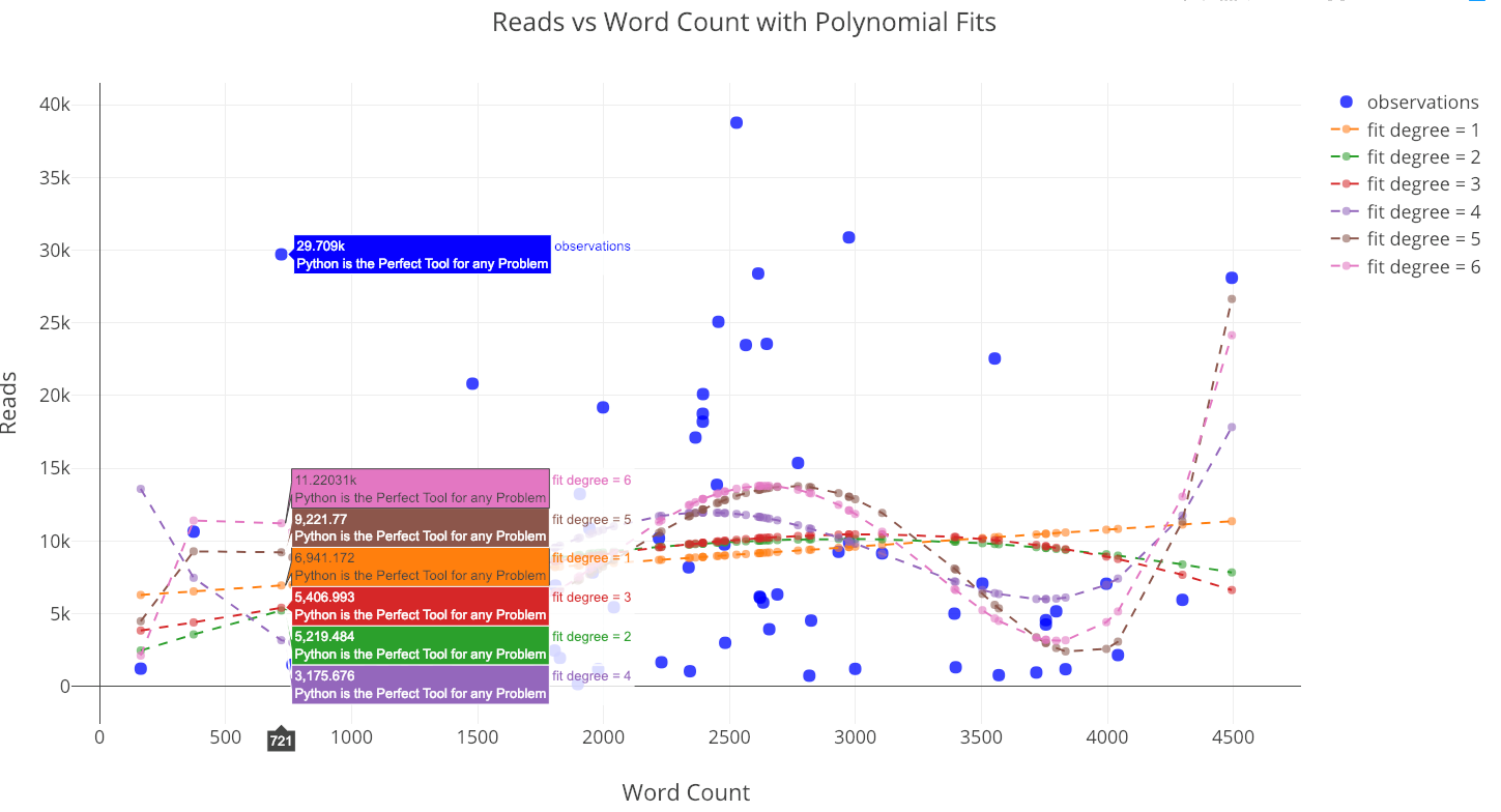 Reads versus the word count with polynomial fits.
Using any of the higher-degree fits to extrapolate beyond the data seen here would not be advisable because the predictions can be non-sensical (negative or extremely large).
If we look at the statistics for the fits, we can see that the root mean squared error tends to decrease as the degree of the polynomial increases:
A lower error means we fit the existing data better, but it does not mean we will be able to accurately generalize to new observations (a point we’ll see in a little bit). In data science, we want the parsimonious model, that is, the simplest model that is able to explain the data.
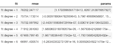
We can also include more than one variable in our linear fits. This is known as multivariate regression since there are multiple independent variables.
list_of_columns = ['read_time', 'edit_days', 'title_word_count',
 '<tag>Education', '<tag>Data Science', '<tag>Towards Data Science',
 '<tag>Machine Learning', '<tag>Python']

 figure, summary = make_linear_regression(tds, x=list_of_columns,
                                    y='fans', intercept_0=False)iplot(figure)
There are some independent variables, such as the tags Python and Towards Data Science, that contribute to more fans, while others, such as the number of days spent editing, lead to a lower number of fans (at least according to the model). If you wanted to figure out how to get the most fans, you could use this fit and try to maximize it with the free parameters.
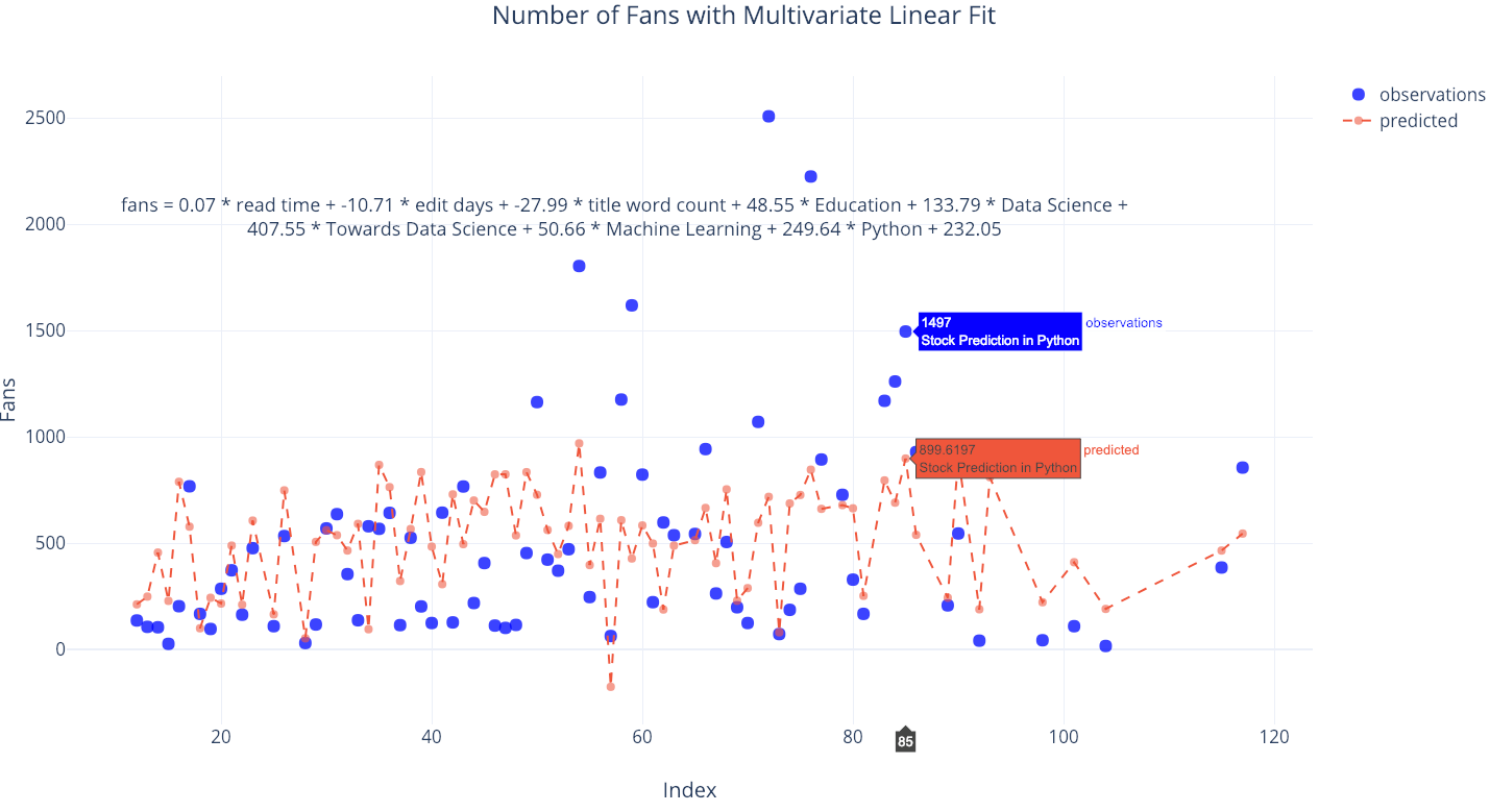
Future Extrapolations
The final tools in our toolkit are also my favorite: extrapolations of the number of views, fans, reads, or word counts far into the future. This might be complete nonsense, but that doesn’t mean it’s not enjoyable! It also serves to highlight the point that a more flexible fit — a higher degree of polynomial — does not lead to more accurate generalizations for new data.
from visuals import make_extrapolation

figure, future_df = make_extrapolation(df, y='word_count',
                                         years=2.5, degree=3)
iplot(figure)
 Looks like I have a lot of work set out ahead of me in order to meet the expected prediction! (The slider on the bottom allows you to zoom in to different places on the graph. You can play around with this in the fully interactive notebook). Getting a reasonable estimate requires adjusting the degree of the polynomial fit. However, because of the limited data, any estimate is likely to break down far into the future.
Let’s do one more extrapolation to see how many reads I can expect:
figure, future_df = make_extrapolation(tds, y='reads', years=1.5,
                                       degree=3)
iplot(figure)
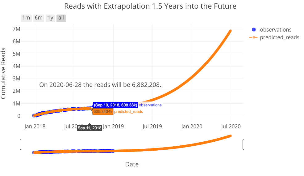 You, my reader, also have your work set out for you! I don’t think these extrapolations are all that useful but they illustrate important points in data science: making a model more flexible does not mean it will be better able to predict the future, and, all models are approximations based on existing data.
Conclusions
The Medium stats Python toolkit is a set of tools developed to allow anyone to quickly analyze their own medium article statistics. Although Medium itself does not provide great insights into your stats, that doesn’t prevent you from carrying out your own analysis with the right tools! There are few things more satisfying to me than making sense out of data — which is why I’m a data scientist— especially when that data is personal and/or useful. I’m not sure there are any major takeaways from this work — besides keep writing for Towards Data Science — but using these tools can demonstrate some important data science principles.
 Overfitting just a little with a 15-degree fit. Remember, all models are approximations based on existing data.
Developing these tools was enjoyable and I’m working on making them better. I would appreciate any contributions (honestly, even if it’s a spelling mistake in a Jupyter Notebook, it helps) so ing — no matter how many stats you contributed to the totals, I could not have done this analysis without you! As we enter the new year, keep reading, keep writing code, keep doing data science, and keep making the world better.
As always, I welcome feedback and discussion. I can be reached on Twitter @koehrsen_will.