
Exploratory Data Analysis With R No Code
Examining the Doctor’s Appointment No-Show Dataset
Author’s Note: The following exploratory data analysis project was completed as part of the Udacity Data Analyst Nanodegree that I finished in May 2017. All code for this project can be found on my GitHub repository for the class. I highly recommend the course to anyone interested in data analysis (that is anyone who wants to make sense of the mass amounts of data generated in our modern world) as well as to those who want to learn basic programming skills in an applied setting. This version of the Exploratory Data Analysis project has all the code removed for readability. The version with all the R code included is also on Medium.
Doctor’s appointment no-shows are a serious issue in the public health care field. Missed appointments are associated with poorer patient outcomes and cost the health care system in the US nearly $200 each. Therefore, it comes as no small surprise that reducing the rate of no-shows has become a priority in the United States and around the world. Numerous studies have been undertaken in order to determine the most effective means of reducing rates of absenteeism at with varying degrees of success. The first step to solving the problem of missed appointments is identifying why a patient skips a scheduled visit in the first place. What trends are there among patients with higher absence rates? Are there demographic indicators or perhaps time-variant relationships hiding in the data? Ultimately, it was these questions that drove my exploratory data analysis. I was curious as to the reasons behind missed appointments, and wanted to examine the data to identify any trends present. I choose this problem because I believe it is an excellent example of how data science and analysis can reveal relationships which can be implemented in the real-world to the benefit of society.
I wanted to choose a dataset that was both relatable and could be used to make smarter decisions. Therefore, I decided to work with medical appointment no shows data available on Kaggle. This dataset is drawn from 300,000 primary physician visits in Brazil across 2014 and 2015. The information about the appointment was automatically coded when the patient scheduled the appointment and then the patient was marked as having either attended or not. The information about the appointment included demographic data, time data, and conditions concerning the reason for the visit.
There were a total of 14 variables I included from the original data. The variables and the description of the values are as follows
- Age: integer age of patient
- Gender: M or F
- AppointmentReservationDate: date and time appointment was made
- AppointmentDate: date of appointment without time
- DayOfTheWeek: day of the week of appointment
- Status: Show-up or No-Show
- Diabetes: 0 or 1 for condition (1 means patient was scheduled to treat condition)
- Alcoholism: 0 or 1 for condition
- Hypertension: 0 or 1 for condition
- Smoker: 0 or 1 for smoker / non-smoker
- Scholarship: 0 or 1 indicating whether the family of the patient takes part in the Bolsa Familia Program, an initiative that provides families with small cash transfers in exchange for keeping children in school and completing health care visits
- Tuberculosis: 1 or 0 for condition
- SMSReminder: 0 ,1 ,2 for number of text message reminders sent to patient about appointment
- WaitingTime: integer number of days between when the appointment was made and when the appointment took place.
Let’s take a look at the structure of the dataframe to identify cleaning/organizing that may need to be performed.
 Structure of Raw Dataframe
From the structure of the dataframe, I can see there is some data housekeeping that needs to be done. First, I want to change the Status variable into an integer 0 or 1. A value of 1 will indicate that the patient did not show up as I am concerned with the variables that are most strongly correlated with a missed appointment. Moreover, I need to convert the registration date and the appointment date to date objects. I decided not to maintain the time (hours:minutes:seconds) associated with the registration date for the appointment although it was available (time of day was not available for the appointment date). I converted both the appointment registration date and appointment date to date objects so I could investigate seasonal and time patterns in the data.
 Structure of Dataframe after First Processing
Based on the updated structure of the dataframe, it looks like I am on the right track but I still have a couple more modifications to make to the dataframe. I will create month, year, and day fields for the appointment and also rename the columns to a more consistent and readable format.
That should about do it for the structure of the main dataframe. I am also concerned with missing/corrupted data, so I will look at the summary of each field to see if any obvious errors or outliers are present in the data.
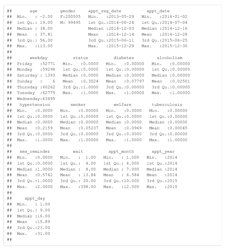 Summary of Dataframe
The summary of the no_shows dataframe reveals plenty of intriguing information as well as several errors that need to be corrected. Right away, it is clear that an age of -2 is not correct, and 113 is stretching the boundaries. However, looking at the oldest people in the world, it is plausible that 113 could be a correct age. I will filter out any negative ages and create a histogram of ages to see if there are a significant amount of outliers at the upper end. Moreover, this data summary shows that 30.24% of appointments are missed based on the mean for the status field. The rates for the various patient conditions can also be seen, and the most commonly coded reason for an appointment is hypertension at nearly 22% of visits. Also, the weekends appear to be a very unpopular time for doctor’s appointments in Brazil, or perhaps the clinics from which this data was drawn are not open on the weekend. Either way, I will need to keep the small sample size of appointments on the weekend in mind when I perform an analysis by weekday.
Frequency Distribution of Ages
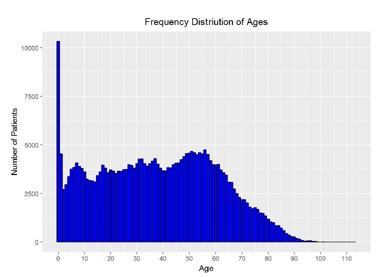
The age histogram does not aligh exactly with my intutions though it is close. I expected that it would be bi-modal, with peaks in patient count at the youngest ages and at the oldest ages. However, while the largest number of patients do appear to be the youngest, the number of patients remains fairly constant into the middle ages, with a second peak around age 60 and then a steep decline into the oldest ages. Based on the visualization, there do not appear to be a large number of outliers in the upper range of the ages. I was skeptical of the high proportion of visits from those aged 0 and decided I needed to do some research. Based on the description of the dataset, this data is for primary care physicians in the public sector and so I looked for a breakdown of ages of patients at these appointments. I could not find statistics from Brazil, but based on official statistics from the Centers for Disease Control in the United States, children under 1 year of age make up 2.6% of all physician visits. I can create a better plot showing the percentage each age is of all patients. I can also quickly check the percentage of visits comprised of patients aged 0 in the data.
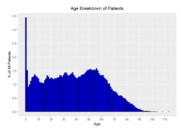
Percentage of patients with an age of 0: 3.442069%
The calculation shows that 0-year olds make up 3.44% of visits. While the initial frequency distribution may looked skewed, the spread of the data along the years makes it look like 0-year olds make up considerably more of the visits than is actually the case. The corrected bar plot does a better job of representing the proportion of patients from each age. From the research by the CDC and the visualization, I conclude that the age distribution skew is not bad but rather legitimate data. To check for outliers in the waiting time field (or how long between the date the appointment was made and the actual date of the appointment), I will make another histogram.
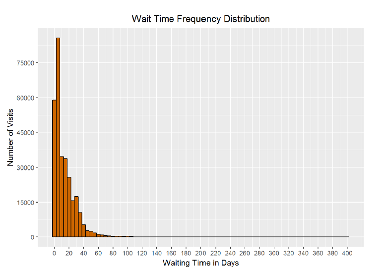
Based on the summary statistics of the dataframe, the longest waiting time was 398 days, with a median of 8 days, and a mean of 13.84 days. From the histogram and the statistics, it is clear that there are a small number of patients at the upper end of the distribution who schedule their appointment very far in advance. I wonder if the 398 days is accidentally a mistake that occured when someone choose the wrong year for their appointment! The graph is certainly long-tailed and positively skewed with a few extreme outliers at the upper limit.
Number of patients with wait time longer than one year: 1 Number of patients with wait time longer than six months: 136
It appears there is only one patient with a waiting time over one year and just over 100 (out of 300000) with a waiting time of over six months. I will exclude the patient with the waiting time over one year, but I will treat the others as good but extreme data. Here is a version of the histogram that better represents the wait time for most patients.
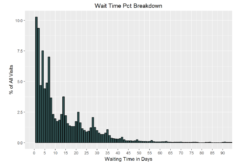
As can be seen in the chart, a plurality of patients wait less than 10 days between the scheduling and the date of their appointment. Based on these visualizations, and the summary statistics for the dataframe, I am confident that the data content of the main dataframe is valid. I can now start the exploration phase of exploratory data analysis! It is time to discover the relationships, or lack thereof, between the variables in the data.
The first step I can take is to find the correlations between all of the columns to see if any stand out as particularly compelling. Of course, I expect that all the trends will not reveal themselves straight away. The rcorr function from the Hmisc library will calculate the Pearson’s correlation coeffient between every field of a dataframe. The Pearson correlation coefficient, is a measure of how linearly dependent two variables on each other. The coefficient value is between -1 and +1, and two variables that are perfectly linearly correlated will have a value of +1.
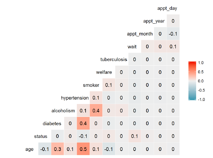 Correlation Matrix of Variables
From those correlation values, there are no standouts that are strong linear predictors of whether or not a patient will miss a visit (given by the status column). It appears that there are not even any strong relationships whatsoever though there is a moderate relationship between age and hypertension. However, I still think there are meaningful relationships to extract from the data. My approach will be to group the data by various fields and then determine if the average absence rate shows a relationship with the fields. The first group of variables I will look at will be those associated with the time-variability of the appointment date.
Date of Appointment
To start off the time-series analysis, I will want to look at absence rate by month of the year. I first needed to group the appointments by month of year and then find the average absence rate for each month.
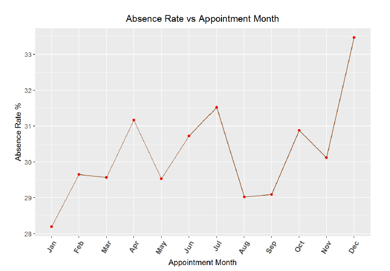
**Correlation between absence rate and month of year**

##
## Pearson's product-moment correlation
##
## data: no_shows_by_month$absence_rate and no_shows_by_month$appt_month
## t = 2.0244, df = 10, p-value = 0.07046
## alternative hypothesis: true correlation is not equal to 0
## 95 percent confidence interval:
## -0.05031758 0.85003600
## sample estimates:
## cor
## 0.5391533
From the graph and the correlation coefficient, it appears there is a minor relationship between month of the year and absence rate. Missed visits do appear to rise as the year progresses, but with only 12 data points, the 95% confidence interval for the correlation coefficient is quite large (-0.05 to 0.85). I would expect that during the end of the year, people tend to be busier and may miss more appointments. It could also be possible that at the beginning of the year, individuals make resolutions to see the doctor and keep a higher percentage of appointments, but the trend could also be noise. Next, I will create a similar absence rate over time graph, but this time by day of the month.
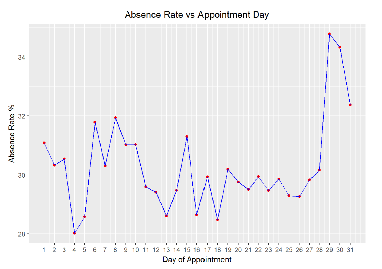
**Correlation between absence rate and day of month**

##
## Pearson's product-moment correlation
##
## data: no_shows_by_day$appt_day and no_shows_by_day$absence_rate
## t = 1.3753, df = 29, p-value = 0.1796
## alternative hypothesis: true correlation is not equal to 0
## 95 percent confidence interval:
## -0.1171669 0.5532753
## sample estimates:
## cor
## 0.2474464
Looking at the plot we can see that there is a very slight positive correlation between day of the month and absence rate but again, the 95% confidence interval spans a wide range of values. To further explore any time variability in the data, I can create the same graph by day of the year and broken out by gender.
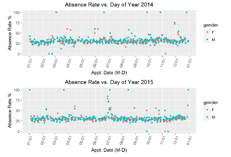
Mean absence rate for males: 30.99653% Mean absence rate for females 29.86962%
From these charts, it appears looks as if there is no correlation betwen the time of year and the absence rate for appointments. Moreover, adding in the gender does not reveal any major descrepancies, although from the calculation, we can see that men on average have a 1% higher absence rate. There are several days for which the absence rate is 1, which bears some more investigation. My idea is that these points might corespond to public holidays. However, I also see that these days are not consistent across the two years, so maybe there are other major events that correspond to an increase in absences. I decided to overlay the holidays to see if that might reveal a relationship. I sourced the holidays based on public holidays in Brazil for each respective year.
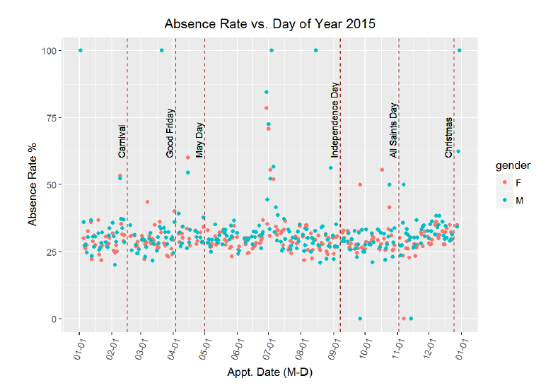
Again, it seems as if these holidays do not line up with higher rates of missed appointments. There is a sustained increase in the absence rate around the beginning of July, but it does not seem to correspond to any holidays. I researched festivals in Brazil in June-July 2015, and it appears that the Paraty International Literary Festival occured July 1–5, but I doubt that this explains the absence rate. There was not city data associated with the original dataset, so it is difficult to attempt to cross-reference specific dates with specific events. I will create a simliar graph for 2014. I remember that the 2014 soccer World Cup was held in Brazil, so perhaps the time around the world cup will have a higher absence rate. I will plot a few holidays and then the dates surrounding the World Cup (which lasted for a month).
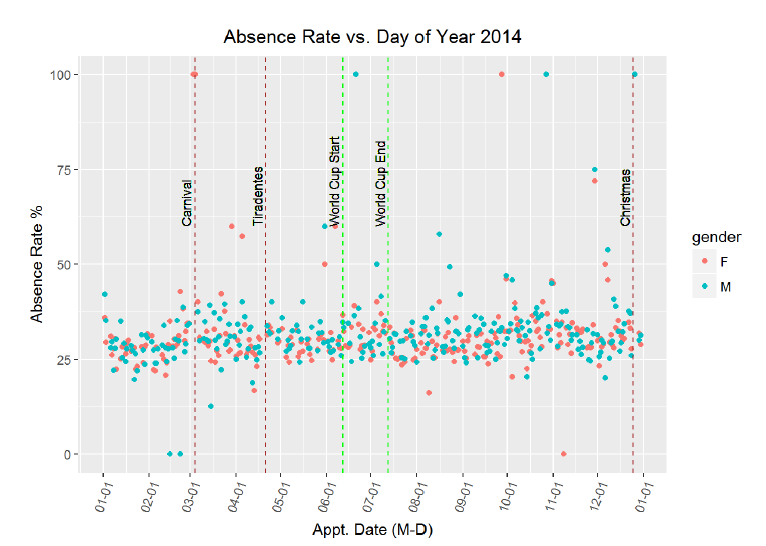
Perhaps there is a slight increase in absence rate during the World Cup? The graph does not clearly indicate either was but I can compare the average absence rate during the World Cup to the average absence rate over the entire length of 2014.Mean absence rate during all of 2014\
[1] 30.08656 Mean absence rate during 2014 World Cup [1] 30.79473
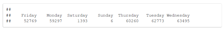
There is a small but not significant increase in the absence rate during the World Cup. It looks like in terms of time variability, there is no significant correlation based on the day of the year or the day of the month. There is one more time variation I want to look at, and that is day of the week. To remind myself of the small sample sizes on the weekend, I also show the appointment days of the week count.
 Absences Broken Out by Day of Week
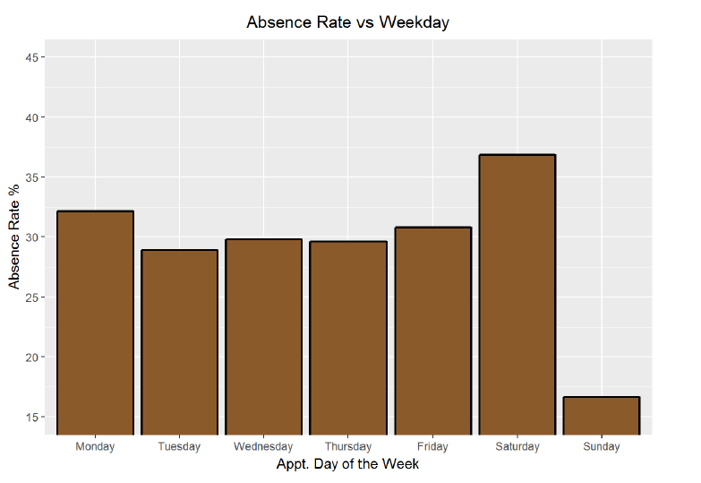
Finally, it looks like there might be some time variability in this data when it is broken down by weekday. Excluding Saturday and Sunday because of their small sample sizes, Monday and Friday have the highest absence rate and Tuesday has the lowest. I will alter the plot to show the absence rate as a relative percentage change from the overall mean absence rate.
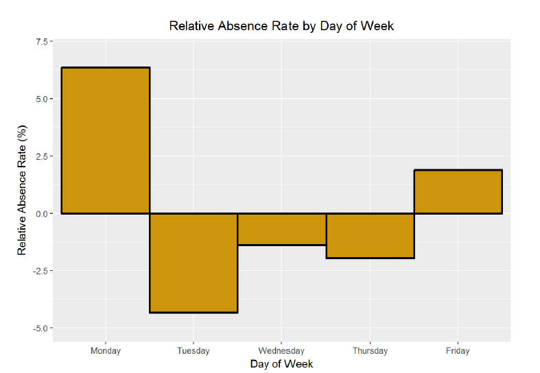
Based on this chart, patients are 6% more likely to miss an appointment on a Monday compared to the overall average absence rate, and 4% less likely to miss an appointment on a Tuesday. This is an actionable discovery for both patients and doctors! If patients want to keep their appointments, and if doctors want to make sure their patients show up, they should schedule their appointments during the middle three days of the week.
Patient Age
I wanted to move on from the time variability and look at the demographic data. In particular, I am interested in whether or not age is correlated with absence rate. My initial guess would be that the youngest and the oldest patients would tend to have lower absence rates. Meanwhile, those patients in the middle would generally be healthier and thus would feel more inclined to skip an appointment. (Everyone is convinced they are invincible in their 20s. In fact, this was one of the issues associated with the initial rollout of Obamacare. Too many young, healthy individuals did not believe they needed insurance and therefore did not sign up for healthcare.)
First I will group patients by age and then visualize the average absence rates.
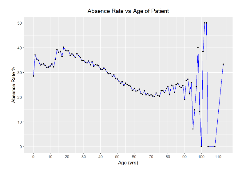
The chart reveals the possibility of a negative relationship between age and absence rate. First though, it is clear that the outliers in the upper end of the data introduce substantial variance. As there are only 719 patients over 90 out of 300000 entries, I think I can filter out any ages over 90 without impacting the validating of the data while reducing the noise. I will use that filter and then improve the aesthetics of the graph.
We can observe that the youngest ages have a relatively low absence rate with an exception for 1-year-olds. The absence rate then climbs for teenagers, peaking around age 20, before beginning a long, gradual decline to around 70, at which point the absence rate rises again slightly. I would like to know precisely which ages have the highest and lowest absence rates. Moreover, what is the pearson correlation between age and absence rate?
Maximum absence rate of 40.21% occurs at age 18 Minimum absence rate of 20.25% occurs at age 72
**Correlation between absence rate and age**
##
## Pearson's product-moment correlation
##
## data: no_shows_by_age$age and no_shows_by_age$absence_rate
## t = -15.728, df = 88, p-value < 2.2e-16
## alternative hypothesis: true correlation is not equal to 0
## 95 percent confidence interval:
## -0.9049699 -0.7927363
## sample estimates:
## cor
## -0.8588338
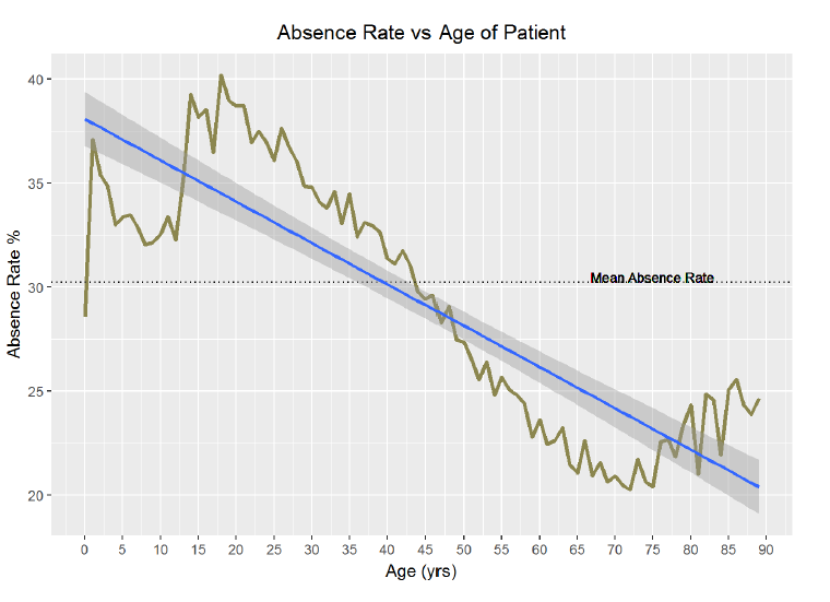
Here are more actionable conclusions. Public health officials need to work on getting teenagers to show up to their appointments! This is expecially crucial because studies have shown that habits form very early and are hard to change later in life. A trend of going to the doctor while younger will likely persist as a patient ages and lead to better lifelong health.
We can further bin the data in five years increments to highlight the “problem years”, that is, the years with the highest missed appointment rate. I will plot the relative absence rate, or the average age group absence rate as a percentage relative to the average absence rate for all ages. Remember, in this plot, below the x-axis is better because it indicates that the age group has a lower rate of missed appointments than the average.
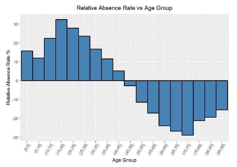
Based on the chart, is it clear that the worst group in terms of absence rate is 15–20 year-olds and the best group for attedance is 70–75 year-olds. The visualization and the statistics are definitive when it comes to ages and missed appointments. The correlation between ages and absence rate is -0.86, which is strongly negative and indicates that as the age of the patient increases, statistically, that patient is less likely to miss a scheduled doctor’s appointment.
Waiting Time
After finding a strong relationship between age and absence rate, I will move on to examine other variables. I would like to search for a possible trend in absence rate by waiting time, or the time between when an appointment was scheduled, and when the appointment took place. My hypothesis is that patients with a longer waiting time will have a higher missed appointment rate because their condition has more time to change in the interim period. Moreover, I think that patients with a shorter waiting time are more likely to need urgent care or have a problem they deem to be pressing, and it would certainly be in their best interest to show up at the appointment.
**Correlation between absence rate and waiting time for appointment**

##
## Pearson's product-moment correlation
##
## data: no_shows_by_wait$absence_rate and no_shows_by_wait$wait
## t = -0.75865, df = 210, p-value = 0.4489
## alternative hypothesis: true correlation is not equal to 0
## 95 percent confidence interval:
## -0.18572082 0.08305389
## sample estimates:
## cor
## -0.05228019
The graph and the correlation coefficient seem to demonstrate a lack of any relationship. However, thinking back on the histogram of waiting time from the initial exploration, the majority of the patients waited under 100 days. There are far fewer data points from people waiting more than 100 days, which is why the average absence rate for those times tends to be either 0% or 100%. If I limit the data to people with a waiting time less than 3 months (90 days), might there exist a relationship? Furthermore, I will group the data into 10 day segments.
Patients with a waiting time over 90 days 1646

**Correlation between absence rate and waiting time for those waiting less than 90 days.**

##
## Pearson's product-moment correlation
##
## data: no_shows_by_wait$absence_rate and no_shows_by_wait$wait
## t = 2.8438, df = 87, p-value = 0.005556
## alternative hypothesis: true correlation is not equal to 0
## 95 percent confidence interval:
## 0.08876595 0.47126629
## sample estimates:
## cor
## 0.2916315
If the data is limited to those patients who scheduled fewer than 3 months in advance, there is a slight positive correlation between waiting time and absence rate. I tried to do some research on this subject in general, and found this from the Safety Net Dental Clinic: “Experience in many safety net dental programs also suggests that the incidence of broken appointments increases when appointments are scheduled more than three weeks in advance.” Based on my analysis, I concur. Patients who schedule less than 10 days out are 20% less likely to miss an appointment than those scheduling further out. The Safety Net Dental Clinic page mentions that often other life events get in the way when we schedule too far out, and although that may be a slightly different situation, the general pattern appears to hold in this case. Add a point to schedule as few days out as possible to the list of recommendations for patients looking to adhere to a scheduled appointment.
SMS Reminders
One of the most intriguing aspects of the dataset to me was the SMS (Short Message Service) text message reminder counts. Text message reminders have been implemented in many clinics because of their ease of use and low cost. Moreover, they have been shown to be effective in some situations. I want to examine this data to discover how or if SMS messages correlate with a failure to attend. I would think that patients who recieve SMS messages will be more likely to attend the appointment than those not receiving them. However, this could be complicated by the fact that younger patients are more likely to sign up for text message alerts, and as we have already seen, young individuals are more inclined to be record a no-show. Therefore, I will probably need to further look at who exactly is recieving the text messages in addition to the correlation between text messages and attendance at the appointment.
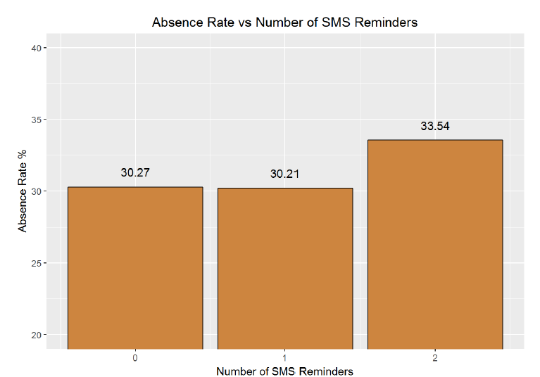
The graph is somewhat surprising to me; one text message seems to decrease the absence rate while two increases the absence rate significantly. I would have expected more SMS reminders to be strongly correlated with a decrease in absence rate. Maybe the direction of this relationship is the opposite of what I thought. Instead of SMS messages persuading patients to attend a scheduled appointment, patients who are least likely to attend an appointment receive more text messages. One way to check for this would be to look at average SMS messages per appointment received by age. I expect there might be odd behavior at the ends of this graph (how young do children receive their first phone nowadays? Has the average 80-year old embraced text messages?). I expect that segmenting by age might reveal more nuances than the overall absence rate vs text messages.

**Correlation between number of SMS reminders and age**

##
## Pearson's product-moment correlation
##
## data: no_shows_by_age_texts$average_reminders and no_shows_by_age_texts$age
## t = -12.39, df = 88, p-value < 2.2e-16
## alternative hypothesis: true correlation is not equal to 0
## 95 percent confidence interval:
## -0.8620345 -0.7068951
## sample estimates:
## cor
## -0.7972722
Sure enough, the average number of SMS reminders per appointment is greater among the younger ages. I looked through the data provider information, and I could not ascertain whether or not those SMS reminders were to the parent in the case of a very young child but that seems likely. From the statistics and the plot, there is a strong negative correlation between the number of SMS messages and the age of the patient. To further explore the absence rate vs text message, I will recreate the absence rate vs age graph, but this time, create separate curves for number of SMS reminders received.
Looking at the graph, we can see that the absence rate versus age grouped by number of SMS reminders looks much the same for the 0 or 1 reminders. However, the graph for 2 reminders is much noisier. I suspect that is due to the lower sample size of people receiving two reminders (which was the maximum). In order to determine if there is an effect from text message reminders at a given age, I need to create a plot showing the difference in absence rates at each age between those receiving any reminder and those receiving no reminder.

Indeed, it does appears that at a given age, the absence rate decreases with 1 or 2 text messages reminders. In fact, the average difference in absence rate holding age constant is -0.57%. That means that having receiving an SMS reminder at a given age decreases the chance that a patient will miss a scheduled appointment by 0.6%. This may seem small, but it could add up over millions of appointments. Moreover, there are certain ages when the effect of the SMS reminders is much greater. The reduction in missed appointments is as great as 2% at age ten and near 3% during other years. This reduction in the failure to attend rate is also what research into text message reminders has found. One study,conducted in Brazil, found: “The nonattendance reduction rates for appointments at the four outpatient clinics studied were 0.82% (p = .590), 3.55% (p = .009), 5.75% (p = .022), and 14.49% (p = <.001).” Furthermore, the conclusion of this research was: “The study results indicate that sending appointment reminders as text messages to patients’ cell phones is an effective strategy to reduce nonattendance rates. When patients attend their appointments, the facility providing care and the patients receiving uninterrupted care benefit.” Based on my analysis of the data, I must concur that at a given age, SMS reminders decrease the absence rate. Another valuable piece of information that could be quite easily implemented in the real world to improve outcomes!
Patient Markers
The final step in this exploratory analysis is to look at the absence rate by the condition for which the patient visited the doctor. I will group by the markers in the original data and then look at each average absence rate.
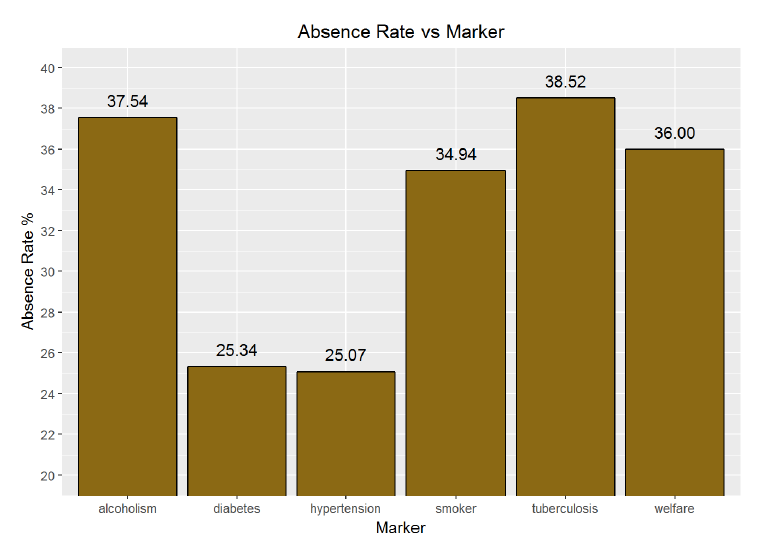
There are considerable differences illustrated between those with different markers. Tuberculosis has the highest rate of absence, followed by alcoholism. However, these conditions also make up a small sample of the overall visits. Diabetes and hypertension have the lowest absence rate. Interestingly, patients marked as being part of the Bolsa Familia welfare program have a high rate of absences. This program rewards patients for attending appointments, which should induce patients to visit their doctor more often. Perhaps there are other factors at play here though. It could be that families on the welfare program cannot take the time to visit the doctor because of the opportunity cost of not working.
To put the conditions in perspective, here is the percentage of all visits each condition makes up.
**Absence Rate  Number of Patients   Marker    Percentage of Visits**

**25.33561%         23390          diabetes      7.79684859%**

**37.54498%          7503        alcoholism      2.50105836%**

**25.07450%         64767      hypertension     21.58950376%**

**34.94367%         15711            smoker      5.23712220%**

**35.99711%         29069           welfare      9.68989276%**

**38.51852%           135      tuberculosis      0.04500105%**
The final plot I can make is of the conditions and the relative percentage difference in absence rates compared to the mean absence rate. Relative difference plots are helpful to me because it is possible to quickly identify if one variable is above or below the average. Again, for this particular plot, values below the x-axis are great because it means the absence rate is lower than the overall average.
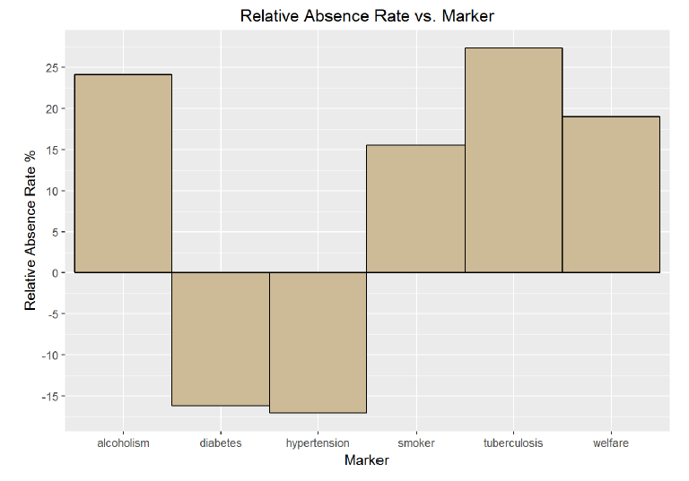
The differences between conditions here are stark. Again, the smaller sample sizes associated with alcoholism and tuberculosis must be taken into account, but it is clear that patients with diabetes and hypertension are more likely to attend an appointment. In fact, they are more than 15% less likely to miss an appointment then the average patient. This is an interesting result and I wonder if it is because of the constant need for care when treating both of these conditions. However, it would seem like all of the conditions require care on an ongoing basis. I would need more detailed condition information before I drew any conclusions about possible causes of the absence rates broken out by condition.
I started this project off with a single simple question: what factors are most likely to determine whether or not a patient shows up to their scheduled doctor’s appointment? As the exploratory data analysis went on, I found this one question had branched into dozens. Does the number of SMS reminders correlate with absence rates? How about if we compare SMS reminders for a given age? Are there major variabilities that we can observe associated with holidays? I found my curiousity and interest in the dataset only grew as I delved further and further. Although at first it appeared there were few meaningful relationships, by grouping and segmenting the data, clear trends emerged. Keeping in mind that this dataset may not be representative of all countries and health care systems, the following are the most notable discoveries from the patient no-show data:
- There is no significant change in the absence rate over the course of the year broken down by month.
- December has the highest absence rate and January has the lowest but there is no trend in between.
2. There is a slight positive correlation between absence rate and the day of the month and as the month progresses, the percentage of missed appointments rises moderately.
3. There is no correlation in the absence rate over the days of the year.
- Major Brazilian holidays did not correspond to any significant changes in the absence rate.
- During the month-long World Cup in 2014 in Brazil, the absence rate increased by only 0.6%.
4. Excluding the weekends, the day of the week with the highest absence rate is Monday followed by Friday. Tuesday had the lowest rate of absences with appointments on Tuesday 4% more likely to be attended than those on the other days of the week.
5. The age of patients was demonstrated a strong negative linear correlation with absence rates with a correlation coefficient of -0.86.
- As the age of the patient increased, the likelihood that they would not show up to their appointment decreased.
- There were some exceptions to this however. The youngest patients had a relatively low rate of missed appointments, then the absence rate rose and peaked in the teens, before gradually declining until age 70 where it increased by a small amount into the upper end of the range.
- 18-year-olds had the highest rate of absences at 40.2%.
- 72-year-olds had the lowest rate of absences at 20.2%.
6. There was a slight positive correlation between the rate of missed appointments and how many days in advance the patient scheduled the appointment.
- Patients who made an appointment less than 10 days in advance were 20% more likely to attend the appointment than those who made the appointment further ahead of time.
7. When looking at the dataset as a whole, patients who recieved two SMS reminders were more likely to miss an appointment than those who recieved no reminders. However, the correlation between age and average text messages recieved was -0.80 meaning that younger patients, who were more likely to miss appointments overall, received more text messages. Subsequently, the effect of text messages reminders can only be revealed by looking at messages received at a given age.
- At a specified age, patients who recieved 1 or 2 text messages were 0.5% less likely to miss an appointment than those receiving no text messages. This effect was even more pronounced among certain age categories.
- Based on the data analysis and concurring research, text message reminders decreased the absence rate.
8. Patients whose appointments were marked for tuberculosis and alcoholism were the most likely to miss the visit, while those coded for hypertension and diabetes were the least likely to miss their appointment.
- Patients with families in the Bolsa Familia program were more likely to miss an appointment than the average patient.
- Patients with hypertension or diabetes were 15% more likely to attend a scheduled appointment than the average average patient.
These are but a few briefs observations that can be gleaned from this dataset. Keeping in mind that correlations do not imply causations (more serious link for those interested), and that some of the groupings results in small sample sizes, there are actionable items that with appropriate further study, could be implemented in the health care system.
The final aspect of the project was to revisit and refine three of my earlier plots. Primarily I am concerned with whether or not the visualizations correctly convey the information within the dataset. My secondary objective is of course aesthetics because what good is even the most informative chart if it is not presentable?
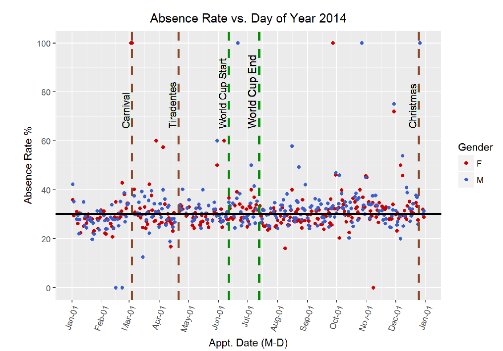
Absence Rate vs. Day of the Year
This first chart was notable to me because of the lack of relationships it revealed. It is the graph of absence rate versus day of the year in 2014 with holidays (and the World Cup) included. I would have initially believed that absence rates spiked around holidays and near the end of the year. However, no clear trend emerged from this plot. In order to improve the information content and the aesthetics, I altered some of the colors, changed the scale on the axis, added in the mean absence rate for reference, and made sure all labels were accurate.
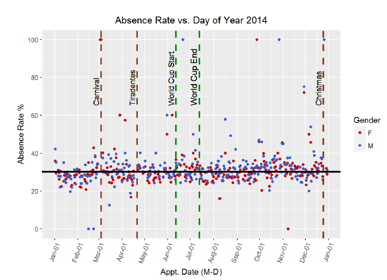
The conclusion to draw from this visualization is that there is no trend in rate of missed appointments over the year by day. Even on major public holidays (of which the World Cup may be the greatest!) there is no noticeable change in absence rate around or on the holiday. This was backed up by the correlation coefficient which showed no linear relationship between day of year and the failure to attend statistic. The overall mean, plotted as the horizontal black line, shows the absence rate for all patients was 30.24%. Women on average had a slightly lower rate of 29.87% and men had a slightly higher rate at 31.00%. The gender discrepancy can barely be picked out on the graph, but it is present.
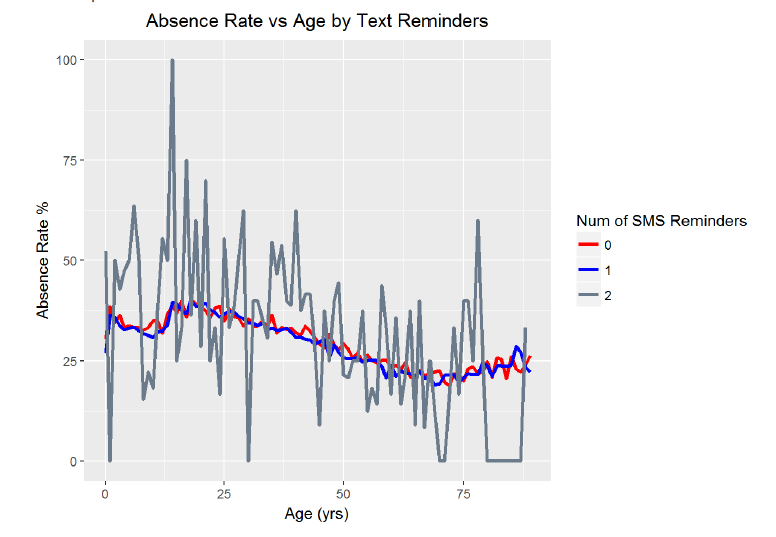
Absence Rate vs. Age by SMS Reminders
The second crucial visualization is the absence rate versus age broken down by number of SMS reminders. When I initially looked at the data showing that overall, people who received 2 text message reminders had higher absences rates, I was a little skeptical. However, after some thought, I realized that people who received text messages were likely to be younger, and I had seen that the younger the patient, the higher the absence rate. Therefore, I decided to look at the effect of text messages reminders at each given age. Based on the resulting chart, I saw that indeed, SMS reminders do reduce the absence rate at a specific age. To make the point clearer in the plot below, I plotted the average absence rate vs age for those who received no text reminders and for those who received either 1 or 2 reminders. The original graph was very noisy, so I applied a moving average over 5 years. The 5 year window was a selection based on the bias-variance tradeoff because while I wanted a smoother plot, I did not want to introduce a high amount of bias into the averages. After improving the graph, it is possible to observe the trend of fewer absences at older ages and the effectiveness of SMS reminders in reducing the failure to attend rate.
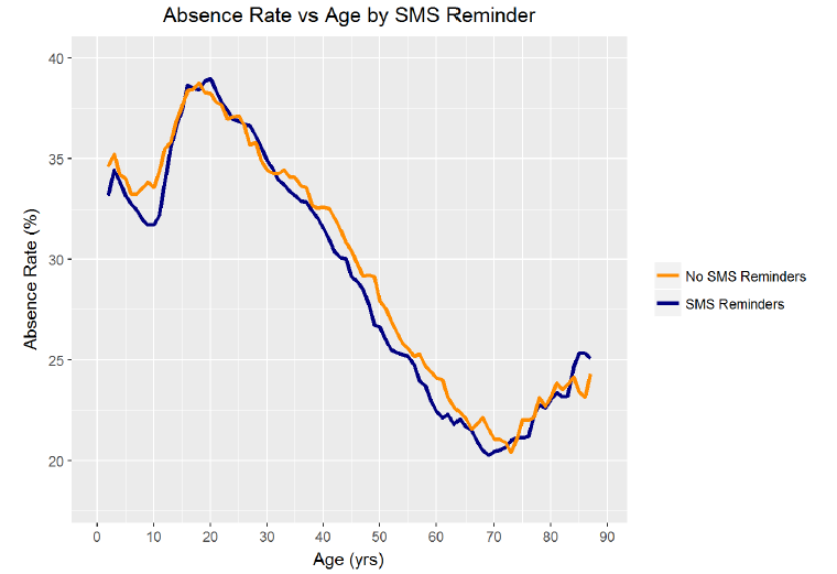
The main two takeaways from this visualization are that as age increases, the absence rate decreases, and, at a given age, patients who receive at least one SMS reminder miss fewer appointments. The age distribution of missed appointments was in line with what I had expected, although I would have initially guessed that children under 10 would have the low absence rates comparable to what was observed in those aged 40 and over. It was not surprising to me that patients in their teens and early 20s had the highest failure to attend rate and it is clear that more effort needs to be expended in ensuring that this age group shows up for their appointments. This is one application where text message reminders could be most useful. Looking at the chart, it is also possible to observe that the rate of no-shows for those receiving an SMS reminder is lower than that for those recieving no reminder at almost every age. Overall, for a given age, text message reminders resulted in absence rates 0.5% lower which could make a substantial impact on the scale on a national health care system.
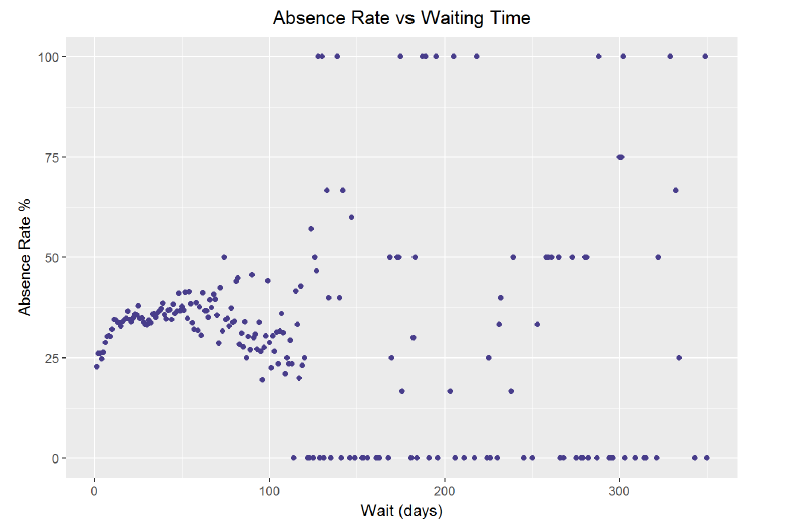
Absence Rate vs. Waiting Time
The third vital graph from this analysis was the relative absence rate vs waiting time graph. This graph displays the absence rate relative the overall mean absence rate for patient groups based on how far in advance they scheduled their appointment. I initially grouped the waiting time, or the elasped days between when the appointment was made and when the appointment occurred, by groups of five days. I then plotted the relative absence rate compared to the overall average for each group. I was surprised to discover how much lower the absence rate was for those sceduling less than 10 days in advance. To improve the plot, I increased the resolution of the graph by narrowing the bin widths to groups of 3 days. I also decided to add in a model created with the LOESS, Local Regression, method of regression. I created a simple model and then used the prediction it generated for each age grouping to draw a curve. The graph reveals the crucial information that appointments scheduled shorter out tend to have higher attendance rates.

The actionable takeaway for patients from this graph is to schedule appointments on a shorter time scale, preferentially less than 10 days in advance. The absence rate for those whose appointments were scheduled only 3 days or less in advance was nearly 30% lower relative to the overall absence rate. Moreover, the model shows that the trend in increasing absence rate with longer waiting times is nearly linear for the first month. After that point, the noise in the visualization increases, but the majority of groups with wait times over 12 days had a higher absence rate than the mean. Patients would be wise to schedule their appointments as soon as possible in order to follow through on visiting the doctor.
Taken together, these three visualizations illustrate several pieces of advice for patients and doctors who have a mutal interest in driving the absence rate as low as possible: 1. Day of the year does not affect the absence rate even near the holidays. 2. Young adults are the most likely to miss their appointments and therefore will need extra prodding to attend an appointment. This prodding can come in the form of SMS reminders, which reduce the absence rate for a given age. 3. Patients should schedule appointments as few days in advance as possible. Ideally appointments would occur within 9 days of being scheduled to increase the chance of attendance.
The primary reason I wanted to learn the tools of data analysis was in order to could extract meaningful information from the mounds of data generated in our modern world. I want to be able to take hundreds of thousands or even millions of data points and extract insights which can be implemented in the real world to improve human institutions, such as the medical system. Exploring the patient no-show dataset has been a small step towards developing that ability. Although the sheer amount of data appeared overwhelming at first, and there were no correlations that immediately stood out, by selectively grouping the data and adjusting the visualization parameters, I was able to discover several key relationships. The main difficulty I had was beginning the analysis. With so many variables, it was a struggle to decide where I should first concentrate. However, once I started grouping the data, I found more and more directions I could explore until I felt that I was satisfied with the extent to which I had unraveled the data. The trends and patterns in the datadictate the questions that we should ask of it. R is a tricky language to pick up, but once I understood the patterns and syntax, I enjoyed the level of control it gave me over the visualizations. I was frustrated at times trying to perfect parameters of a graph, but in the end, I think I am a better data analyst because I had to work through all the intricacies of the R language.
The next step forward, now that the exploratory data analysis of the no-shows dataset is complete, is to perform confirmatory data analysis. Based on my initial observations, I could form several hypotheses and then use rigorous statistical methods to test those hypothesis. Exploratory data analysis can discover potential relationships, but it takes statistical testing to determine whether these correlations are statistically meaningful. Moreover, this dataset is an ideal candidate for using machine learning to create classifiers that would identify patients likely to be a no-show at an appointment. The objective would be to make a model that would take in as features patient demographics and conditions, and would return the likelihood that a patient would fail to attend a scheduled doctor’s appointment. If the model was accurate enough, it could then be implemented in the real-world by ensuring that patients most likely to miss a doctor’s visit receive additional persuasion. Moreover, with a more complete dataset, including city information or detailed demographics, more relationships could be discovered such as absence rate correlations with the weather or with access to public transportation. The initial exploratory data analysis of the doctor’s appointment no-show data has revealed numerous potential relationships. The dataset holds actionable information and this project demonstrates the benefits of not just collecting large amounts of data, but thoroughly analyzing it to find the correlations that could be used to improve patient outcomes and public health.
Originally published at medium.com on August 8, 2017.