
Data Science: A Practical Application

Charting the Great Weight Challenge of 2017
One frustration I often hear from those learning data science is that it is difficult to make the leap from toy examples in books to real-world problems. Any learning process must necessarily start off with simple problems, but at some point we need to move beyond curated examples and into messy, human-generated data. This graphic pretty well sums up what I’ve gone through in my data science education, and although I’m not yet over the cursing mountain, I have climbed part of the way up through trying (and often failing) at numerous projects with real data:
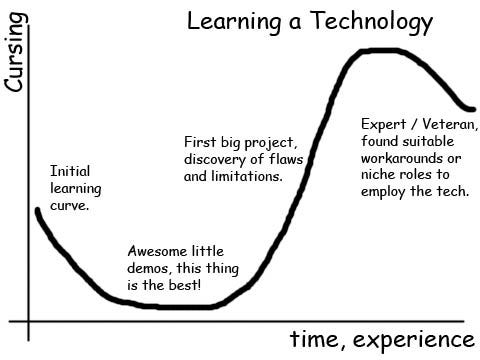 Technology Learning Curve (Source)
The best way to ascend this curve is build up your confidence over time, and there is no better place to start than a project directly related to your life. This post will demonstrate a straightforward application of data science to my health and that of my dad, a personal problem with clear benefits if there ever was one!
The good news is that in order to apply data science for your personal benefit, you don’t need the data or resources of a massive tech firm, just a consistent set of measurements and free open-source analysis tools such as R and Python. If you stop to look, you will find data streams all around you waiting to be tracked. You might step onto a scale every morning and, depending on the outcome, congratulate or denigrate yourself, and then forget about it until the next day. However, taking a few seconds and recording a once-daily weight in a spreadsheet can yield a useful and clean dataset in a few months (and increases the chances that you will hit your goal). This data is perfect for allowing you to develop your data science skills on a real problem.
 At its core, data science is fundamentally about drawing intelligence from data and this post is an illustration of how data science can yield insights that improve real-world outcomes. Data science is a multi-disciplinary field — composed of computer science, statistics, and engineering — but the most vital aspect is also the most overlooked: communication. Your analysis could be great, but at the end of the day, managers, professors, and the general public care more about the final result than the exact methods. Being able to clearly communicate an answer to a data science question and the limitations of an analysis is a valuable asset in any data science toolbox.
In this post, I have left out all of the code (done in R) used to create the graphs in order to focus on the results and what we can learn from them, but all code is available on the project GitHub page for anyone who wants to see how the magic happens. Likewise, the data is on GitHub and on Google Drive as a csv file for those wanting to follow along. I have also tried to provide resources on specific topics for those wanting to learn more. Now, it’s time to dive into the data science of the Great Weight Challenge of 2017!
Disclaimer: First, all data presented in this project is real! My dad and I both believe in open data (up to a point) and we definitely don’t care about making ourselves look more successful than we are. Second, I will not try to sell you any weight loss products (although I did consider calling this post “How to Lose Weight with Data Science”).
The Great Weight Challenge of 2017
Having good-naturedly teased each other for years about our respective struggles — mine to gain weight, and his to lose weight — my dad and I decided the best solution was a weight change competition. My dad’s performance would be measured by pounds lost, and mine by pounds gained. The only rules were: we had to weigh in once a day, the competition started on August 18 and ended January 1, 2018, and the loser had to pay the winner double the winner’s weight change in pounds. Because this is a real-world problem with actual people, neither the first nor the second rule was completely upheld! Nonetheless, over the course of the competition (which actually ended Jan 6), we gathered over 100 data points each, more than enough to yield many intriguing conclusions.
Competitors
- Me (Will): college-aged male, 5’11’’, starting weight 125.6 lbs, student, occasional ultra-marathon runner
- Dad (Craig): prime-aged male (I’ll let you guess what age that is), 5’11’, starting weight 235.2 lbs, office worker, former competitive weight-lifter
We both decided to be as open about the challenge as possible and told family and friends about the competition to force us to follow through. After receiving plenty of well-intended advice, we drew up respective strategies. I decided to start eating lunching as I had developed an unhealthy habit of skipping the mid-day meal to focus on my work as an intern at NASA. My dad wanted to eat exactly the same diet but reduce portion sizes. This seemed like a wise decision because it meant he did not have to think about dieting, but made the same foods and served them on smaller plates. He also resolved to work on the exercise side by taking long walks, emphasizing the need not for a short-term weight-loss plan, but a healthier overall lifestyle.
Results
Might as well start with the entire results graph.
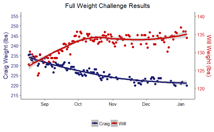 Weight Challenge Results
So that’s it right? The whole competition summed up in one picture. Well, not entirely. It’s a good start, but there is plenty of insight to be drawn from working our way into the data. The lines drawn through the data are models made using the ‘loess’ regression method, while the points are the actual measurements. Right away we can see that both of us went in the right direction! However, this graph obscures a lot of information. We can’t even judge who won! For that we can turn to a plot showing each of our weight changes in pounds from the starting weight.
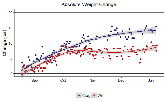 Absolute Weight Change
We are using absolute values here so a higher number is better. We can clearly see that while the competition was initially close, my dad (Craig) pulled away at the end and won by a considerable margin. Congrats dad! Another takeaway is that weight measurements are quite noisy. We tried to take data at the same time every day, first thing in the morning, on the same scale, but there are so many factors that influence weight from day-to-day that looking at a single point is meaningless. It is only by examining a series of data points that a trend emerges. Additionally, each of our weight changes seems to resemble a square root relationship or a logarithm. That is, there is an initial rapid gain (or loss) that then levels off over time. This was expected because initially it is quite easy to make progress when you are motivated, but it can be difficult to keep up the momentum. Eventually we both settled into weight plateaus with the very final measurements showing slight signs of improvement that may or may not be trends.
One slight issue with this result is it does not take body weight into account. If my dad loses 10 lbs, that is smaller relative to his body weight than if I gain 10 lbs. The next graph also shows changes, but this time in terms of percentage of body weight.
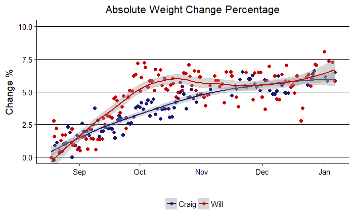 Weight Change Percentage
Well, if you were rooting for me, things look much better in this graph. My percentage change was larger for most of the competition, and I was ahead until the last day when my dad just edged me in terms of percentage. It is interesting that both of us settled into a total change near 6% of body weight. This might suggest our bodies can fluctuate within a +- 6% range easily, but beyond that, further change is more difficult.
Presented below are the final numerical results.
- Craig: Final Weight = 219.8 lbs, Absolute Change = 15.4 lbs, Percentage Change = 6.55%
- Will: Final Weight = 134 lbs, Absolute Change = 7.4 lbs, Percentage Change = 5.85%
Modeling
Graphs can show us much information and qualitative trends quickly, but do not answer questions with a quantitative result. For instance, how much weight did each of us gain or lose on average per day? What is our predicted weight one year from now using all the data? These are questions that we must turn to modeling to answer.
Simple Linear Modeling
The best place to start with any modeling where we have a continuous variable such as weight is a simple linear regression approach. We will create a linear model with one response (y) variable and one explanatory (x) variable. We are interested in the relationship between weight and days since the start of the competition, therefore, the response is weight and the explanatory variable is days. From the graphs, we have seen this may not be the best representation of the data, but it is a good place to begin and allows us to quantity our respective weight changes.
Craig’s model results are presented below. There is a lot of information here, but I’ll walk through it and point out what is important.
Coefficients:
              Estimate Std. Error t value Pr(>|t|)
**(Intercept) 227.779544**   0.481849 472.720  < 2e-16 ***
**days         -0.023887 **  0.006326  -3.776 **0.000264 *****
---
Signif. codes:  0 ‘***’ 0.001 ‘**’ 0.01 ‘*’ 0.05 ‘.’ 0.1 ‘ ’ 1

Residual standard error: 3.861 on 105 degrees of freedom
**Multiple R-squared:  0.1196**, Adjusted R-squared:  0.1112
F-statistic: 14.26 on 1 and 105 DF,  **p-value: 0.0002642**
The main parts to examine are the parameters, the numbers that define the model. In the case of a simple linear model these are the intercept and the slope as shown in the equation for a straight line: y = mx + b. For the weight challenge, this model becomes: weight = (weight change per day) * days + weight at zero days. The weight at zero days in the above summary is in the (intercept) row under the estimate column with a value of 227.78 lbs. The weight change per day is in the days row under the estimate column with a value of -0.024 lbs/day. This means, that under a linear model, my dad lost an average of 0.024 lbs per day on average.
The other statistics presented above are slightly more detailed, but also informative. The R-squared represents the fraction of the in variation in the y variable (weight) which can be explained by the variation in the x variable (days). A higher R-Squared means the model better represents the data and we can see our model only accounts for 11.96% of the variation in weight. Additionally, we can look at the p-value to see if there is a real trend in our model or if our data is simply noise. A p-value is a common statistic that represents the chance of the observed data occurring at random under the model. For Craig’s model, the p-value is 0.0002642 which falls well below the generally accepted significance threshold of 0.05 (lower is better for a p-value because it means the data is less likely to have been generated by chance). Therefore, the chance that my dad’s weight loss is simply random noise is less than 3 in 10000. From this model, we can conclude that my dad’s weight loss over the course of the competition is a real trend!
We can now turn to my simple linear regression model for a similar analysis.
Estimate Std. Error t value Pr(>|t|)
**(Intercept)  131.9**   3.133e-01  420.843   <2e-16 ***
**days         0.0095**  3.808e-03   2.388   0.0185 *
---
Signif. codes:  0 ‘***’ 0.001 ‘**’ 0.01 ‘*’ 0.05 ‘.’ 0.1 ‘ ’ 1

Residual standard error: 2.679 on 121 degrees of freedom
**Multiple R-squared:  0.04502,** Adjusted R-squared:  0.03713
F-statistic: 5.704 on 1 and 121 DF,  **p-value: 0.01847**
The model summary shows an intercept of 131.9 lbs, a weight change per day of 0.0095 lbs, an R-Squared of 0.04502, and a p-value of 0.01847. Our conclusions are:
- I gained 0.0095 lbs/day over the course of the competition
- The model can explain only 4.5% of the variation in weight
- The observed results have a 1.85% chance of occurring due to pure chance
The p-value for my model is slightly higher than that for my dad, but it still falls below the significance threshold and the model shows a real trend.
We can visualize how well linear models fit the data by slightly altering the full results code and changing the model trend line from ‘loess’ to linear.
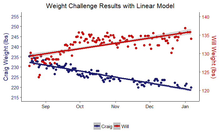 Linear Model Performance
The takeaway from linear modeling is that my dad and I both demonstrated significant progress towards our weight change goals over the challenge.
Generalized Additive Model (GAM)
A generalized additive model goes beyond the linear relationship assumption of a simple linear model and represents a time-series (weight in this case) as a combination (addition) of an overall trend, and daily, weekly, or yearly patterns. This approach works very well for real-world data that often exhibits specific patterns. Our data was collected once a day for about 4 months, so there are only weekly patterns and an overall trend (to have daily patterns would require multiple observations per day). Nevertheless, we still are able to draw useful conclusions from an additive model.
We can first plot the overall trend. This is similar to the smooth line we saw in the full results graph and shows us the overall trajectory of weight change.
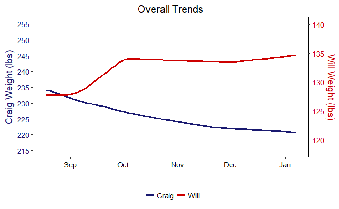 Overall Trend from Generalized Additive Model
The next graph shows weekly trends in terms of weight lost or gained on each day of the week. This plot has actionable information because it shows which days are problems for our weight change objectives.
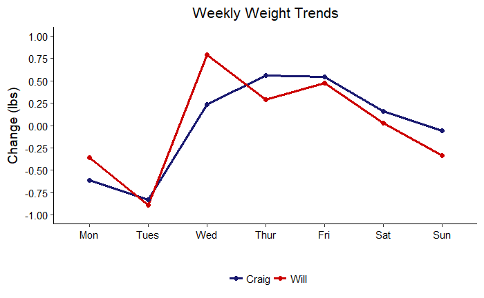 Weekly Trends
Although my dad and I were trying to go in opposite directions, we had very similar weekly patterns. We both lost weight in the first two days of the work week, gained weight during the rest of the work week and trended downwards over the weekend. It is possible to read too much into this plots, but my interpretation for myself is that I tended to get much more exercise on the weekends (usually a couple multi-hour runs) which would reduce my weight heading into the work week. I would then catch back up on my weight when I was busy with classes, before losing momentum again over the weekend. My dad’s better performance on the weekends is likely also due to an increase in exercise when he was not in work. These results say I need to work on consuming more food on the weekends, and my dad needs to work on reducing his consumption during the week. A generalized additive model may seem complex, but we can use the results to determine simple actions to improve our health!
Predictions
A further benefit of modeling is that we can use the results to make predictions. We can make predictions with either the linear model or the generalized additive model, but because the additive model better represents the data, we will only make predictions with it. There are two estimates that are of primary interest:
- Predictions for January 1, 2018 made with our measurements from the first two months (through the end of October 2017)
- Predictions for January 1, 2019 made with all measurements
The first prediction will allow us to compare our performance in the second half of the competition from that predicted based on our first half data. The second prediction will give us an idea of where we expect to be one year from now.
An essential aspect of predictions that is often overlooked are the uncertainty bounds. Managers usually only want a single number for a forecast, but that is an impossibility in an uncertain world. Even the most accurate model is not able to capture inherent randomness in the data or non-exact measuring devices. Therefore in order to be responsible data scientists, we will provide a range of uncertainty in addition to a single prediction number.
Predictions for January 1, 2018 from Two Months of Data
The following graphs show the predictions for Craig and me for the planned end of the competition made from data up to November 1, 2017.
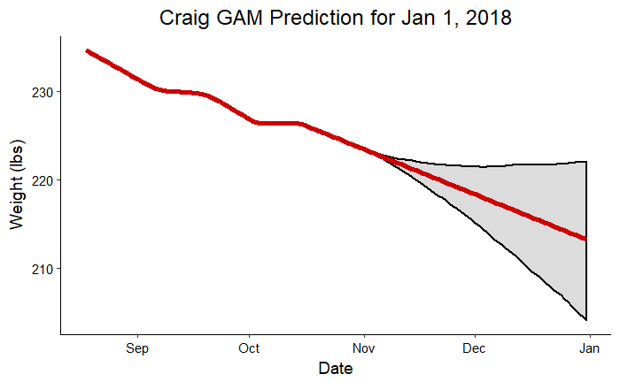 Craig Prediction for Jan 1, 2018
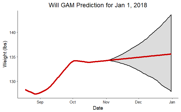 Will Prediction for Jan 1, 2018
The gray shaded region indicates that most crucial part of an forecast: the region of uncertainty. The red line shows us the most likely future results were we to continue exactly on the trend observed so far. The shaded region is the likely range of finishing weights based on the observations and taking into account the noise in the measurements. To put those ranges in perspective, we should look at the actual numbers:
- Craig: Prediction = 213.2 lbs, Upper Bound = 223.5 lbs, Lower Bound = 203.2 lbs, Actual Weight on Jan 1 = 220.8 lbs
- Will: Prediction = 135.6, Upper Bound = 143.4 lbs, Lower Bound = 127.3 lbs, Actual Weight on Jan 1 = 136.9 lbs
The actual weight for both my dad and I fell into the range predicted. The model did a relatively good job of predicting our actual weights two months in advance considering it was working on about 70 datapoints!
Predictions for Jan 1, 2019
As a final exploration of the models, we can look at where we can expect to be one year from now. Perhaps these prediction will not quite turn out , but they should at least give us a goal for the next year! Following are predictions for 2019 made using all the competition data:
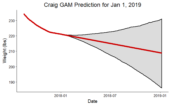 Craig Prediction for Jan 1, 2019
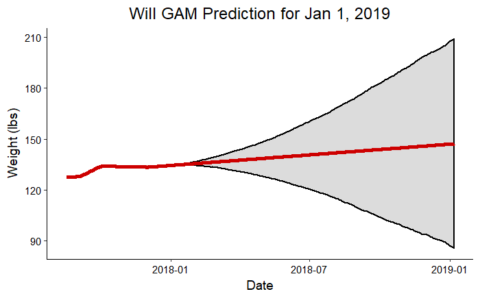 Will Prediction for Jan 1, 2019
These graphs clearly show how uncertainty increases the further out we extrapolate from data. According to these plots, I could weigh more than my dad at the beginning of next year! This exercise is meant to be more for fun than as a serious prediction, but the forecast can improve if we continue to collect more data. Eventually, with enough information, we should be able to build a model that could theoretically make accurate predictions one year into the future. We’ll have to check back in next year for an update on the accuracy of these predictions!
- Craig: Prediction = 208.8 lbs, Upper Bound = 230.9 lbs, Lower Bound = 186.0 lbs, Goal Weight = 215.0 lbs
- Will: Prediction = 147.2 lbs, Upper Bound = 209.2 lbs, Lower Bound = 85.5 lbs, Goal Weight = 155.0 lbs
Conclusions
The question to ask yourself at the end of any data analysis is: “What do I know now that I can use?” Sometimes the answer will be not much and that is perfectly fine! It simply indicates you need to collect more data or you need to rethink the modeling approach. However, in the analysis of the Great Weight Challenge of 2017, there are some insights to review and put into use!
- Craig handily won the competition in terms of weight change although both of us were successful: Craig lost about 6% of his body weight, while I gained about 6%.
- Craig lost 0.024 lbs / day while I gained 0.0095 lbs /day. Both of us demonstrated significant trends in weight change.
- I need to work on gaining weight on the weekends, and my dad needs to work on losing it during the work week.
- Both of us performed better in the first half of the competition when weight change was consistently in the right direction, but we reached plateaus in the third month.
- Forecasts for the next year predict us both to continue on the right track, but with a considerably wide range of uncertainty.
Finally, I will show two more plots which contrast the predictions for Jan 1, 2018 with the actual results on this date.
 Craig Additive Model Prediction vs. Actual Weight
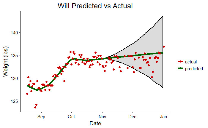 Will Additive Model Prediction vs. Actual Weight
I hope this post has shown how anyone can use data science in their daily life for personal or community benefit. My goal is to democratize data science and allow everyone to take advantage of this exciting field by demonstrating real uses of data science tools!
As always, I welcome feedback and constructive criticism. I can be reached at wjk68@case.edu.