
Improving Random Forest In Python Part 1

Gathering More Data and Feature Engineering
In a previous post we went through an end-to-end implementation of a simple random forest in Python for a supervised regression problem. Although we covered every step of the machine learning process, we only briefly touched on one of the most critical parts: improving our initial machine learning model. The model we finished with achieved decent performance and beat the baseline, but we should be able to better the model with a couple different approaches. This article is the first of two that will explore how to improve our random forest machine learning model using Python and the Scikit-Learn library. I would recommend checking out the introductory post before continuing, but the concepts covered here can also stand on their own.
 # How to Improve a Machine Learning Model
There are three general approaches for improving an existing machine learning model:
- Use more (high-quality) data and feature engineering
- Tune the hyperparameters of the algorithm
- Try different algorithms
These are presented in the order in which I usually try them. Often, the immediate solution proposed to improve a poor model is to use a more complex model, often a deep neural network. However, I have found that approach inevitably leads to frustration. A complex model is built over many hours, which then also fails to deliver, leading to another model and so on. Instead, my first question is always: “Can we get more data relevant to the problem?”. As Geoff Hinton (the father of deep neural networks) has pointed out in an article titled ‘The Unreasonable Effectiveness of Data”, the amount of useful data is more important to the problem than the complexity of the model. Others have echoed the idea that a simple model and plenty of data will beat a complex model with limited data. If there is more information that can help with our problem that we are not using, the best payback in terms of time invested versus performance gained is to get that data.
This post will cover the first method for improving ML models, and the second approach will appear in a subsequent article. I will also write end-to-end implementations of several algorithms which may or may not beat the random forest (If there are any requests for specific algorithms, let me know in the comments)! All of the code and data for this example can be found on the project GitHub page. I have included plenty of code in this post, not to discourage anyone unfamiliar with Python, but to show how accessible machine learning has become and to encourage anyone to start implementing these useful models!
Problem Recap
As a brief reminder, we are dealing with a temperature prediction problem: given historical data, we want to predict the maximum temperature tomorrow in our city. I am using Seattle, WA, but feel free to use the NOAA Climate Data Online Tool to get info for your city. This task is a supervised, regression machine learning problem because we have the labels (targets) we want to predict, and those labels are continuous values (in contrast to unsupervised learning where we do not have labels, or classification, where we are predicting discrete classes). Our original data used in the simple model was a single year of max temperature measurements from 2016 as well as the historical average max temperature. This was supplemented by the predictions of our “meteorologically-inclined” friend, calculated by randomly adding or subtracting 20 degrees from the historical average.
Our final performance using the original data was an average error of 3.83 degrees compared to a baseline error of 5.03 degrees. This represented a final accuracy of 93.99%.
Getting More Data
In the first article, we used one year of historical data from 2016. Thanks to the NOAA (National Atmospheric and Oceanic Administration), we can get data going back to 1891. For now, let’s restrict ourselves to six years (2011–2016), but feel free to use additional data to see if it helps. In addition to simply getting more years of data, we can also include more features. This means we can use additional weather variables that we believe will be useful for predicting the max temperature. We can use our domain knowledge (or advice from the experts), along with correlations between the variable and our target to determine which features will be helpful. From the plethora of options offered by the NOAA (seriously, I have to applaud the work of this organization and their open data policy), I added average wind speed, precipitation, and snow depth on the ground to our list of variables. Remember, because we are predicting the maximum temperature for tomorrow, we can’t actually use the measurement on that day. We have to shift it one day into the past, meaning we are using today’s precipitation total to predict the max temperature tomorrow. This prevents us from ‘cheating’ by having information from the future today.
The additional data was in relatively good shape straight from the source, but I did have to do some slight modifications before reading it into Python. I have left out the “data munging” details to focus on the Random Forest implementation, but I will release a separate post showing how to clean the data. I use the R statistical language for munging because I like how it makes data manipulation interactive, but that’s a discussion for another article. For now, we can load in the data and examine the first few rows.
# Pandas is used for data manipulation
import pandas as pd

# Read in data as a dataframe
features = pd.read_csv('data/temps_extended.csv')
features.head(5)
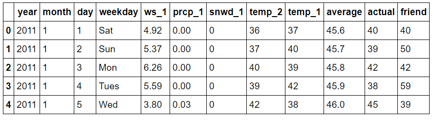 Expanded Data Subset
The new variables are:
ws_1: average wind speed from the day before (mph)
prcp_1: precipitation from the day before (in)
snwd_1: snow depth on the ground from the day before (in)
Before we had 348 days of data. Let’s look at the size now.
print('We have {} days of data with {} variables'.format(*features.shape))

**We have 2191 days of data with 12 variables.**
There are now over 2000 days of historical temperature data (about 6 years). We should summarize the data to make sure there are no anomalies that jump out in the numbers.
round(features.describe, 2)
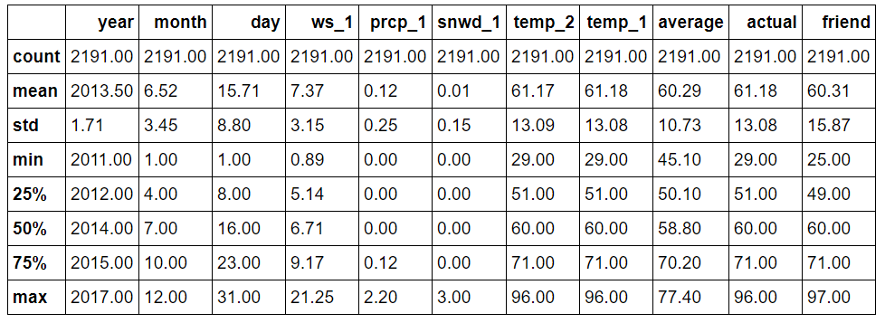 Expanded Data Summary
Nothing appears immediately anomalous from the descriptive statistics. We can quickly graph all of the variables to confirm this. I have left out the plotting code because while the matplotlib library is very useful, the code is non-intuitive and it can be easy to get lost in the details of the plots. (All the code is available for inspection and modification on GitHub).
First up are the four temperature plots.
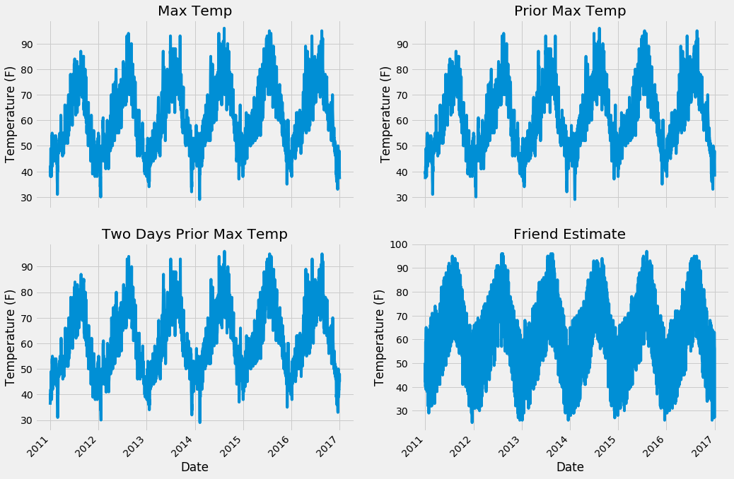 Expanded Data Temperature Plots
Next we can look at the historical max average temperature and the three new variables.
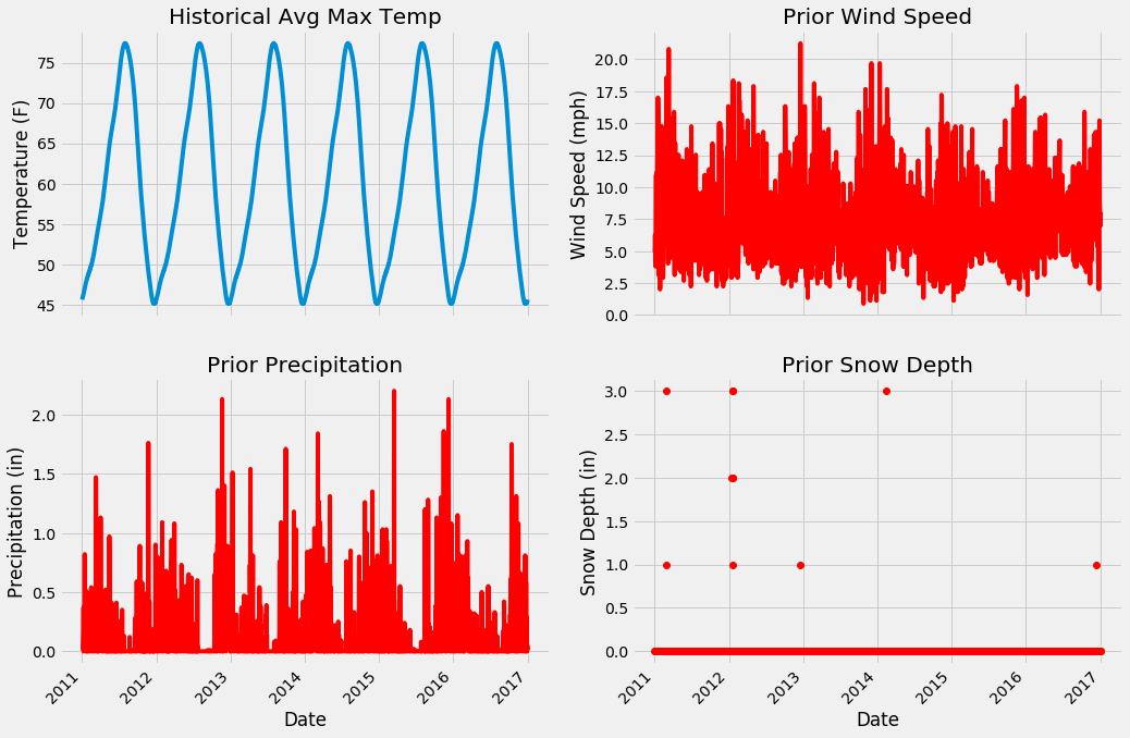 Expanded Data Additional Variables
From the numerical and graphical inspection, there are no apparent outliers n our data. Moreover, we can examine the plots to see which features will likely be useful. I think the snow depth will be the least helpful because it is zero for the majority of days, likewise, the wind speed looks to be too noisy to be of much assistance. From prior experience, the historical average max temperature and prior max temperature will probably be most important, but we will just have to see!
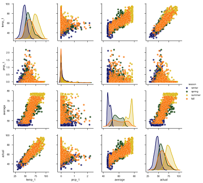
We can make one more exploratory plot, the pairplot, to visualize the relationships between variables. This plots all the variables against each other in scatterplots allowing us to inspect correlations between features. The code for this impressive-looking plot is rather simple compared to the above graphs!
# Create columns of seasons for pair plotting colors
seasons = []

for month in features['month']:
    if month in [1, 2, 12]:
        seasons.append('winter')
    elif month in [3, 4, 5]:
        seasons.append('spring')
    elif month in [6, 7, 8]:
        seasons.append('summer')
    elif month in [9, 10, 11]:
        seasons.append('fall')

# Will only use six variables for plotting pairs
reduced_features = features[['temp_1', 'prcp_1', 'ws_1', 'average', 'friend', 'actual']]
reduced_features['season'] = seasons

# Use seaborn for pair plots
import seaborn as sns
sns.set(style="ticks", color_codes=True);

# Create a custom color palete
palette = sns.xkcd_palette(['dark blue', 'dark green', 'gold', 'orange'])

# Make the pair plot with a some aesthetic changes
sns.pairplot(reduced_features, hue = 'season', diag_kind = 'kde', palette= palette, plot_kws=dict(alpha = 0.7),
                   diag_kws=dict(shade=True))
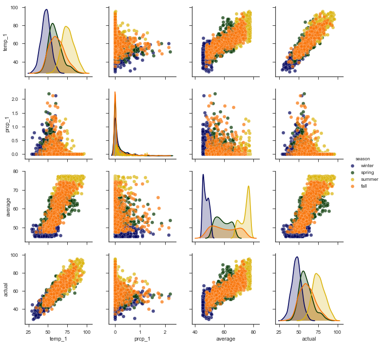 Pairplots
The diagonal plots show the distribution of each variable because graphing each variable against itself would just be a straight line! The colors represent the four seasons as shown in the legend on the right. What we want to concentrate on are the trends between the actual max temperature and the other variables. These plots are in the bottom row, and to see a specific relationship with the actual max, move to the row containing the variable. For example, the plot in the bottom left shows the relationship between the actual max temperature and the max temperature from the previous day (temp_1). This is a strong positive correlation, indicating that as the max temperature one day prior increases, the max temperature the next day also increases
Data Preparation
The data has been validation both numerically and graphically, and now we need to put it in a format understandable by the machine learning algorithm. We will perform exactly the same data formatting procedure as in the simple implementation:
- One-hot encode categorical variables (day of the week)
- Separate data into features (independent varibles) and labels (targets)
- Convert dataframes to Numpy arrays
- Create random training and testing sets of features and labels
We can do all of those steps in a few lines of Python.
# One Hot Encoding
features = pd.get_dummies(features)

# Extract features and labels
labels = features['actual']
features = features.drop('actual', axis = 1)

# List of features for later use
feature_list = list(features.columns)

# Convert to numpy arrays
import numpy as np

features = np.array(features)
labels = np.array(labels)

# Training and Testing Sets
from sklearn.model_selection import train_test_split

train_features, test_features, train_labels, test_labels = train_test_split(features, labels,                                          test_size = 0.25, random_state = 42)
We set a random seed (of course it has to be 42) to ensure consistent results across runs. Let’s quickly do a check of the sizes of each array to confirm everything is in order.
print('Training Features Shape:', train_features.shape)
print('Training Labels Shape:', train_labels.shape)
print('Testing Features Shape:', test_features.shape)
print('Testing Labels Shape:', test_labels.shape)

**Training Features Shape: (1643, 17)
Training Labels Shape: (1643,)
Testing Features Shape: (548, 17)
Testing Labels Shape: (548,)**
Good to go! We have about 4.5 years of training data and 1.5 years of testing data. However, before we can get to the fun part of modeling, there is one additional step.
Establish a New Baseline
In the previous post, we used the historical average maximum temperature as our target to beat. That is, we evaluated the accuracy of predicting the max temperature tomorrow as the historical average max temperature on that day. We already know even the model trained on a single year of data can beat that baseline so we need to raise our expectations. For a new baseline, we will use the model trained on the original data. To make a fair comparison, we need to test it against the new, expanded test set. However, the new test set has 17 features, whereas the original model was only trained on 14 features. We first have to remove the 3 new features from the test set and then evaluate the original model. The original random forest has already been trained on the original data and code below shows preparing the testing features and evaluating the performance (refer to the notebook for the model training).
# Find the original feature indices
original_feature_indices = [feature_list.index(feature) for feature in feature_list if feature not in ['ws_1', 'prcp_1', 'snwd_1']]

# Create a test set of the original features
original_test_features = test_features[:, original_feature_indices]

# Make predictions on test data using the model trained on original data
predictions = rf.predict(original_test_features)

# Performance metrics
errors = abs(predictions - test_labels)

print('Metrics for Random Forest Trained on Original Data')
print('Average absolute error:', round(np.mean(errors), 2), 'degrees.')

# Calculate mean absolute percentage error (MAPE)
mape = 100 * (errors / test_labels)

# Calculate and display accuracy
accuracy = 100 - np.mean(mape)
print('Accuracy:', round(accuracy, 2), '%.')

**Metrics for Random Forest Trained on Original Data
Average absolute error: 4.3 degrees.
Accuracy: 92.49 %.**
The random forest trained on the single year of data was able to achieve an average absolute error of 4.3 degrees representing an accuracy of 92.49% on the expanded test set. If our model trained with the expanded training set cannot beat these metrics, then we need to rethink our method.
Training and Evaluating on Expanded Data
The great part about Scikit-Learn is that many state-of-the-art models can be created and trained in a few lines of code. The random forest is one example:
# Instantiate random forest and train on new features
from sklearn.ensemble import RandomForestRegressor

rf_exp = RandomForestRegressor(n_estimators= 1000, random_state=100)
rf_exp.fit(train_features, train_labels)
Now, we can make predictions and compare to the known test set targets to confirm or deny that our expanded training dataset was a good investment:
# Make predictions on test data
predictions = rf_exp.predict(test_features)

# Performance metrics
errors = abs(predictions - test_labels)

print('Metrics for Random Forest Trained on Expanded Data')
print('Average absolute error:', round(np.mean(errors), 2), 'degrees.')

# Calculate mean absolute percentage error (MAPE)
mape = np.mean(100 * (errors / test_labels))

# Compare to baseline
improvement_baseline = 100 * abs(mape - baseline_mape) / baseline_mape
print('Improvement over baseline:', round(improvement_baseline, 2), '%.')

# Calculate and display accuracy
accuracy = 100 - mape
print('Accuracy:', round(accuracy, 2), '%.')

**Metrics for Random Forest Trained on Expanded Data
Average absolute error: 3.7039 degrees.
Improvement over baseline: 16.67 %.
Accuracy: 93.74 %.**
Well, we didn’t waste our time getting more data! Training on six years worth of historical measurements and using three additional features has netted us a 16.41% improvement over the baseline model. The exact metrics will change depending on the random seed, but we can be confident that the new model outperforms the old model.
Why does a model improve with more data? The best way to answer this is to think in terms of how humans learn. We increase our knowledge of the world through experiences, and the more times we practice a skill, the better we get. A machine learning model also “learns from experience” in the sense that each time it looks at another training data point, it learns a little more about the relationships between the features and labels. Assuming that there are relationships in the data giving the model more data will allow it to better understand how to map a set of features to a label. For our case, as the model sees more days of weather measurements, it better understands how to take those measurements and predict the maximum temperature on the next day. Practice improves human abilities and machine learning model performance alike.
Feature Reduction
In some situations, we can go too far and actually use too much data or add too many features. One applicable example is a machine learning prediction problem involving building energy which I am currently working on. The problem is to predict building energy consumption in 15-minute intervals from weather data. For each building, I have 1–3 years of historical weather and electricity use data. Surprisingly, I found as I included more data for some buildings, the prediction accuracy decreased. Asking around, I determined some buildings had undergone retrofits to improve energy efficiency in the middle of data collection, and therefore, recent electricity consumption differed significantly from before the retrofit. When predicting current consumption, using data from before the modification actually decreased the performance of my models. More recent data from after the change was more relevant than the older data, and for several buildings, I ended up decreasing the amount of historical data to improve performance!
For our problem, the length of the data is not an issue because there have been no major changes affecting max temperatures in the six years of data (climate change is increasing temperatures but on a longer timescale). However, it may be possible we have too many features. We saw earlier that some of the features, especially our friend’s prediction, looked more like noise than an accurate predictor of the maximum temperature. Extra features can decrease performance because they may “confuse” the model by giving it irrelevant data that prevents it from learning the actual relationships. The random forest performs implicit feature selection because it splits nodes on the most important variables, but other machine learning models do not. One approach to improve other models is therefore to use the random forest feature importances to reduce the number of variables in the problem. In our case, we will use the feature importances to decrease the number of features for our random forest model, because, in addition to potentially increasing performance, reducing the number of features will shorten the run time of the model. This post does not touch on more complex dimensionality reductions such as PCA (principal components analysis) or ICA (independent component analysis). These do a good job of decreasing the number of features while not decreasing information, but they transform the features such that they no longer represent our measured variables. I like machine learning models to have a blend of interpretability and accuracy, and I generally therefore stick to methods that allow me to understand how the model is making predictions.
Feature Importances
Finding the feature importances of a random forest is simple in Scikit-Learn. The actual calculation of the importances is beyond this blog post, but this occurs in the background and we can use the relative percentages returned by the model to rank the features.
The following Python code creates a list of tuples where each tuple is a pair, (feature name, importance). The code here takes advantage of some neat tricks in the Python language, namely list comprehensive, zip, sorting, and argument unpacking. Don’t worry if you do not understand these entirely, but if you want to become skilled at Python, these are tools you should have in your arsenal!
# Get numerical feature importances
importances = list(rf_exp.feature_importances_)

# List of tuples with variable and importance
feature_importances = [(feature, round(importance, 2)) for feature, importance in zip(feature_list, importances)]

# Sort the feature importances by most important first
feature_importances = sorted(feature_importances, key = lambda x: x[1], reverse = True)

# Print out the feature and importances
[print('Variable: {:20} Importance: {}'.format(*pair)) for pair in feature_importances]

Variable: temp_1               Importance: 0.83
Variable: average              Importance: 0.06
Variable: ws_1                 Importance: 0.02
Variable: temp_2               Importance: 0.02
Variable: friend               Importance: 0.02
Variable: year                 Importance: 0.01
Variable: month                Importance: 0.01
Variable: day                  Importance: 0.01
Variable: prcp_1               Importance: 0.01
Variable: snwd_1               Importance: 0.0
Variable: weekday_Fri          Importance: 0.0
Variable: weekday_Mon          Importance: 0.0
Variable: weekday_Sat          Importance: 0.0
Variable: weekday_Sun          Importance: 0.0
Variable: weekday_Thurs        Importance: 0.0
Variable: weekday_Tues         Importance: 0.0
Variable: weekday_Wed          Importance: 0.0
These stats definitely prove that some variables are much more important to our problem than others! Given that there are so many variables with zero importance (or near-zero due to rounding), it seems like we should be able to get rid of some of them without impacting performance. First, let’s make a quick graph to represent the relative differences in feature importances. I left this plotting code in because it’s a little easier to understand.
# list of x locations for plotting
x_values = list(range(len(importances)))

# Make a bar chart
plt.bar(x_values, importances, orientation = 'vertical', color = 'r', edgecolor = 'k', linewidth = 1.2)

# Tick labels for x axis
plt.xticks(x_values, feature_list, rotation='vertical')

# Axis labels and title
plt.ylabel('Importance'); plt.xlabel('Variable'); plt.title('Variable Importances');
 Expanded Model Variable Importances
We can also make a cumulative importance graph that shows the contribution to the overall importance of each additional variable. The dashed line is drawn at 95% of total importance accounted for.
# List of features sorted from most to least important
sorted_importances = [importance[1] for importance in feature_importances]
sorted_features = [importance[0] for importance in feature_importances]

# Cumulative importances
cumulative_importances = np.cumsum(sorted_importances)

# Make a line graph
plt.plot(x_values, cumulative_importances, 'g-')

# Draw line at 95% of importance retained
plt.hlines(y = 0.95, xmin=0, xmax=len(sorted_importances), color = 'r', linestyles = 'dashed')

# Format x ticks and labels
plt.xticks(x_values, sorted_features, rotation = 'vertical')

# Axis labels and title
plt.xlabel('Variable'); plt.ylabel('Cumulative Importance'); plt.title('Cumulative Importances');
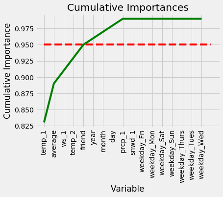 Cumulative Feature Importances
We can now use this to remove unimportant features. 95% is an arbitrary threshold, but if it leads to noticeably poor performance we can adjust the value. First, we need to find the exact number of features to exceed 95% importance:
# Find number of features for cumulative importance of 95%
# Add 1 because Python is zero-indexed
print('Number of features for 95% importance:', np.where(cumulative_importances > 0.95)[0][0] + 1)

**Number of features for 95% importance: 6**
We can then create a new training and testing set retaining only the 6 most important features.
# Extract the names of the most important features
important_feature_names = [feature[0] for feature in feature_importances[0:5]]
# Find the columns of the most important features
important_indices = [feature_list.index(feature) for feature in important_feature_names]

# Create training and testing sets with only the important features
important_train_features = train_features[:, important_indices]
important_test_features = test_features[:, important_indices]

# Sanity check on operations
print('Important train features shape:', important_train_features.shape)
print('Important test features shape:', important_test_features.shape)

**Important train features shape: (1643, 6)
Important test features shape: (548, 6)**
We decreased the number of features from 17 to 6 (although to be fair, 7 of those features were created from the one-hot encoding of day of the week so we really only had 11 pieces of unique information). Hopefully this will not significantly decrease model accuracy and will considerably decrease the training time.
Training and Evaluating on Important Features
Now we go through the same train and test procedure as we did with all the features and evaluate the accuracy.
# Train the expanded model on only the important features
rf_exp.fit(important_train_features, train_labels);

# Make predictions on test data
predictions = rf_exp.predict(important_test_features)

# Performance metrics
errors = abs(predictions - test_labels)

print('Average absolute error:', round(np.mean(errors), 2), 'degrees.')

# Calculate mean absolute percentage error (MAPE)
mape = 100 * (errors / test_labels)

# Calculate and display accuracy
accuracy = 100 - np.mean(mape)
print('Accuracy:', round(accuracy, 2), '%.')

**Average absolute error: 3.821 degrees.
Accuracy: 93.56 %.**
The performance suffers a minor increase of 0.12 degrees average error using only 6 features. Often with feature reduction, there will be a minor decrease in performance that must be weighed against the decrease in run-time. Machine learning is a game of making trade-offs, and run-time versus performance is usually one of the critical decisions. I will quickly do some bench-marking to compare the relative run-times of the two models (see Jupyter Notebook for code).
 Model Tradeoffs
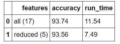
Overall, the reduced features model has a relative accuracy decrease of 0.131% with a relative run-time decrease of 35.1%. In our case, run-time is inconsequential because of the small size of the data set, but in a production setting, this trade-off likely would be worth it.
Conclusions
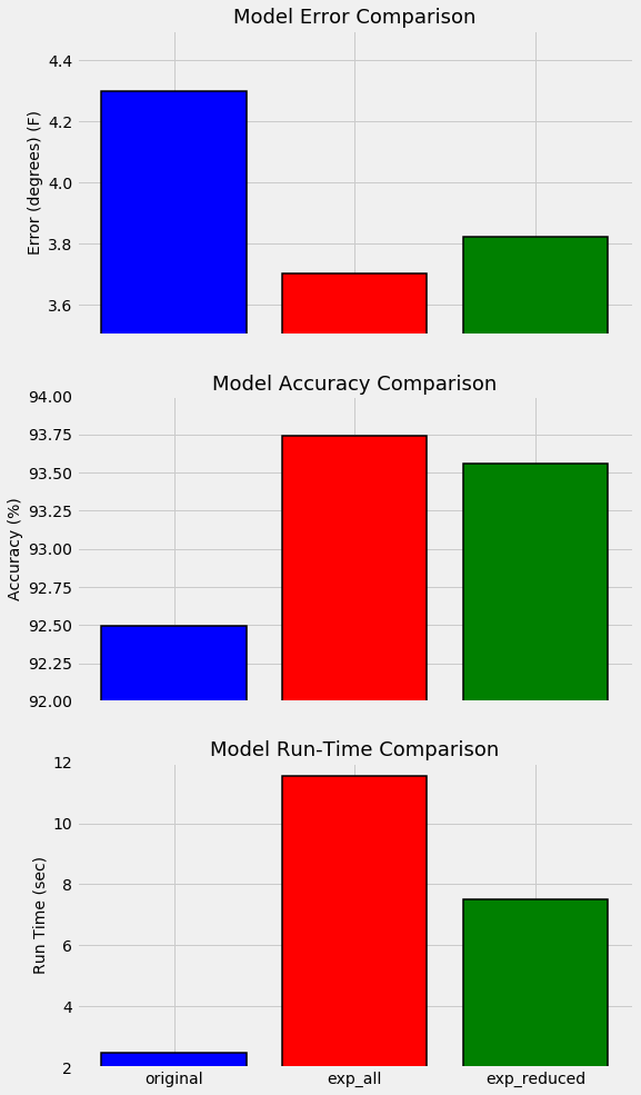
Instead of developing a more complex model to improve our random forest, we took the sensible step of collecting more data points and additional features. This approach was validated as we were able to decrease the error of compared to the model trained on limited data by 16.7%. Furthermore, by reducing the number of features from 17 to 6, we decreased our run-time by 35% while suffering only a minor decrease in accuracy. The best way to summarize these improvements is with another graph. The model trained on one year of training data is on the left, the model using six years of data and all features is in the middle, and the model on the right used six years of data but only a subset of the most important features.
 Model Comparisons
This example has demonstrated the effectiveness of increasing the amount of data. While most people make the mistake of immediately moving to a more powerful model, we have learned most problems can be improving by collecting more relevant data points. In further parts of this series, we will take a look at the other ways to improve our model, namely, hyperparameter tuning and using different algorithms. However, getting more data is likely to have the largest payoff in terms of time invested versus increase in performance in this situation. The next time you see someone rushing to implement a complex deep learning model after failing on the first model, nicely ask them if they have exhausted all sources of data. Chances are, if there is still data out there relevant to their problem, they can get better performance and save time in the process!
As always, I appreciate any comments and constructive feedback. I can be reached at wjk68@case.edu