
A Complete Machine Learning Walk Through In Python Part One

Putting the machine learning pieces together
Reading through a data science book or taking a course, it can feel like you have the individual pieces, but don’t quite know how to put them together. Taking the next step and solving a complete machine learning problem can be daunting, but preserving and completing a first project will give you the confidence to tackle any data science problem. This series of articles will walk through a complete machine learning solution with a real-world dataset to let you see how all the pieces come together.
We’ll follow the general machine learning workflow step-by-step:
- Data cleaning and formatting
- Exploratory data analysis
- Feature engineering and selection
- Compare several machine learning models on a performance metric
- Perform hyperparameter tuning on the best model
- Evaluate the best model on the testing set
- Interpret the model results
- Draw conclusions and document work
Along the way, we’ll see how each step flows into the next and how to specifically implement each part in Python. The complete project is available on GitHub, with the first notebook here. This first article will cover steps 1–3 with the rest addressed in subsequent posts.
(As a note, this problem was originally given to me as an “assignment” for a job screen at a start-up. After completing the work, I was offered the job, but then the CTO of the company quit and they weren’t able to bring on any new employees. I guess that’s how things go on the start-up scene!)
Problem Definition
The first step before we get coding is to understand the problem we are trying to solve and the available data. In this project, we will work with publicly available building energy data from New York City.
The objective is to use the energy data to build a model that can predict the Energy Star Score of a building and interpret the results to find the factors which influence the score.
The data includes the Energy Star Score, which makes this a supervised regression machine learning task:
- Supervised: we have access to both the features and the target and our goal is to train a model that can learn a mapping between the two
- Regression: The Energy Star score is a continuous variable
We want to develop a model that is both accurate — it can predict the Energy Star Score close to the true value — and interpretable — we can understand the model predictions. Once we know the goal, we can use it to guide our decisions as we dig into the data and build models.
Data Cleaning
Contrary to what most data science courses would have you believe, not every dataset is a perfectly curated group of observations with no missing values or anomalies (looking at you mtcars and iris datasets). Real-world data is messy which means we need to clean and wrangle it into an acceptable format before we can even start the analysis. Data cleaning is an un-glamorous, but necessary part of most actual data science problems.
First, we can load in the data as a Pandas DataFrame and take a look:
import pandas as pd
import numpy as np

# Read in data into a dataframe
data = pd.read_csv('data/Energy_and_Water_Data_Disclosure_for_Local_Law_84_2017__Data_for_Calendar_Year_2016_.csv')

# Display top of dataframe
data.head()
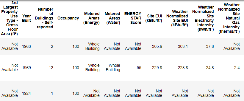 What Actual Data Looks Like!
This is a subset of the full data which contains 60 columns. Already, we can see a couple issues: first, we know that we want to predict the ENERGY STAR Score but we don’t know what any of the columns mean. While this isn’t necessarily an issue — we can often make an accurate model without any knowledge of the variables — we want to focus on interpretability, and it might be important to understand at least some of the columns.
When I originally got the assignment from the start-up, I didn’t want to ask what all the column names meant, so I looked at the name of the file,
 and decided to search for “Local Law 84”. That led me to this page which explains this is an NYC law requiring all buildings of a certain size to report their energy use. More searching brought me to all the definitions of the columns. Maybe looking at a file name is an obvious place to start, but for me this was a reminder to go slow so you don’t miss anything important!
We don’t need to study all of the columns, but we should at least understand the Energy Star Score, which is described as:
A 1-to-100 percentile ranking based on self-reported energy usage for the reporting year. The Energy Star score is a relative measure used for comparing the energy efficiency of buildings.
That clears up the first problem, but the second issue is that missing values are encoded as “Not Available”. This is a string in Python which means that even the columns with numbers will be stored as object datatypes because Pandas converts a column with any strings into a column of all strings. We can see the datatypes of the columns using the dataframe.info()method:
# See the column data types and non-missing values
data.info()
 Sure enough, some of the columns that clearly contain numbers (such as ft²), are stored as objects. We can’t do numerical analysis on strings, so these will have to be converted to number (specifically
 float) data types!
Here’s a little Python code that replaces all the “Not Available” entries with not a number ( np.nan), which can be interpreted as numbers, and then converts the relevant columns to the float datatype:
Once the correct columns are numbers, we can start to investigate the data.
Missing Data and Outliers
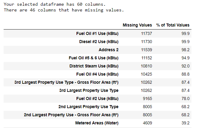
In addition to incorrect datatypes, another common problem when dealing with real-world data is missing values. These can arise for many reasons and have to be either filled in or removed before we train a machine learning model. First, let’s get a sense of how many missing values are in each column (see the notebook for code).
 (To create this table, I used a function from this Stack Overflow Forum).
While we always want to be careful about removing information, if a column has a high percentage of missing values, then it probably will not be useful to our model. The threshold for removing columns should depend on the problem (here is a discussion), and for this project, we will remove any columns with more than 50% missing values.
At this point, we may also want to remove outliers. These can be due to typos in data entry, mistakes in units, or they could be legitimate but extreme values. For this project, we will remove anomalies based on the definition of extreme outliers:
- Below the first quartile − 3 ∗ interquartile range
- Above the third quartile + 3 ∗ interquartile range
(For the code to remove the columns and the anomalies, see the notebook). At the end of the data cleaning and anomaly removal process, we are left with over 11,000 buildings and 49 features.
Exploratory Data Analysis
Now that the tedious — but necessary — step of data cleaning is complete, we can move on to exploring our data! Exploratory Data Analysis (EDA) is an open-ended process where we calculate statistics and make figures to find trends, anomalies, patterns, or relationships within the data.
In short, the goal of EDA is to learn what our data can tell us. It generally starts out with a high level overview, then narrows in to specific areas as we find interesting parts of the data. The findings may be interesting in their own right, or they can be used to inform our modeling choices, such as by helping us decide which features to use.
Single Variable Plots
The goal is to predict the Energy Star Score (renamed to score in our data) so a reasonable place to start is examining the distribution of this variable. A histogram is a simple yet effective way to visualize the distribution of a single variable and is easy to make using matplotlib.
import matplotlib.pyplot as plt

# Histogram of the Energy Star Score
plt.style.use('fivethirtyeight')
plt.hist(data['score'].dropna(), bins = 100, edgecolor = 'k');
plt.xlabel('Score'); plt.ylabel('Number of Buildings');
plt.title('Energy Star Score Distribution');
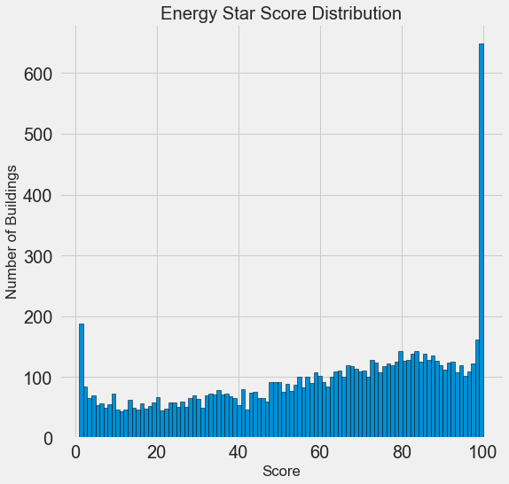 This looks quite suspicious! The Energy Star score is a percentile rank, which means we would expect to see a uniform distribution, with each score assigned to the same number of buildings. However, a disproportionate number of buildings have either the highest, 100, or the lowest, 1, score (higher is better for the Energy Star score).
If we go back to the definition of the score, we see that it is based on “self-reported energy usage” which might explain the very high scores. Asking building owners to report their own energy usage is like asking students to report their own scores on a test! As a result, this probably is not the most objective measure of a building’s energy efficiency.
If we had an unlimited amount of time, we might want to investigate why so many buildings have very high and very low scores which we could by selecting these buildings and seeing what they have in common. However, our objective is only to predict the score and not to devise a better method of scoring buildings! We can make a note in our report that the scores have a suspect distribution, but our main focus in on predicting the score.
Looking for Relationships
A major part of EDA is searching for relationships between the features and the target. Variables that are correlated with the target are useful to a model because they can be used to predict the target. One way to examine the effect of a categorical variable (which takes on only a limited set of values) on the target is through a density plot using the seaborn library.
A density plot can be thought of as a smoothed histogram because it shows the distribution of a single variable. We can color a density plot by class to see how a categorical variable changes the distribution. The following code makes a density plot of the Energy Star Score colored by the the type of building (limited to building types with more than 100 data points):
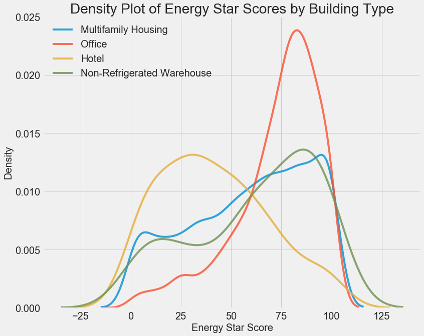 We can see that the building type has a significant impact on the Energy Star Score. Office buildings tend to have a higher score while Hotels have a lower score. This tells us that we should include the building type in our modeling because it does have an impact on the target. As a categorical variable, we will have to one-hot encode the building type.
A similar plot can be used to show the Energy Star Score by borough:
 The borough does not seem to have as large of an impact on the score as the building type. Nonetheless, we might want to include it in our model because there are slight differences between the boroughs.
To quantify relationships between variables, we can use the Pearson Correlation Coefficient. This is a measure of the strength and direction of a linear relationship between two variables. A score of +1 is a perfectly linear positive relationship and a score of -1 is a perfectly negative linear relationship. Several values of the correlation coefficient are shown below:
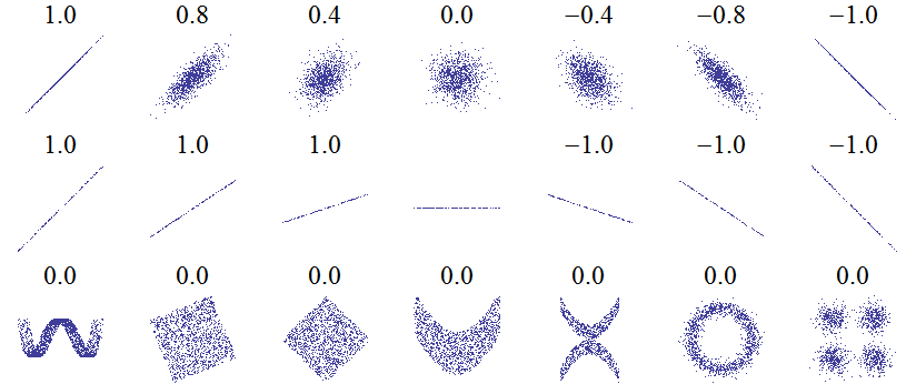 Values of the Pearson Correlation Coefficient (Source)
While the correlation coefficient cannot capture non-linear relationships, it is a good way to start figuring out how variables are related. In Pandas, we can easily calculate the correlations between any columns in a dataframe:
# Find all correlations with the score and sort
correlations_data = data.corr()['score'].sort_values()
The most negative (left) and positive (right) correlations with the target:
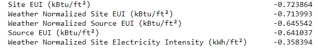
 There are several strong negative correlations between the features and the target with the most negative the different categories of EUI (these measures vary slightly in how they are calculated). The EUI — Energy Use Intensity — is the amount of energy used by a building divided by the square footage of the buildings. It is meant to be a measure of the efficiency of a building with a lower score being better. Intuitively, these correlations make sense: as the EUI increases, the Energy Star Score tends to decrease.
Two-Variable Plots
To visualize relationships between two continuous variables, we use scatterplots. We can include additional information, such as a categorical variable, in the color of the points. For example, the following plot shows the Energy Star Score vs. Site EUI colored by the building type:
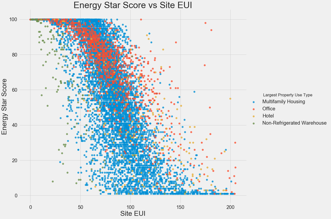 This plot lets us visualize what a correlation coefficient of -0.7 looks like. As the Site EUI decreases, the Energy Star Score increases, a relationship that holds steady across the building types.
The final exploratory plot we will make is known as the Pairs Plot. This is a great exploration tool because it lets us see relationships between multiple pairs of variables as well as distributions of single variables. Here we are using the seaborn visualization library and the PairGrid function to create a Pairs Plot with scatterplots on the upper triangle, histograms on the diagonal, and 2D kernel density plots and correlation coefficients on the lower triangle.
 To see interactions between variables, we look for where a row intersects with a column. For example, to see the correlation of
 Weather Norm EUI with score, we look in the Weather Norm EUI row and the score column and see a correlation coefficient of -0.67. In addition to looking cool, plots such as these can help us decide which variables to include in modeling.
Feature Engineering and Selection
Feature engineering and selection often provide the greatest return on time invested in a machine learning problem. First of all, let’s define what these two tasks are:
- Feature engineering: The process of taking raw data and extracting or creating new features. This might mean taking transformations of variables, such as a natural log and square root, or one-hot encoding categorical variables so they can be used in a model. Generally, I think of feature engineering as creating additional features from the raw data.
- Feature selection: The process of choosing the most relevant features in the data. In feature selection, we remove features to help the model generalize better to new data and create a more interpretable model. Generally, I think of feature selection as subtracting features so we are left with only those that are most important.
A machine learning model can only learn from the data we provide it, so ensuring that data includes all the relevant information for our task is crucial. If we don’t feed a model the correct data, then we are setting it up to fail and we should not expect it to learn!
For this project, we will take the following feature engineering steps:
- One-hot encode categorical variables (borough and property use type)
- Add in the natural log transformation of the numerical variables
One-hot encoding is necessary to include categorical variables in a model. A machine learning algorithm cannot understand a building type of “office”, so we have to record it as a 1 if the building is an office and a 0 otherwise.
Adding transformed features can help our model learn non-linear relationships within the data. Taking the square root, natural log, or various powers of features is common practice in data science and can be based on domain knowledge or what works best in practice. Here we will include the natural log of all numerical features.
The following code selects the numeric features, takes log transformations of these features, selects the two categorical features, one-hot encodes these features, and joins the two sets together. This seems like a lot of work, but it is relatively straightforward in Pandas!
After this process we have over 11,000 observations (buildings) with 110 columns (features). Not all of these features are likely to be useful for predicting the Energy Star Score, so now we will turn to feature selection to remove some of the variables.
Feature Selection
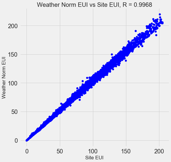
Many of the 110 features we have in our data are redundant because they are highly correlated with one another. For example, here is a plot of Site EUI vs Weather Normalized Site EUI which have a correlation coefficient of 0.997.
 Features that are strongly correlated with each other are known as collinear and removing one of the variables in these pairs of features can often help a machine learning model generalize and be more interpretable. (I should point out we are talking about correlations of features with other features, not correlations with the target, which help our model!)
There are a number of methods to calculate collinearity between features, with one of the most common the variance inflation factor. In this project, we will use thebcorrelation coefficient to identify and remove collinear features. We will drop one of a pair of features if the correlation coefficient between them is greater than 0.6. For the implementation, take a look at the notebook (and this Stack Overflow answer)
While this value may seem arbitrary, I tried several different thresholds, and this choice yielded the best model. Machine learning is an empirical field and is often about experimenting and finding what performs best! After feature selection, we are left with 64 total features and 1 target.
# Remove any columns with all na values
features  = features.dropna(axis=1, how = 'all')
print(features.shape)

**(11319, 65)**
Establishing a Baseline
We have now completed data cleaning, exploratory data analysis, and feature engineering. The final step to take before getting started with modeling is establishing a naive baseline. This is essentially a guess against which we can compare our results. If the machine learning models do not beat this guess, then we might have to conclude that machine learning is not acceptable for the task or we might need to try a different approach.
For regression problems, a reasonable naive baseline is to guess the median value of the target on the training set for all the examples in the test set. This sets a relatively low bar for any model to surpass.
The metric we will use is mean absolute error (mae) which measures the average absolute error on the predictions. There are many metrics for regression, but I like Andrew Ng’s advice to pick a single metric and then stick to it when evaluating models. The mean absolute error is easy to calculate and is interpretable.
Before calculating the baseline, we need to split our data into a training and a testing set:
- The training set of features is what we provide to our model during training along with the answers. The goal is for the model to learn a mapping between the features and the target.
- The testing set of features is used to evaluate the trained model. The model is not allowed to see the answers for the testing set and must make predictions using only the features. We know the answers for the test set so we can compare the test predictions to the answers.
We will use 70% of the data for training and 30% for testing:
# Split into 70% training and 30% testing set
X, X_test, y, y_test = train_test_split(features, targets,
                                        test_size = 0.3,
                                        random_state = 42)
Now we can calculate the naive baseline performance:
**The baseline guess is a score of 66.00
Baseline Performance on the test set: MAE = 24.5164**
The naive estimate is off by about 25 points on the test set. The score ranges from 1–100, so this represents an error of 25%, quite a low bar to surpass!
Conclusions
In this article we walked through the first three steps of a machine learning problem. After defining the question, we:
- Cleaned and formatted the raw data
- Performed an exploratory data analysis to learn about the dataset
- Developed a set of features that we will use for our models
Finally, we also completed the crucial step of establishing a baseline against which we can judge our machine learning algorithms.
The second post (available here) will show how to evaluate machine learning models using Scikit-Learn, select the best model, and perform hyperparameter tuning to optimize the model. The third post, dealing with model interpretation and reporting results, is here.
As always, I welcome feedback and constructive criticism and can be reached on Twitter @koehrsen_will.