
Introduction To Interactive Time Series Visualizations With Plotly In Python
 (Source)
Up and running with the powerful plotly visualization library
There comes a time when it’s necessary to move on from even the most beloved tools. Matplotlib has served its purpose of quickly creating simple charts, but I’ve grown frustrated with how much code is required to customize plots or do seemingly easy things like get the x-axis to correctly show dates.
For a while, I’ve been looking for an alternative — not a complete replacement as Matplotlib is still useful for exploration — ideally, a library that has interactive elements and lets me focus on what I want to show instead of getting caught in the how to show it details. Enter plotly, a declarative visualization tool with an easy-to-use Python library for interactive graphs.
In this article, we’ll get an introduction to the plotly library by walking through making basic time series visualizations. These graphs, though easy to make, will be fully interactive figures ready for presentation. Along the way, we’ll learn the basic ideas of the library which will later allow us to rapidly build stunning visualizations. If you have been looking for an alternative to matplotlib, then as we’ll see, plotly is an effective choice.
 Interactive Visualization made with a few lines of Plotly code
The full code for this article is available on GitHub. You can also view the notebook with interactive elements on nbviewer. The data used in this article is anonymized building energy time-series data from my job at Cortex Building Intelligence. If you want to use your web dev skills to help buildings save energy, then get in touch because we’re hiring!
Introduction to Plotly
Plotly is a company that makes visualization tools including a Python API library. (Plotly also makes Dash, a framework for building interactive web-based applications with Python code). For this article, we’ll stick to working with the plotly Python library in a Jupyter Notebook and touching up images in the online plotly editor. When we make a plotly graph, it’s published online by default which makes sharing visualizations easy.
You will need to create a free plotly account which gives you 25 public charts and 1 private chart. Once you hit your quota, you’ll have to delete some of the old charts to make new ones (or you can run in an offline mode where images only appear in the notebook). Install plotly ( pip install plotly ) and run the following to authenticate the library, replacing the username and API key:
import plotly# Authenticate with your account
plotly.tools.set_credentials_file(username='########',
                                  api_key='******')
The standard plotly imports along with the settings to run offline are:
import plotly.plotly as py
import plotly.graph_objs as go# Offline mode
from plotly.offline import init_notebook_mode, iplot
init_notebook_mode(connected=True)
When we make plots in offline mode, we’ll get a link in the bottom right of the image to export to the plotly online editor to make touch-ups and share.
 Example of image in the notebook with link to edit in plotly.
Benefits of Plotly
Plotly (the Python library) uses declarative programming which means we write code describing what we want to make rather than how to make it. We provide the basic framework and end goals and let plotly figure out the implementation details. In practice, this means less effort spent building up a figure, allowing us to focus on what to present and how to interpret it.
If you don’t believe in the benefits of this method, then go check out the dozens of examples such as the one below made with 50 lines of code.
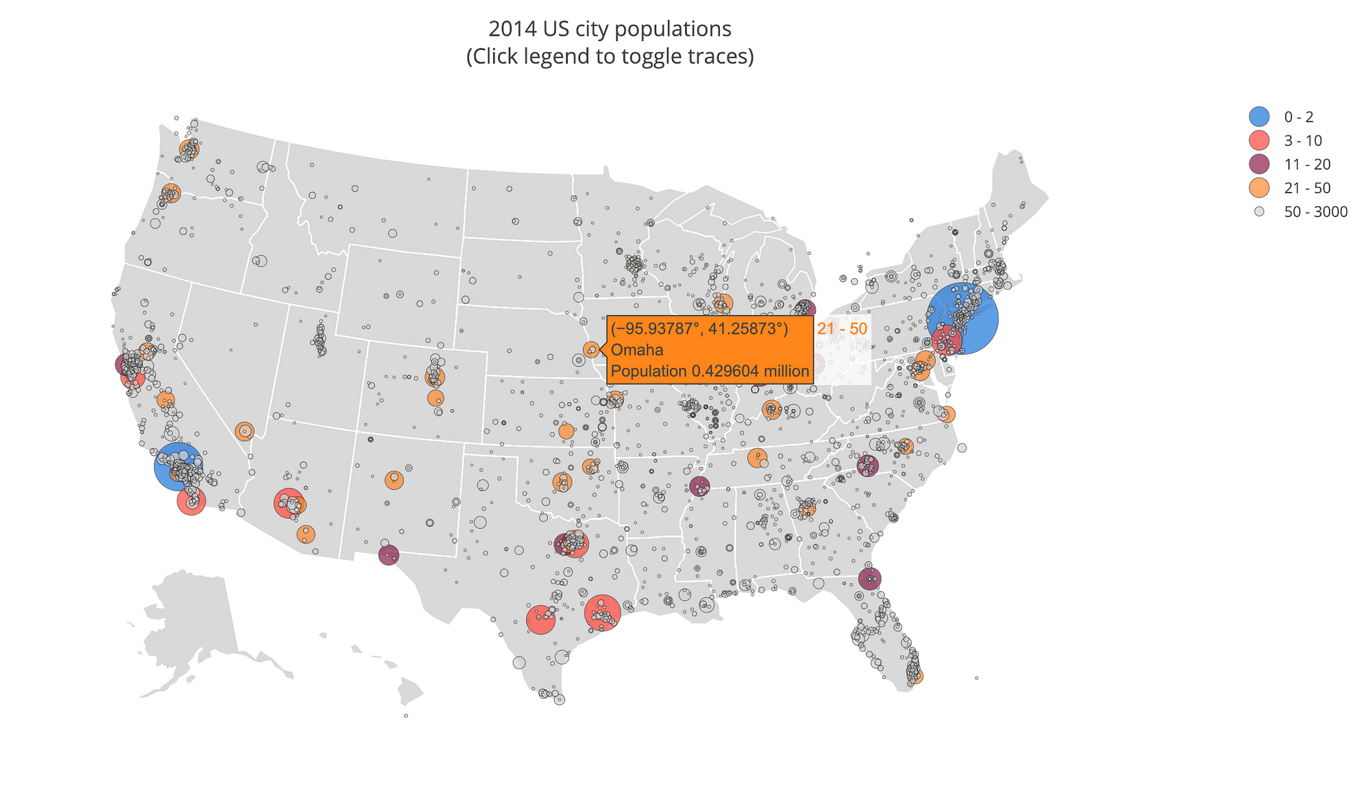 US City Populations (Source)
Time-Series Data
For this project, we’ll be using real-world building data from my job at Cortex Building Intelligence (data has been anonymized). Building energy data presents intriguing challenges for time-series analysis because of seasonal, daily, and weekly patterns and drastic effects from weather conditions. Effectively visualizing this data can help us understand the response of a building and where there are chances for energy savings.
(As a note, I use the terms “Power” and “Energy” interchangeably even though energy is the ability to do work while power is the rate of energy consumption. Technically, power is measured in kilowatts (KW) and electrical energy is measured in KiloWatt Hours (KWh). The more you know!)
Our data is in a dataframe with a multi-index on the columns to keep track of the sensor type and the sensor number. The index is a datetime:
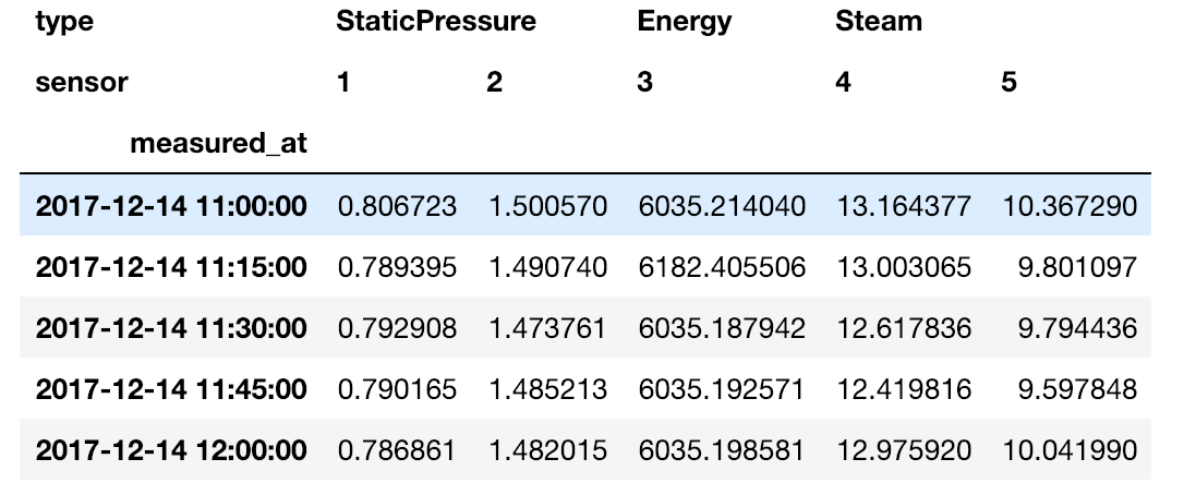 Time Series Building Data
Working with multi-index dataframes is an entirely different article (here are the docs), but we won’t do anything too complicated. To access a single column and plot it, we can do the following.
import pandas as pd # Read in data with two headers
df = pd.read_csv('building_one.csv', header=[0,1], index_col=0)
# Extract energy series from multi-index
energy_series = df.loc[:, ('Energy', '3')]# Plot
energy_series.plot()
The default plot (provided by matplotlib) looks like:
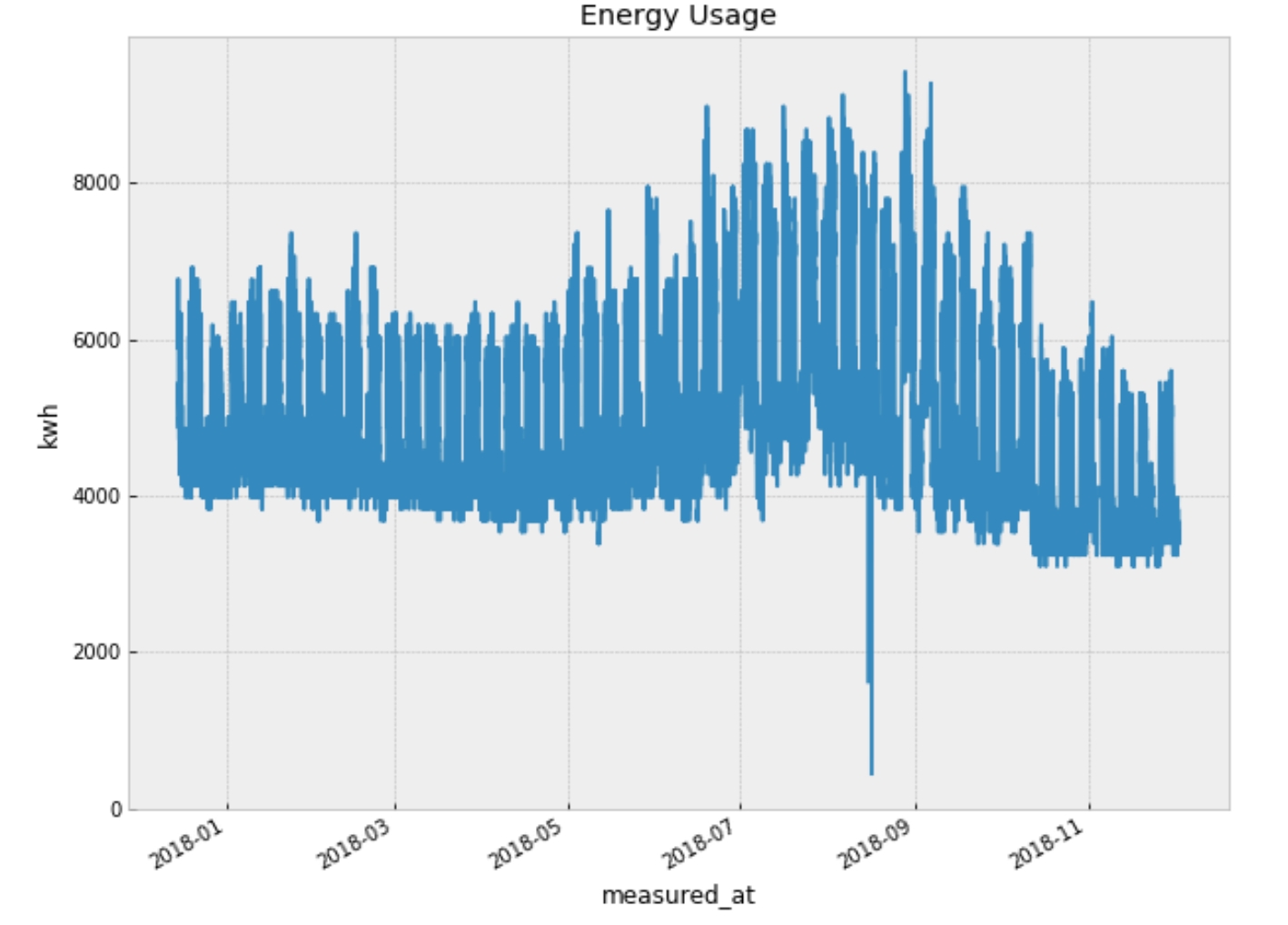
This isn’t terrible, especially for one line of code. However, there is no interactivity, and it’s not visually appealing. Time to get into plotly.
Basic Time Series Plot
Much like Bokeh (articles), making a basic plot requires a little more work in plotly, but in return, we get much more, like built-in interactivity.
We build up a graph starting with a data object. Even though we want a line chart, we use go.Scatter() . Plotly is smart enough to automatically give us a line graph if we pass in more than 20 points! For the most basic graph, all we need is the x and y values:
energy_data = go.Scatter(x=energy_series.index,
                         y=energy_series.values)
Then, we create a layout using the default settings along with some titles:
layout = go.Layout(title='Energy Plot', xaxis=dict(title='Date'),
                   yaxis=dict(title='(kWh)'))
(We use dict(x = 'value') syntax which is the same as {'x': 'value'} ).
Finally, we can create our figure and display it interactively in the notebook:
fig = go.Figure(data=[energy_data], layout=layout)
py.iplot(fig, sharing='public')
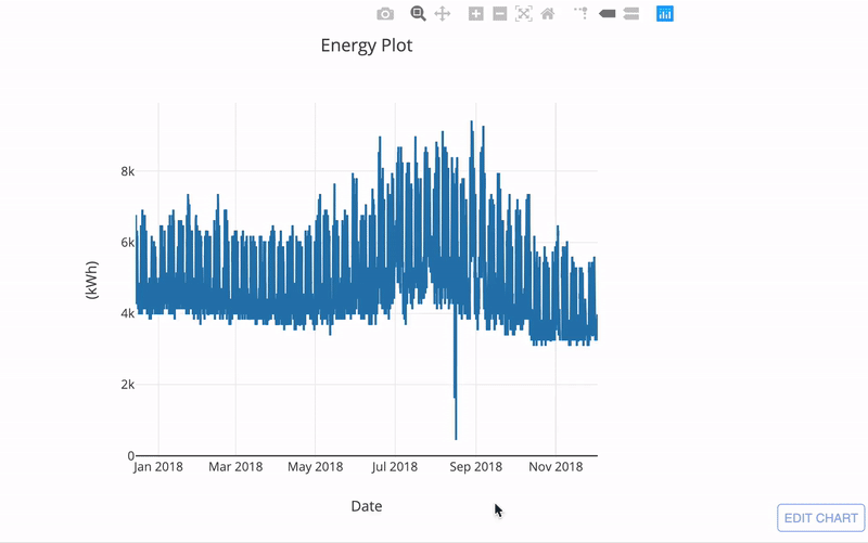 Basic time series plot in plotly
Right away, we have a fully interactive graph. We can explore patterns, inspect individual points, and download the plot as an image. Notice that we didn’t even need to specify the axis types or ranges, plotly got that completely right for us. We even get nicely formatted hover messages with no extra work.
What’s more, this plot is automatically exported to plotly which means we can share the chart with anyone. We can also click Edit Chart and open it up in the online editor to make any changes we want in an easy-to-use interface:
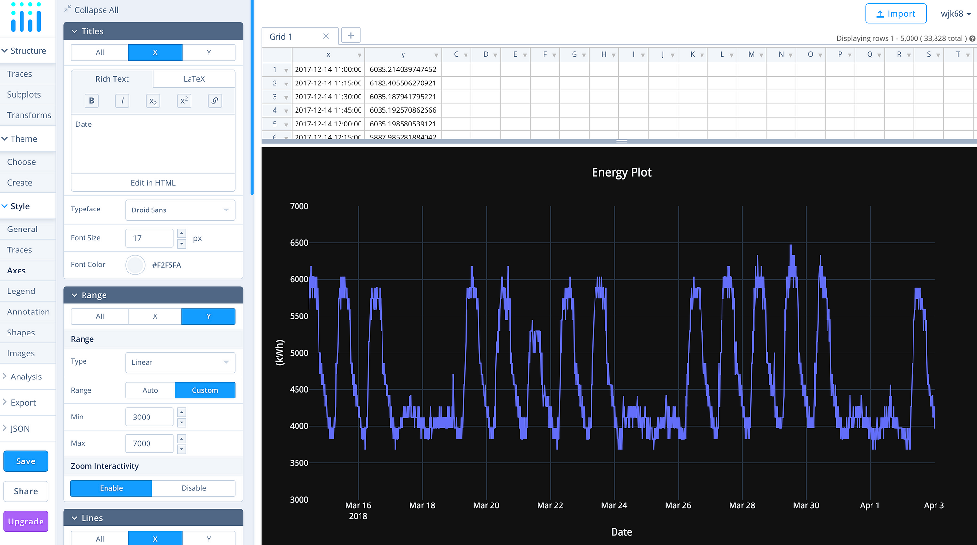 Online editor interface
If you edit the chart in the online editor you can then automatically generate the Python code for the exact graph and style you have created!
Improving Plots
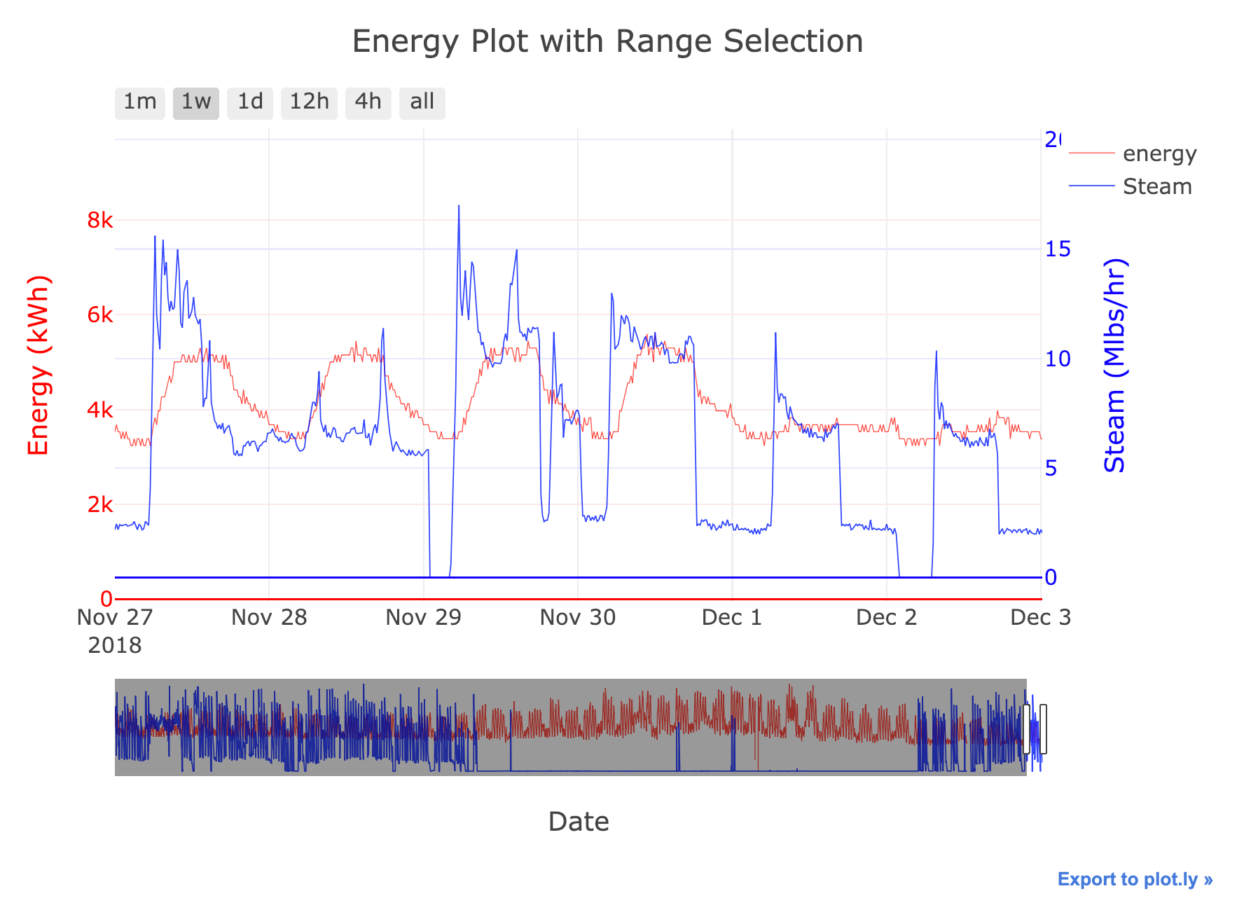
Even a basic time-series plot in Plotly is impressive but we can improve it with a few more lines of code. For example, let’s say we want to compare the steam usage of the building with the energy. These two quantities have vastly different units, so if we show them on the same scale it won’t work out. This is a case where we have to use a secondary y-axis. In matplotlib, this requires a large amount of formatting work, but we can do it quite easily in Plotly.
The first step is to add another data source, but this time specify yaxis='y2'.
# Get the steam data
steam_series = df.loc[:, ("Steam", "4")]

# Create the steam data object
steam_data = go.Scatter(x=steam_series.index,
                        y=steam_series.values,
                        # Specify axis
                        yaxis='y2')
(We also add in a few other parameters to improve the styling which can be seen in the notebook).
Then, when we create the layout, we need to add a second y-axis.
layout = go.Layout(height=600, width=800,
                   title='Energy and Steam Plot',
                   # Same x and first y
                   xaxis=dict(title='Date'),
                   yaxis=dict(title='Energy', color='red'),
                   # Add a second yaxis to the right of the plot
                   yaxis2=dict(title='Steam', color='blue',
                               overlaying='y', side='right')
                   )

fig = go.Figure(data=[energy_data, steam_data], layout=layout)
py.iplot(fig, sharing='public')
When we display the graph, we get both steam and energy on the same graph with properly scaled axes.
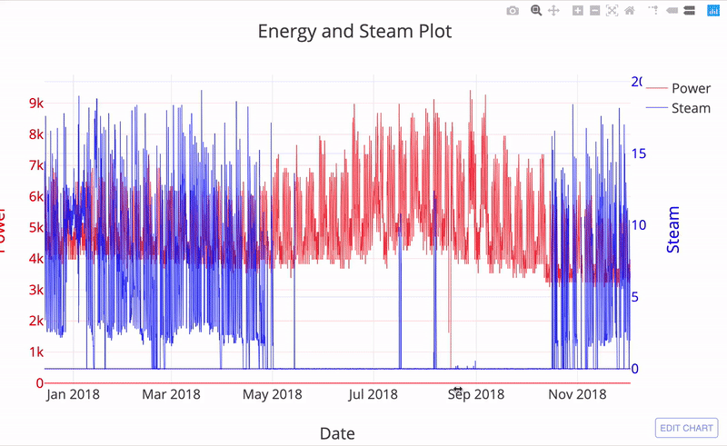
With a little online editing, we get a finished product:
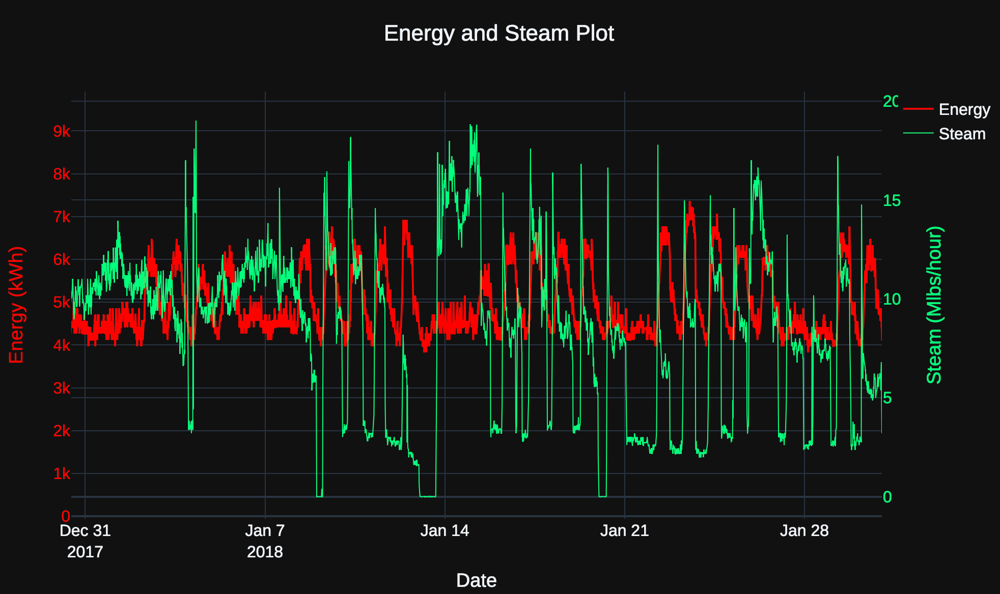 Finished plot of energy and steam.
Plot Annotations
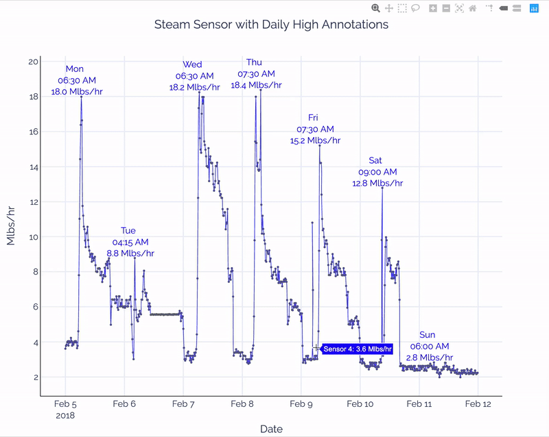
Plot annotations are used to call out aspects of a visualization for attention. As one example, we can highlight the daily high consumption of steam while looking at a week’s worth of data. First, we’ll subset the steam sensor into one week (called steam_series_four) and create a formatted data object:
# Data object
steam_data_four = go.Scatter(
                     x=steam_series_four.index,
                     y=steam_series_four.values,
                     line=dict(color='blue', width=1.1),
                     opacity=0.8,
                     name='Steam: Sensor 4',
                     hoverinfo = 'text',
                     text = [f'Sensor 4: {x:.1f} Mlbs/hr' for x in
                             steam_series_four.values])
Then, we’ll find the daily max values for this sensor (see notebook for code):
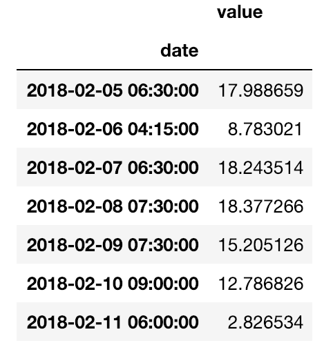 To build the annotations, we’ll use a list comprehension adding an annotation for each of the daily maximum values (
 four_highs is the above series). Each annotation needs a position ( x , y) and text:
# Create a list of annotations
four_annotations = [dict(x = date, y = value,
           xref = 'x', yref = 'y',
           font=dict(color = 'blue'),
           text = f'{format_date(date)}<br> {value[0]:.1f} Mlbs/hr')
                    for date, value in zip(four_highs.index,
                                           four_highs.values)]


four_annotations[:1]

{'x': Timestamp('2018-02-05 06:30:00'),
  'y': 17.98865890412107,
  'xref': 'x',
  'yref': 'y',
  'font': {'color': 'blue'},
  'text': 'Mon <br> 06:30 AM<br> 18.0 Mlbs/hr'}}
(The <br> in the text is html which is read by plotly for displaying).
There are other parameters of an annotation that we can modify, but we’ll let plotly take care of the details. Adding the annotations to the plot is as simple as passing them to the layout :
layout = go.Layout(height=800, width=1000,
                   title='Steam Sensor with Daily High Annotations',
                   annotations=four_annotations)
After a little post-processing in the online editor, our final plot is:
 Final plot with steam sensor annotations
The extra annotations can give us insights into our data by showing when the daily peak in steam usage occurs. In turn, this will allow us to make steam start time recommendations to building engineers.
The best part about plotly is we can get a basic plot quickly and extend the capabilities with a little more code. The upfront investment for a basic plot pays off when we want to add increased functionality.
Conclusions
We have only scratched the surface of what we can do in plotly. I’ll explore some of these functions in a future article, and refer to the notebook for how to add even more interactivity such as selection menus. Eventually, we can build deployable web applications in Dash with Python code. For now, we know how to create basic — yet effective — time-series visualizations in plotly.
These charts give us a lot for the small code investment and by touching up and sharing the plots online, we can build a finished, presentable product.
Although I’m not abandoning matplotlib — one-line bar and line charts are hard to beat — it’s clear that using matplotlib for custom charts is not a good time investment. Instead, we can use other libraries, including plotly, to efficiently build full-featured interactive visualizations. Seeing your data in a graph is one of the joys of data science, but writing the code is often painful. Fortunately, with plotly, visualizations in Python are intuitive, even enjoyable to create and achieve the goal of graphs: visually understand our data.
As always, I welcome feedback and constructive criticism. I can be reached on Twitter @koehrsen_will or through my personal website willk.online.