The Myth Of Us Vs Them
 (Source)
Why the “Developed and Developing world” distinction no longer works: Reality Project Episode 4
Of all the myths spread by the media, perhaps none is more detrimental than Us vs Them: the idea that the world is divided into two groups — one good, one evil — and all events can be viewed as a struggle between the two. This two-sided view of the world takes advantage of our natural tendency to form tribes and is applied in many situations, from political parties to economic systems, and, to countries in the form of “developed vs. developing world.” In the last case, this takes the form: developed = rich with low birth rates (assumed to be us) vs. developing = poor with high birth rates (them).
A binary outlook may make for compelling news (conflicts and tribalism are sure ways to get our attention) but it’s false. All of human life, from the personal — income, height, sexuality — to the international — systems of government, economic systems, national wealth — exists not in two states, but along a continuum. Moreover, we dehumanize people by splitting them into two groups letting our instincts and cognitive biases do the thinking for us instead of using our rationality. In this article, the fourth episode of the Reality Project — an effort dedicated to becoming less wrong about the world with data — we’ll see why a separation between developing and developed countries no longer applies and look at factful ways to view nations instead.
The previous episode of The Reality Project, on global nuclear weapons is here. You can find all The Reality Project by searching on Medium for the tag.
The Data
For this article, we’ll rely primarily on Hans Rosling’s book: Factfulness: Ten Reasons We’re Wrong About the World. Other sources are the World Bank Poverty Page, the YouTube video “Debunking Third World Myths with the Best Stats You’ve Never Seen”, and the article “Should We Continue to Use the Term ‘Developing World’?”. I made the graphs with the Gapminder Data Exploration tool which you can download for free (it includes data).
To start, it’s worth looking at where this binary idea applied to countries originated. The term “developing country” probably evolved out of “Third World”, which originally referred to countries aligned with neither the Communist Soviet bloc or Capitalist NATO in the 1950s. These countries tended to be former colonies struggling to provide citizens with a decent standard of living, and “Third World” soon came to mean poor countries with high birth rates, what are now referred to as developing nations.
Admittedly, at one point, during the 1960s, this distinction actually did make sense — or at least was in line with the existing data. In the below chart, we see the fertility rate (births per woman) on the y-axis versus income (GDP per capita) on the x-axis in 1960 for all countries where we have data.
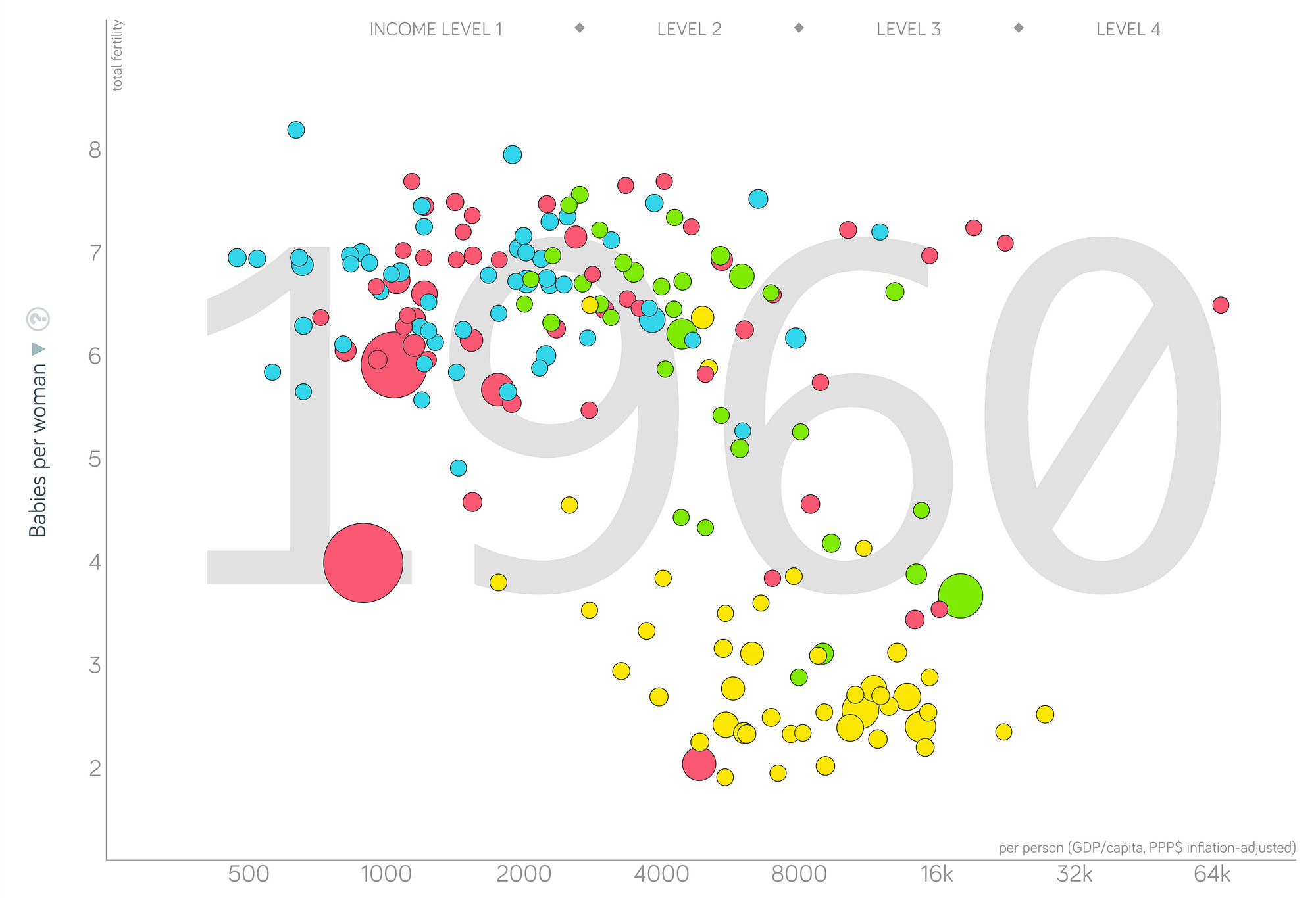 Fertility Rate vs Income in 1960 (created with Gapminder Data Exploration tool).
(The color represents the world region: yellow = Europe, blue = Africa, green = Americas, and Red = Asia + Australia). There is a relatively clear grouping as countries in Europe plus a few in the Americas and Asia tended to be both richer and have fewer babies per woman (lower right). On the other hand, African countries almost exclusively had high birth rates and low income. Development aid took off in the post-WWII years, and so, at the time, this classification allowed NGOs and governments to focus their efforts.
However, since 1960, the picture of the world has changed dramatically. Let’s look at the same graph in 1990, just after the fall of the Soviet Union.
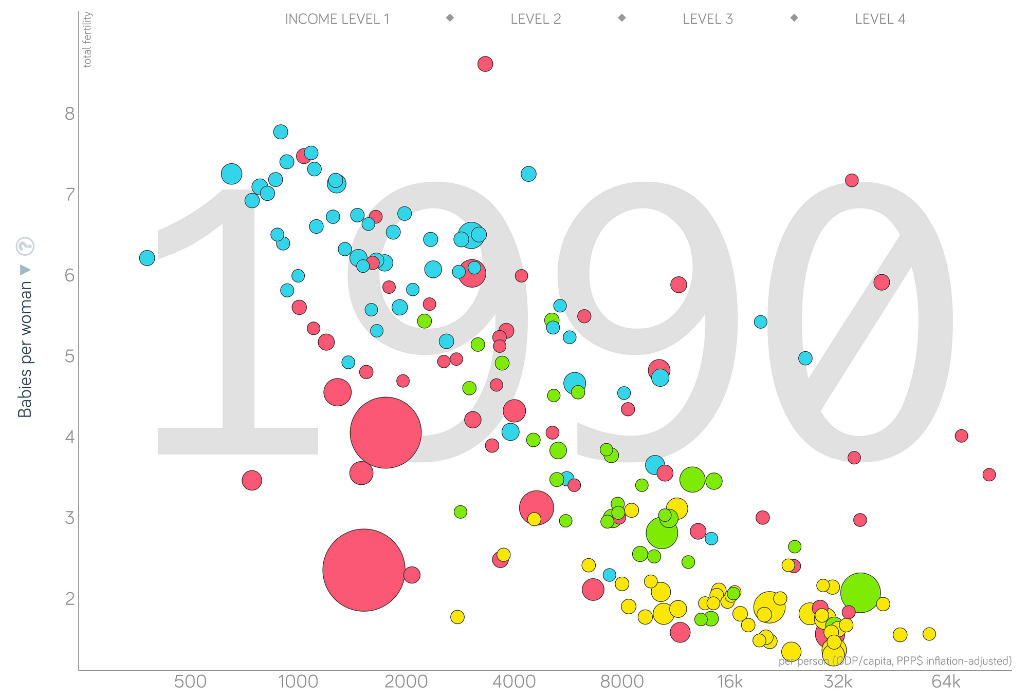 Fertility Rate vs Income in 1990
Now we see not a grouping but a linear transition. There are still differences between countries, but the noticeable gap that existed has given way to a smooth line. The global fertility rate, at an extremely high 5 babies per woman in 1960, had fallen to 3 in 1990. The extreme poverty rate — less than $2 /day — likewise fell, from over 60% in 1960 to less than 40% in 1990.
These trends — decreasing fertility and decreasing poverty — have only accelerated since 1990. Below is the most up-to-date picture of the world:
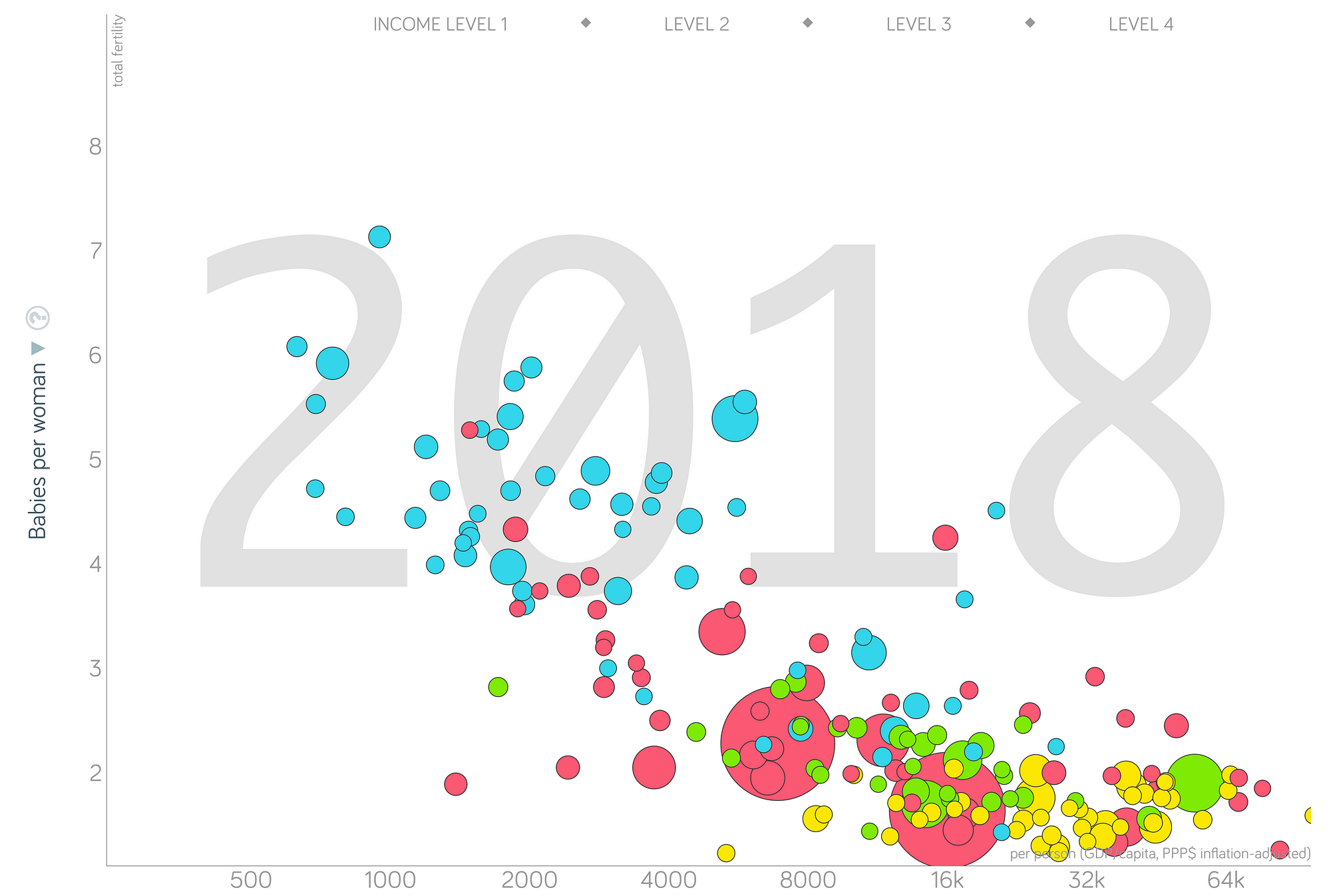 Fertility Rate vs Income in 2018
What we see here has been named “The Great Convergence.” While there are still differences, there is no one gap that divides countries; instead, they are arrayed along a continuous line of income. Drawing a single separating line of this graph is impossible because there is only a smooth transition. Countries all over the world have gotten richer and, as a result, have longer lives, reduced childhood mortality, and fewer children per women.
Notably, China and India (visible as the large red bubbles) have experienced extreme reductions in poverty, resulting in a new world low of under 9% extreme poverty in 2018. The new global birth rate is at 2.5 babies per woman, drawing near to the replacement rate of 2.1.
When we look at a similar graph of childhood survival versus fertility rate, we can see the same trend. The developing/developed gap here is even clearer in 1960 (left) but again, the world has since converged (right).
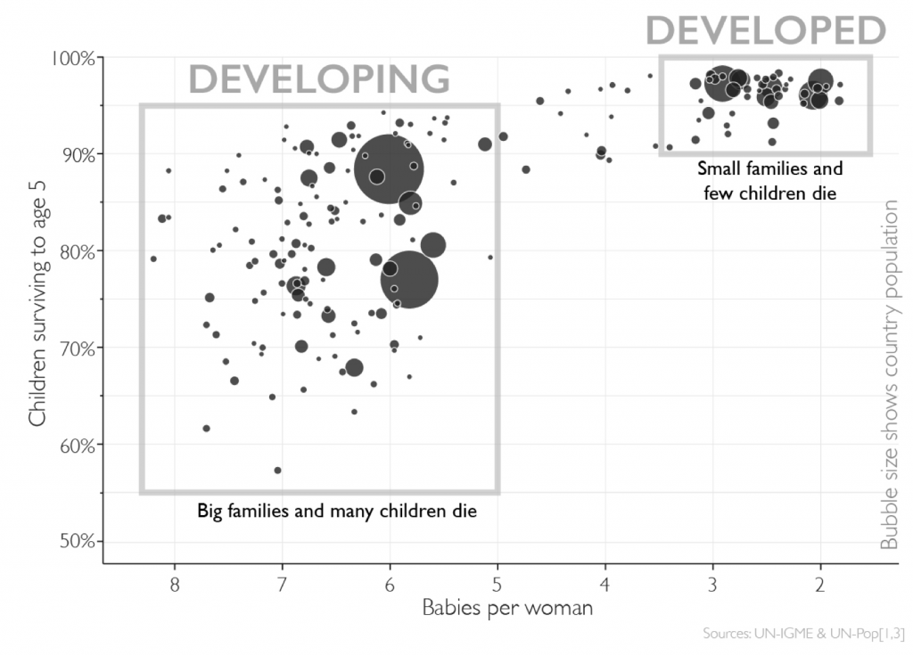
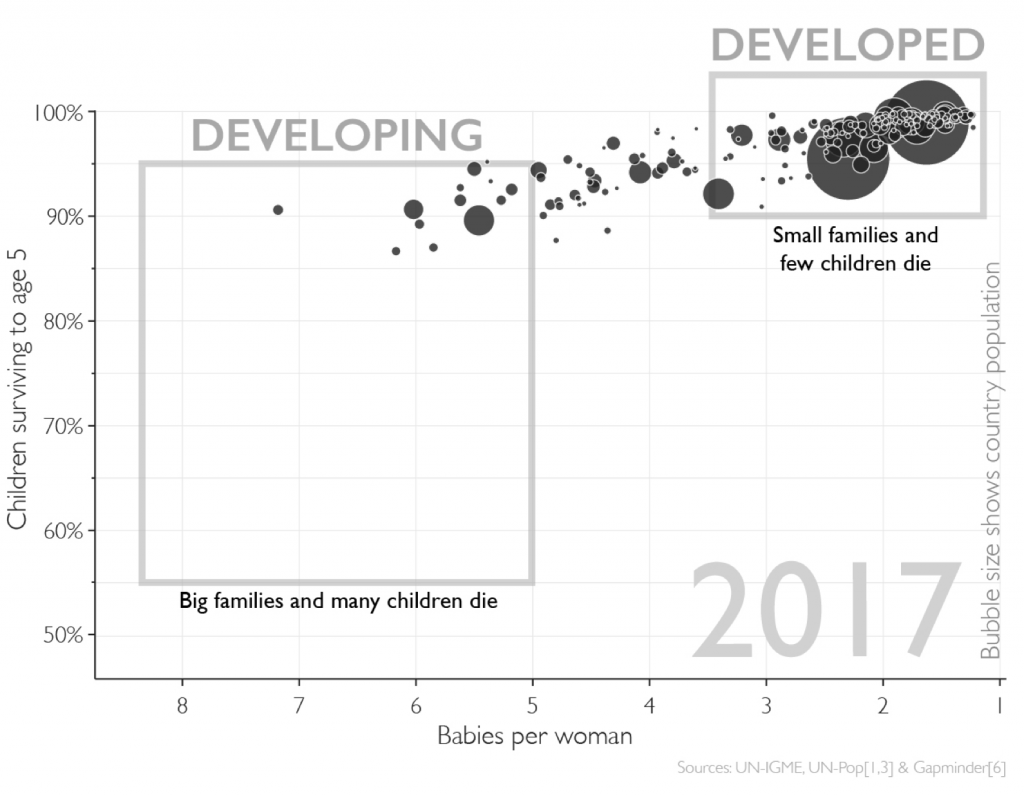 Children surviving to age 5 vs fertility rate in 1960 (left) and 2017 (right)
The old boxes clearly no longer fit. We’ll get into a more accurate characteristic in the next section.
We’ll end this part with one final visual: the changing worldwide income distribution since 1800. It’s one thing to get your picture of the world from the news, but completely different to watch the transformations take place in front of your eyes with real data. As incomes around the world increase, the global extreme poverty rate (vertical line) decreases from 86% to under 15%(and, in 2018, the World Bank reported it was under 10%).
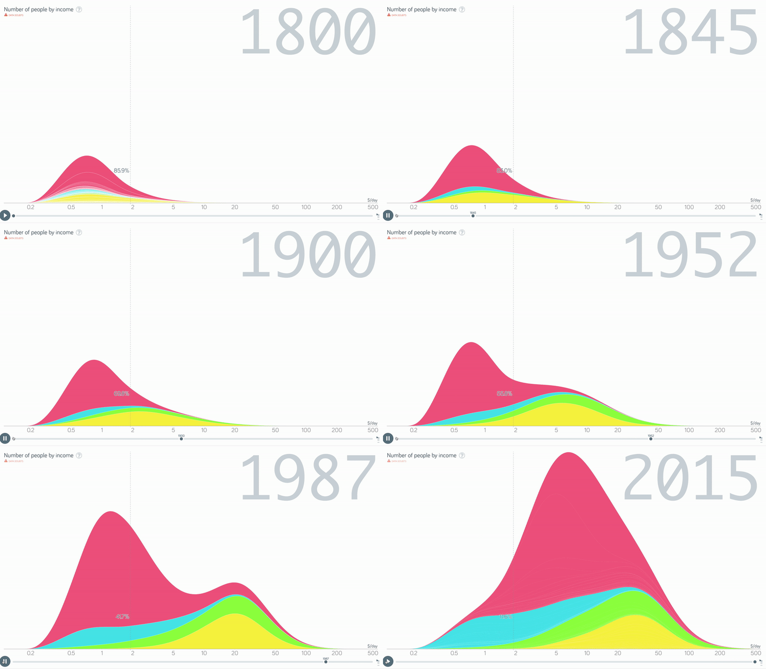
If you watch closely, you can see the emergence of a gap right around 1960 — this is precisely the time at which the terms “developing” and “developed” first came into use. However, as the animation continues, the gap slowly disappears until incomes exist along a continuous distribution. The separation of incomes — called the Great Divergence — was a real phenomenon, but the new picture is a Great Convergence as incomes increase nearly everywhere.
This disappearing of the “gap” between two distinct sets of countries means the terms “developing” and “developed” no longer accurately represent countries. If we use this distinction, it means placing Mexico, GDP per capita $17,000, and Mozambique, GDP per capita $1,200, in the same category. In other words, a binary distinction is too broad. Nonetheless, as in the 1960s, some form of breaking up countries is useful as it allows us to find countries with similar needs. If the two-part model is broken, what fixes it?
A Better System
In Factfulness, Hans Rosling lays out a four-tiered approach for grouping countries based on similar needs derived from income. These are outlined as follows (from Bill Gates’ excellent post on the subject).
- Level One: less than $2 per day. Around 1 billion people are on this level and getting food every day can be a struggle.
- Level Two: between $2 and $8 per day. Around 3 billion people are on this level where kids can go to school instead of working.
- Level Three: between $8 and $32 per day. Around 2 billion people are on this level that includes motorized transportation and high school.
- Level Four: more than $32 per day. Around 1 billion people are on this level with labor-saving appliances and reliable health care.
If you must think of it this way, Level One is “lower-class”, Levels Two and Three are the global “middle-class”, and Level Four is the “upper-class”. In this system, the vast majority of the world’s population are correctly classified as middle class or above reflecting the recent substantial gains in income.
Below is a breakdown of the world population into each level over time:
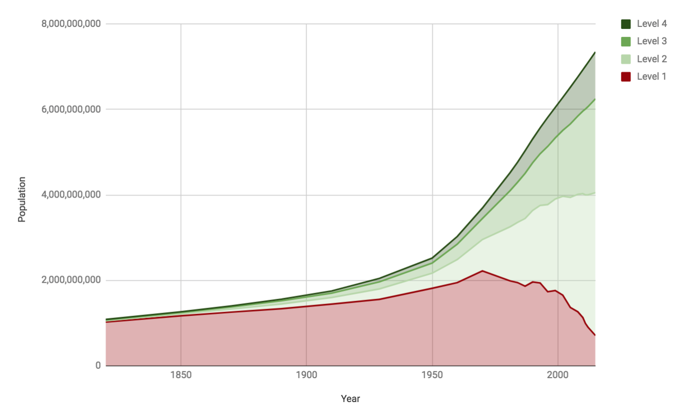 Raw number of people on each level over time (Source)
In 1800, close to the entire world population (85%) existed on Level One. In 2018, only 15% of the world’s population is still there and the middle classes are growing far faster than the extremes.
The actual levels and dollar amounts, with each person representing approximately 1 billion people, are below:
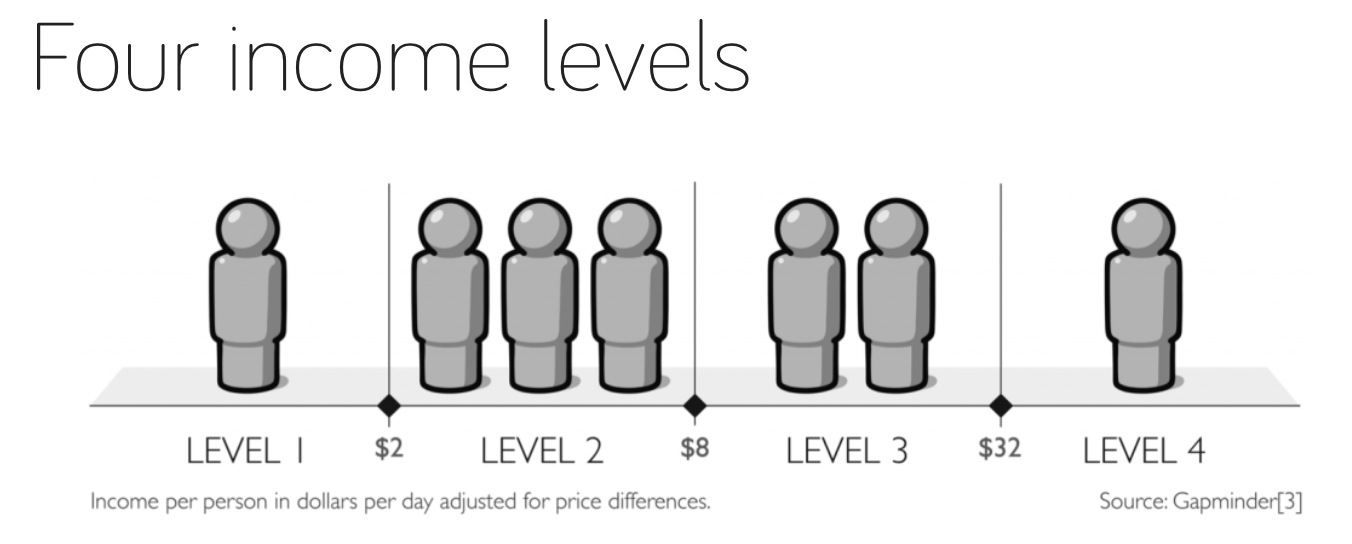 Four Income Levels Proposed by Hans Rosling at Gapminder
The four-tier system is an improvement over a binary split. Rosling’s approach is useful because it captures needs of different countries more accurately than binary categories, it allows us to clearly see progress over time, and it prevents us from falling into the Us vs. Them type of thinking. (Not to mention the numbers work out very well). While this argument may seem like semantics, it actually does matter because how we measure determines how we act.
(There are other systems to approach the same problem. The International Monetary Fund still uses a binary advanced vs emerging economies, the United Nations Development Program uses a continuous Human Development Index, and the World Bank has recently stopped using the terms “developing” and “developed”. There is also a compelling argument for expanding the four categories to five with the fifth representing abundance.)
Why This Matters
Why does any measurement matter? The answer: it helps us to figure out what approaches work to solve a problem by observing causes and effects. Consider a typical continuous human measurement, weight. If you are trying to lose weight, one of the best places to start is simply weigh yourself every day so you can see if you are going in the right direction. How else are you supposed to know if your (non)-interventions are having any impact? A process of act — measure results — adjust actions is how we personally improve in any pursuit. The exact same is true of global development: measuring along a continuous or four-tier scale allows us to clearly see progress over time and relate back specific improvements to causes.
The weight metaphor also holds up when we start to think about using binary versus multiple categories. If there are only two states — fat and thin — we are inaccurate categorizing a lot of people and it’s going to be hard to stay motivated if your status never changes even from year-to-year. We are much better off thinking in terms of categories — obese, overweight, healthy, underweight — so we can make salient recommendations to individuals (or ourselves) to guide their actions for losing weight.
When it comes to global poverty, it can seem like there are reasons to despair. There are 750 million people — mostly in Sub-Saharan Africa — currently in extreme poverty. However, we shouldn’t stop there, and, once we start digging into the data, the picture becomes much better: over 1.2 billion people lifted out of extreme poverty in the past 30 years and the real possibility of eliminating extreme poverty within the next several decades. With a binary worldview, we risk missing all of that by lumping together everyone not at our income level as developing. In the four-tier framework, we can see that actually about 85% (6/7 billion) people live on the second level or higher and the largest segment of the population lives in the global middle class (levels 2 and 3). If we look again at the graph of the distribution of levels over time, we see lots of reason for hope:
 Number of people on each income level over time. (Source)
The middle classes are growing and the first level (the “lower class”) is shrinking rapidly. This is good not only for people in those countries but also for everyone around the world. As countries get wealthier, citizens report increased life satisfaction (a better measure than day-to-day happiness):
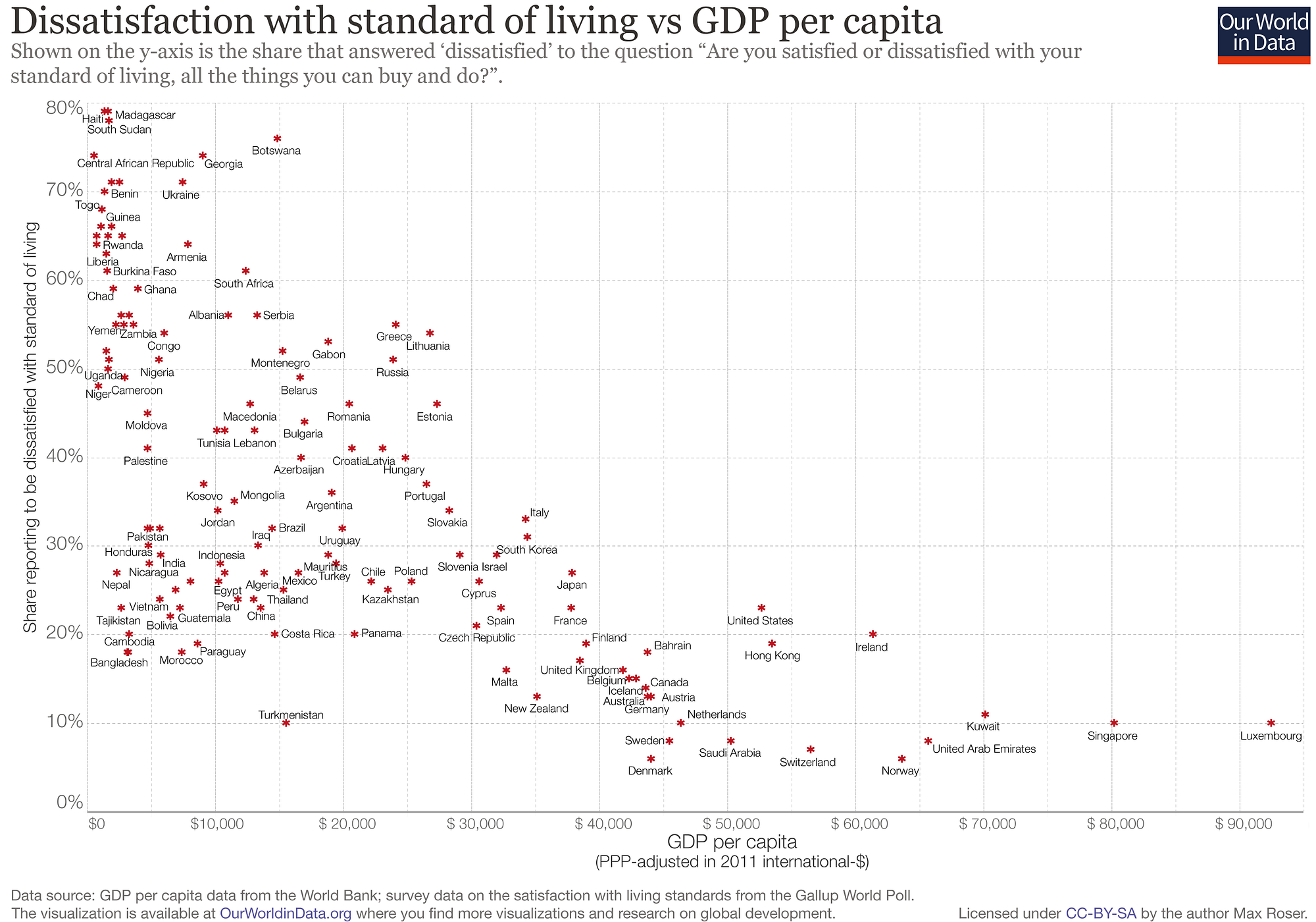 Dissatisfaction with life versus GDP per capita (Source).
Furthermore, as incomes increase, fertility rates decrease as better health care leads to fewer children dying and subsequently, women have fewer babies:
 Fertility rate versus average income (source)
(There are many other reasons for the decline in fertility which you can read about on the Our World in Data fertility page.) There are people worried about overpopulation (I don’t happen to be one of them based on the data and best estimates) and, if you are one of them, the best way to limit population growth is to bring people in all countries out of poverty. As families have fewer children, they can spend more resources on each child, giving them a better chance to succeed, which they can then pass on to their children and the virtuous cycle of decreasing poverty and decreasing fertility continues.
Conclusions
You might argue that at the end of the day, this is only semantics. However, the “developed vs developing” dichotomy is more than a choice of words, it’s a mindset. At its core, a ed other rather than as people fighting for the same things that we are — health, prosperity, and a better life for those in the next generation.
The Reality Project isn’t about knowing facts so you can feel superior, it’s about using facts to encourage people to contribute to the long ascent of humankind. The “Developed vs Developing” myth is a great place to start because it offers an opportunity to show optimistic stats, talk about how our view of the world is wrong, and make gentle corrections. Once we understand why and how the world is getting better, we can make sure it continues that way. As a first step, start by viewing matters — in your personal life and on an international level — not as black and white but on a scale, that, even when divided, shows progress and its causes.
As always, I welcome feedback and constructive criticism. I can be reached on Twitter @koehrsen_will.