
Simpson’s Paradox: How to Prove Opposite Arguments with the Same Data
Understanding a statistical phenomenon and the importance of asking why
Imagine you and your partner are trying to find the perfect restaurant for a pleasant dinner. Knowing this process can lead to hours of arguments, you seek out the oracle of modern life: online reviews. Doing so, you find your choice, Carlo’s Restaurant is recommended by a higher percentage of both men and women than your partner’s selection, Sophia’s Restaurant. However, just as you are about to declare victory, your partner, using the same data, triumphantly states that since Sophia’s is recommended by a higher percentage of all users, it is the clear winner.
What is going on? Who’s lying here? Has the review site got the calculations wrong? In fact, both you and your partner are right and you have unknowingly entered the world of Simpson’s Paradox, where a restaurant can be both better and worse than its competitor, exercise can lower and increase the risk of disease, and the same dataset can be used to prove two opposing arguments. Instead of going out to dinner, perhaps you and your partner should spend the evening discussing this fascinating statistical phenomenon.
Simpson’s Paradox occurs when trends that appear when a dataset is separated into groups reverse when the data are aggregated. In the restaurant recommendation example, it really is possible for Carlo’s to be recommended by a higher percentage of both men and women than Sophia’s but to be recommended by a lower percentage of all reviewers. Before you declare this to be lunacy, here is the table to prove it.
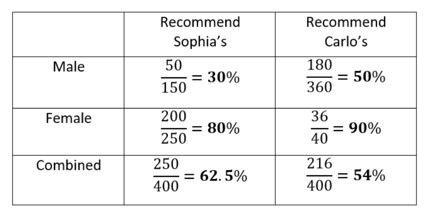 Carlo’s wins among both men and women but loses overall!
The data clearly show that Carlo’s is preferred when the data are separated, but Sophia’s is preferred when the data are combined!
How is this possible? The problem here is that looking only at the percentages in the separate data ignores the sample size, the number of respondents answering the question. Each fraction shows the number of users who would recommend the restaurant out of the number asked. Carlo’s has far more responses from men than from women while the reverse is true for Sophia’s. Since men tend to approve of restaurants at a lower rate, this results in a lower average rating for Carlo’s when the data are combined and hence a paradox.
To answer the question of which restaurant we should go to, we need to decide if the data can be combined or if we should look at separately. Whether or not we should aggregate the data depends on the process generating the data— that is, the causal model of the data. We’ll cover what this means and how to resolve Simpson’s Paradox after we see another example.
Correlation Reversal
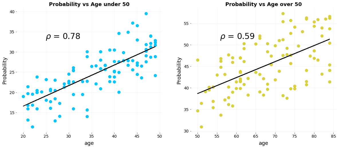
Another intriguing version of Simpson’s Paradox occurs when a correlation that points in one direction in stratified groups becomes a correlation in the opposite direction when aggregated for the population. Let’s take a look at a simplified example. Say we have data on the number of hours of exercise per week versus the risk of developing a disease for two sets of patients, those below the age of 50 and those over the age of 50. Here are individual plots showing the relationship between exercise and probability of disease.
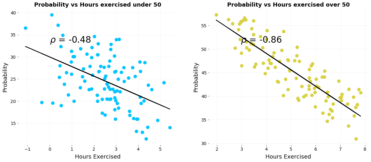 Plots of probability of disease versus hours of weekly exercise stratified by age.
(Example can be re-created in this Jupyter Notebook).
We clearly see a negative correlation, indicating that increased levels of exercise per week are correlated with a lower risk of developing the disease for both groups. Now, let’s combine the data together on a single plot:
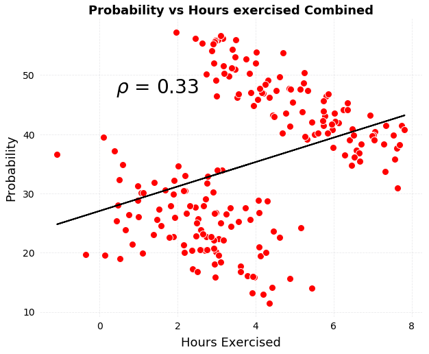 Combined plot of probability of disease versus exercise.
The correlation has completely reversed! If shown only this figure, we would conclude that exercise increases the risk of disease, the opposite of what we would say from the individual plots. How can exercise both decrease and increase the risk of disease? The answer is that it doesn’t and to figure out how to resolve the paradox, we need to look beyond the data we are shown and reason through the data generation process — what caused the results.
Resolving the Paradox
To avoid Simpson’s Paradox leading us to two opposite conclusions, we need to choose to segregate the data in groups or aggregate it together. That seems simple enough, but how do we decide which to do? The answer is to think casually: how was the data generated and based on this, what factors influence the results that we are not shown?
In the exercise vs disease example, we intuitively know that exercise is not the only factor affecting the probability of developing a disease. There are other influences such as diet, environment, heredity and so forth. However, in the plots above, we see only probability versus hours of exercise. In our fictional example, let’s assume disease is caused by both exercise and age. This is represented in the following causal model of disease probability.
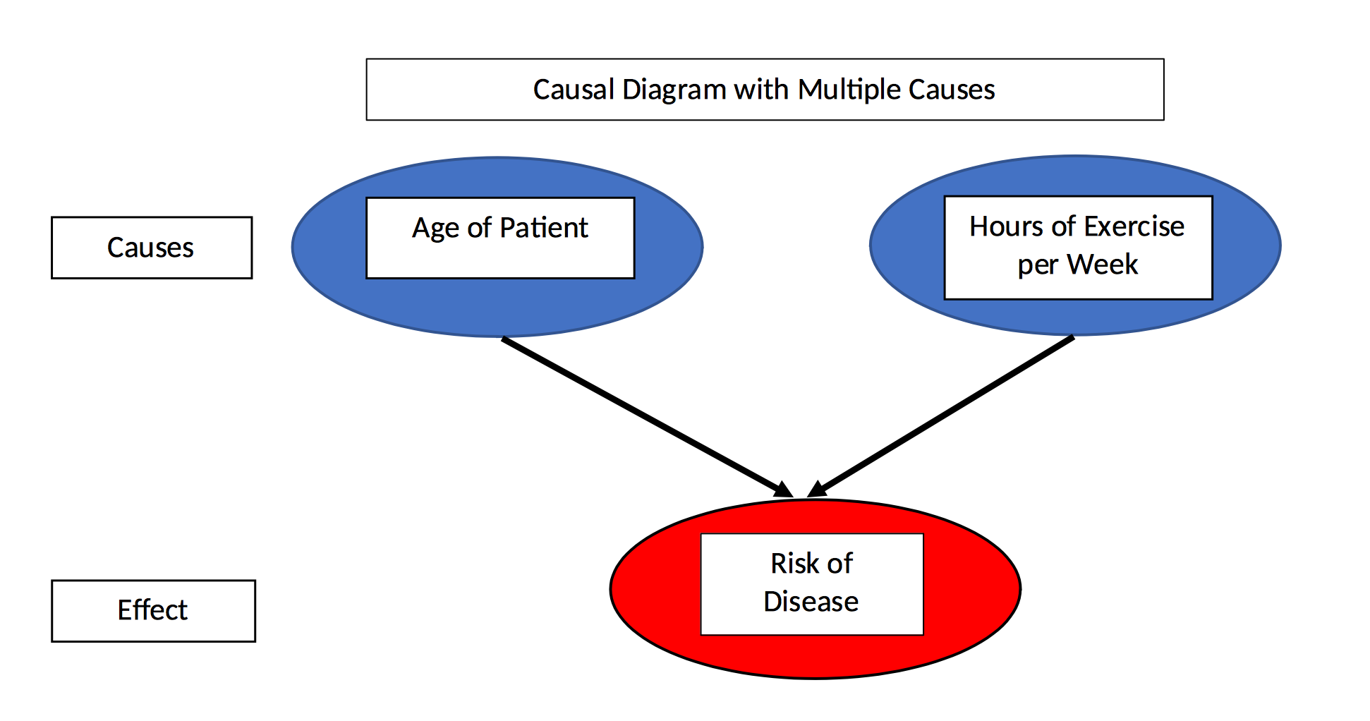 Causal model of disease probability with two causes.
In the data, there are two different causes of disease yet by aggregating the data and looking at only probability vs exercise, we ignore the second cause — age — completely. If we go ahead and plot probability vs age, we can see that the age of the patient is strongly positively correlated with disease probability.
 Plots of disease probability vs age stratified by age group.
As the patient increases in age, her/his risk of the disease increases which means older patients are more likely to develop the disease than younger patients even with the same amount of exercise. Therefore, to assess the effect of just exercise on disease, we would want to hold the age constant and change the amount of weekly exercise.
Separating the data into groups is one way to do this, and doing so, we see that for a given age group, exercise decreases the risk of developing the disease. That is, controlling for the age of the patient, exercise is correlated with a lower risk of disease. Considering the data generating process and applying the causal model, we resolve Simpson’s Paradox by keeping the data stratified to control for an additional cause.
Thinking about what question we want to answer can also help us solve the paradox. In the restaurant example, we want to know which restaurant is most likely to satisfy both us and our partner. Even though there may be other factors influencing a review than just the quality of the restaurant, without access to that data, we’d want to combine the reviews together and look at the overall average. In this case, aggregating the data makes the most sense.
The relevant query to ask in the exercise vs disease example is should we personally exercise more to reduce our individual risk of developing the disease? Since we are a person either below 50 or above 50 (sorry to those exactly 50) then we need to look at the correct group, and no matter which group we are in, we decide that we should indeed exercise more.
Thinking about the data generation process and the question we want to answer requires going beyond just looking at data. This illustrates perhaps the key lesson to learn from Simpson’s Paradox: the data alone are not enough. Data are never purely objective and especially when we only see the final plot, we must consider if we are getting the whole story.
We can try to get a more complete picture by asking what caused the data and what factors influencing the data are we not being shown. Often, the answers reveal that we should in fact come away with the opposite conclusion!
Simpson’s Paradox in Real Life
This phenomenon is not — as seems to be the case for some statistical concepts — a contrived problem that is theoretically possible but never occurs in practice. There are in fact many well-known studied cases of Simpson’s Paradox in the real world.
One example occurs with data about the effectiveness of two kidney stone treatments. Viewing the data separated into the treatments, treatment A is shown to work better with both small and large kidney stones, but aggregating the data reveals that treatment B works better for all cases! The table below shows the recovery rates:
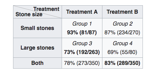 Treatment data for kidney stones (Source)
How can this be? The paradox can be resolved by considering the data generation process — causal model — informed by domain knowledge. It turns out that small stones are considered less serious cases, and treatment A is more invasive than treatment B. Therefore, doctors are more likely to recommend the inferior treatment, B, for small kidney stones, where the patient is more likely to recover successfully in the first place because the case is less severe. For large, serious stones, doctors more often go with the better — but more invasive — treatment A. Even though treatment A performs better on these cases, because it is applied to more serious cases, the overall recovery rate for treatment A is lower than treatment B.
In this real-world example, size of kidney stone — seriousness of case — is called a confounding variable because it affects both the independent variable — treatment method — and the dependent variable — recovery. Confounding variables are also something we don’t see in the data table but they can be determined by drawing a causal diagram:
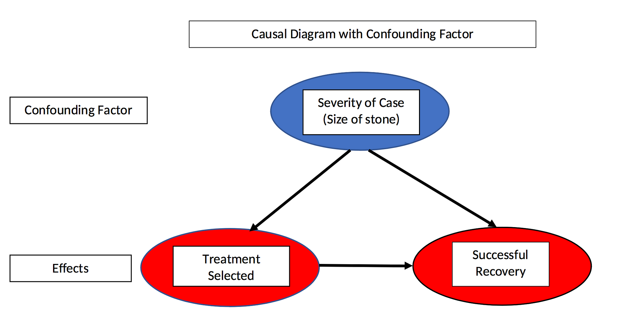 Causal diagram with confounding factor
The effect in question, recovery, is caused both by the treatment and the size of the stone (seriousness of the case). Moreover, the treatment selected depends on the size of the stone making size a confounding variable. To determine which treatment actually works better, we need to control for the confounding variable by segmenting the two groups and comparing recovery rates within groups rather than aggregated over groups. Doing this we arrive at the conclusion that treatment A is superior.
Here’s another way to think about it: if you have a small stone, you prefer treatment A; if you have a large stone you also prefer treatment A. Since you must have either a small or a large stone, you always prefer treatment A and the paradox is resolved.
Sometimes looking at aggregated data is useful but in other situations it can obscure the true story.
Proving an Argument and the Opposite
The second real-life example shows how Simpson’s Paradox could be used to prove two opposite political points. The following table shows that during Gerald Ford’s presidency, he not only lowered taxes for every income group, he also raised taxes on a nation-wide level from 1974 to 1978. Take a look at the data:
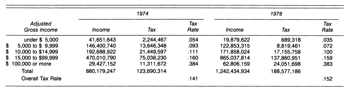 All individual tax rates decreased but the overall tax rate increased. (Source)
We can clearly see that the tax rate in each tax bracket decreased from 1974 to 1978, yet the overall tax rate increased over the same time period. By now, we know how to resolve the paradox: look for additional factors that influence overall tax rates. The overall tax rate is a function both of the individual bracket tax rates, and also the amount of taxable income in each bracket. Due to inflation (or wage increases), there was more income in the upper tax brackets with higher rates in 1978 and less income in lower brackets with lower rates. Therefore, the overall tax rate increased.
Whether or not we should aggregate the data depends on the question we want to answer (and maybe the political argument we are trying to make) in addition to the data generation process. On a personal level, we are just one person, so we only care about the tax rate within our bracket. In order to determine if our taxes rose from 1974 to 1978, we must determine both did the tax rate change in our tax bracket, and did we move to a different tax bracket. There are two causes to account for the tax rate paid by an individual, but only one is captured in this slice of the data.
Why Simpson’s Paradox Matters
Simpson’s Paradox is important because it reminds us that the data we are shown is not all the data there is. We can’t be satisfied only with the numbers or a figure, we have to consider the data generation process — the causal model — responsible for the data. Once we understand the mechanism producing the data, we can look for other factors influencing a result that are not on the plot. Thinking causally is not a skill most data scientists are taught, but it’s critical to prevent us from drawing faulty conclusions from numbers. We can use our experience and domain knowledge — or those of experts in the field — in addition to data to make better decisions.
Moreover, while our intuitions usually serve us pretty well, they can fail in cases where not all the information is immediately available. We tend to fixate on what’s in front of us — all we see is all there is — instead of digging deeper and using our rational, slow mode of thinking. Particularly when someone has a product to sell or an agenda to implement, we have to be extremely skeptical of the numbers by themselves. Data is a powerful weapon, but it can be used by both those who want to help us and nefarious actors.
Simpson’s Paradox is an interesting statistical phenomenon but it also demonstrates the best shield against manipulation is the ability to think rationally and ask why.
References
- Wikipedia Article on Simpson’s Paradox
- Stanford Encyclopedia Article on Simpson’s Paradox
- Simpson’s Paradox: A Cautionary Tale in Advanced Analytics
- The Book of Why: The New Science of Cause and Effect by Judea Pearl
- Simpson’s Paradox in Real Life
- Understanding Simpson’s Paradox
As always, I welcome discussion and constructive criticism. I can be reached through Twitter @koehrsen_will or on my personal website willk.online.