
Data Visualization With Bokeh In Python Part Ii Interactions

Moving beyond static plots
In the first part of this series, we walked through creating a basic histogram in Bokeh, a powerful Python visualization library. The final result, which shows the distribution of arrival delays of flights departing New York City in 2013 is shown below (with a nice tooltip!):
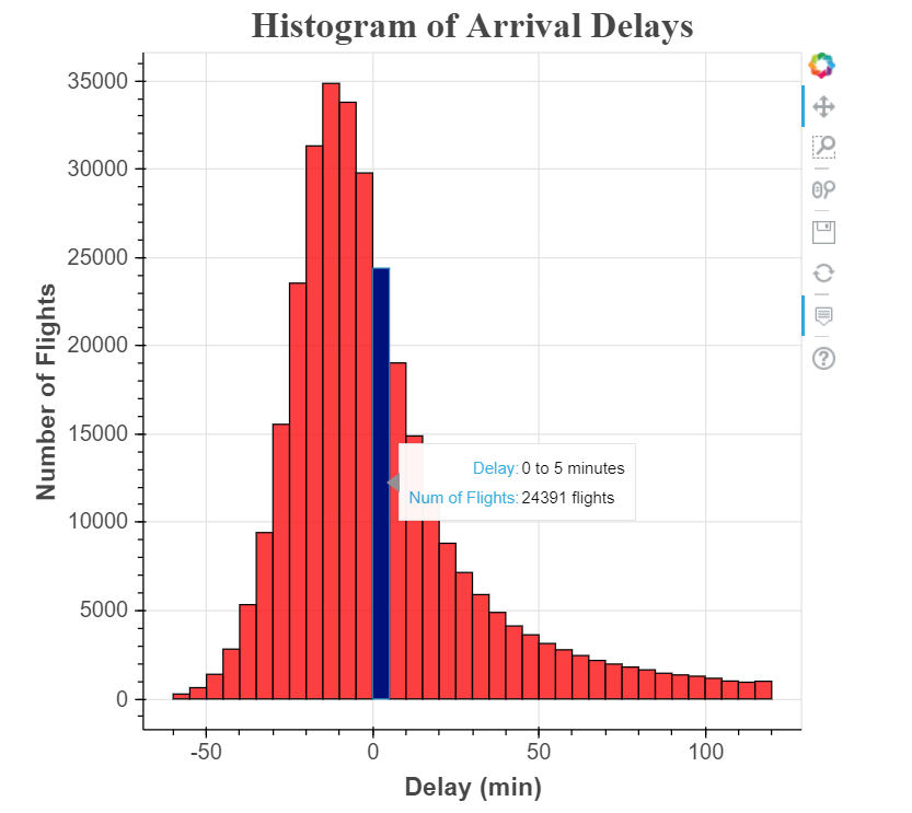 This chart gets the job done, but it’s not very engaging! Viewers can see the distribution of flight delays is nearly normal (with a slight positive skew), but there’s no reason for them to spend more than a few seconds with the figure.
If we want to create more engaging visualization, we can allow users to explore the data on their own through interactions. For example, in this histogram, one valuable feature would be the ability to select specific airlines to make comparisons or the option to change the width of the bins to examine the data in finer detail. Fortunately, these are both features we can add on top of our existing plot using Bokeh. The initial development of the histogram may have seemed involved for a simple plot, but now we get to see the payoff of using a powerful library like Bokeh!
All the code for this series is available on GitHub. I encourage anyone to check it out for all the data cleaning details (an uninspiring but necessary part of data science) and to experiment with the code!(For interactive Bokeh plots, we can still use a Jupyter Notebook to show the results or we can write Python scripts and run a Bokeh server. For development, I usually work in a Jupyter Notebook because it is easier to rapidly iterate and change plots without having to restart the server. I then move to a server to display the final results. You can see both a standalone script and the full notebook on GitHub.)
Active Interactions
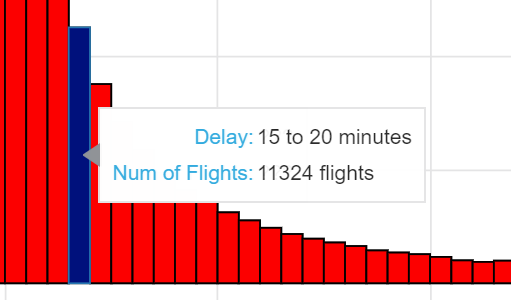
There are two classes of interactions in Bokeh: passive and active. Passive interactions, covered in Part I, are also known as inspectors because they allow users to examine a plot in more detail but do not change the information displayed. One example is a tooltip that appears when a user hovers over a data point:
 Tooltip, a passive interactor
The second class of interaction is called active because it changes the actual data displayed on the plot. This can be anything from selecting a subset of the data (such as specific airlines) to changing the degree of a polynomial regression fit. There are multiple types of active interactions in Bokeh, but here we will focus on what are called “widgets”, elements that can be clicked on and that give the user control over some aspect of the plot.
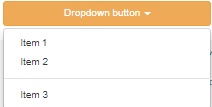
 Example of Widgets (dropdown button and radio button group)
When I view graphs, I enjoy playing with active interactions (such as those on FlowingData) because they allow me to do my own exploration of the data. I find it more insightful to discover conclusions from the data on my own (with some direction from the designer) rather than from a completely static chart. Moreover, giving users some amount of freedom allows them to come away with slightly different interpretations that can generate beneficial discussion about the dataset.
Interaction Outline
Once we start adding active interactions, we need to move beyond single lines of code and into functions that encapsulate specific actions. For a Bokeh widget interaction, there are three main functions that to implement:
make_dataset()Format the specific data to be displayedmake_plot()Draw the plot with the specified dataupdate()Update the plot based on user selections
Formatting the Data
Before we can make the plot, we need to plan out the data that will be displayed. For our interactive histogram, we will offer users three controllable parameters:
- Airlines displayed (called carriers in the code)
- Range of delays on the plot, for example: -60 to +120 minutes
- Width of histogram bin, 5 minutes by default
For the function that makes the dataset for the plot, we need to allow each of these parameters to be specified. To inform how we will transform the data in our make_dataset function, lets load in all the relevant data and inspect.
 Data for histogram
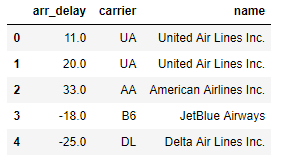
In this dataset, each row is one separate flight. The arr_delaycolumn is the arrival delay of the flight in minutes (negative numbers means the flight was early). In part I, we did some data exploration and know there are 327,236 flights with a minimum delay of -86 minutes and a maximum delay of +1272 minutes. In the make_datasetfunction, we will want to select airlines based on the name column in the dataframe and limit the flights by the arr_delay column.
To make the data for the histogram, we use the numpy function histogram which counts the number of data points in each bin. In our case, this is the number of flights in each specified delay interval. For part I, we made a histogram for all flights, but now we will do it by each carrier. As the number of flights for each carrier varies significantly, we can display the delays not in raw counts but in proportions. That is, the height on the plot corresponds to the fraction of all flights for a specific airline with a delay in the corresponding bin. To go from counts to a proportion, we divide the count by the total count for the airline.
Below is the full code for making the dataset. The function takes in a list of carriers that we want to include, the minimum and maximum delays to be plotted, and the specified bin width in minutes.
(I know this is a post about Bokeh, but you can’t make a graph without formatted data, so I included the code to demonstrate my methods!)
The results of running the function with all of the carriers is below:
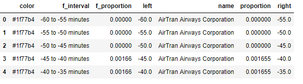 As a reminder, we are using the Bokeh
 quad glyphs to make the histogram and so we need to provide the left, right, and top of the glyph (the bottom will be fixed at 0). These are in the left, right, and proportion columns respectively. The color column gives each carrier a unique color and the f_ columns provide formatted text for the tooltips.
The next function to implement is make_plot. The function should take in a ColumnDataSource (a specific type of object used in Bokeh for plotting) and return the plot object:
If we pass in a source with all airlines, this code gives us the following plot:
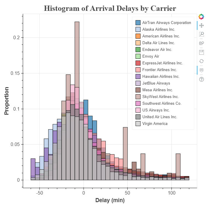 This histogram is very cluttered because there are 16 airlines plotted on the same graph! If we want to compare airlines, it’s nearly impossible because of the overlapping information. Luckily, we can add widgets to make the plot clearer and enable quick comparisons.
Creating Widget Interactions
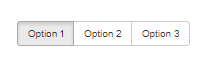
Once we create a basic figure in Bokeh adding in interactions via widgets is relatively straightforward. The first widget we want is a selection box that allows viewers to select airlines to display. This control will be a check box which allows as many selections as desired and is known in Bokeh as a CheckboxGroup. To make the selection tool, we import the CheckboxGroup class and create an instance with two parameters, labels: the values we want displayed next to each box and active: the initial boxes which are checked. Here is the code to create a CheckboxGroup with all carriers.
from bokeh.models.widgets import CheckboxGroup

# Create the checkbox selection element, available carriers is a
# list of all airlines in the data
carrier_selection = CheckboxGroup(labels=available_carriers,
                                  active = [0, 1])
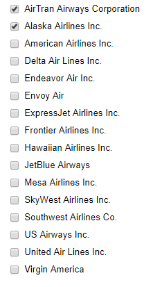 CheckboxGroup widget
The labels in a Bokeh checkbox must be strings, while the active values are integers. This means that in the image ‘AirTran Airways Corporation’ maps to the active value of 0 and ‘Alaska Airlines Inc.’ maps to the active value of 1. When we want to match the selected checkboxes to the airlines, we need to make sure to find the string names associated with the selected integer active values. We can do this using the .labels and .active attributes of the widget:
# Select the airlines names from the selection values
[carrier_selection.labels[i] for i in carrier_selection.active]

**['AirTran Airways Corporation', 'Alaska Airlines Inc.']**
After making the selection widget, we now need to link the selected airline checkboxes to the information displayed on the graph. This is accomplished using the .on_change method of the CheckboxGroup and an update function that we define. The update function always takes three arguments: attr, old, new and updates the plot based on the selection controls. The way we change the data displayed on the graph is by altering the data source that we passed to the glyph(s) in the make_plot function. That might sound a little abstract, so here’s an example of an update function that changes the histogram to display the selected airlines:
# Update function takes three default parameters
def update(attr, old, new):
    # Get the list of carriers for the graph
    carriers_to_plot = [carrier_selection.labels[i] for i in
                        carrier_selection.active]

# Make a new dataset based on the selected carriers and the
    # make_dataset function defined earlier
    new_src = make_dataset(carriers_to_plot,
                           range_start = -60,
                           range_end = 120,
                           bin_width = 5)

# Update the source used in the quad glpyhs
    src.data.update(new_src.data)
Here, we are retrieving the list of airlines to display based on the selected airlines from the CheckboxGroup. This list is passed to the make_datasetfunction which returns a new column data source. We update the data of the source used in the glyphs by calling src.data.update and passing in the data from the new source. Finally, in order to link changes in the carrier_selection widget to the update function, we have to use the .on_change method (called an event handler).
# Link a change in selected buttons to the update function
carrier_selection.on_change('active', update)
This calls the update function any time a different airline is selected or unselected. The end result is that only glyphs corresponding to the selected airlines are drawn on the histogram, which can be seen below:
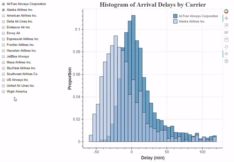 ## More Controls
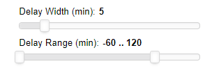
Now that we know the basic workflow for creating a control we can add in more elements. Each time, we create the widget, write an update function to change the data displayed on the plot, and link the update function to the widget with an event handler. We can even use the same update function for multiple elements by rewriting the function to extract the values we need from the widgets. To practice, we will add two additional controls: a Slider which selects the bin width for the histogram, and a RangeSlider that sets the minimum and maximum delays to display. Here’s the code to make both of these widgets and the new update function:
The standard slider and the range slider are shown here:
 If we want, we can also change other aspects of the plot besides the data displayed using the update function. For example, to change the title text to match the bin width we can do:
# Change plot title to match selection
bin_width = binwidth_select.value
p.title.text = 'Delays with %d Minute Bin Width' % bin_width
There are many other types of interactions in Bokeh, but for now, our three controls allow users plenty to “play” with on the chart!
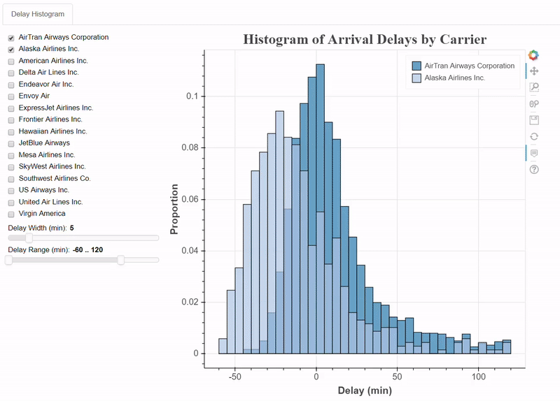
Putting it all together
All the elements for our interactive plot are in place. We have the three necessary functions: make_dataset, make_plot, and update to change the plot based on the controls and the widgets themselves. We join all of these elements onto one page by defining a layout.
from bokeh.layouts import column, row, WidgetBox
from bokeh.models import Panel
from bokeh.models.widgets import Tabs

# Put controls in a single element
controls = WidgetBox(carrier_selection, binwidth_select, range_select)

# Create a row layout
layout = row(controls, p)

# Make a tab with the layout
tab = Panel(child=layout, title = 'Delay Histogram')
tabs = Tabs(tabs=[tab])
I put the entire layout onto a tab, and when we make a full application, we can put each plot on a separate tab. The final result of all this work is below:
 Feel free to check out the code and plot for yourself on GitHub.
Next Steps and Conclusions
The next part of this series will look at how we can make a complete application with multiple plots. We will be able to show our work on a server and access it in a browser, creating a full dashboard to explore the dataset.
We can see that the final interactive plot is much more useful than the original! We can now compare delays between airlines and change the bin widths/ranges to see how the distribution is affected. Adding interactivity raises the value of a plot because it increases engagement with the data and allows users to arrive at conclusions through their own explorations. Although setting up the initial plot was involved, we saw how we could easily add elements and control widgets to an existing figure. The customizability of plots and interactions are the benefits of using a heavier plotting library like Bokeh compared to something quick and simple like matplotlib. Different visualization libraries have different advantages and use-cases, but when we want to add the extra dimension of interaction, Bokeh is a great choice. Hopefully at this point you are confident enough to start developing your own visualizations, and please share anything you create!
I welcome feedback and constructive criticism and can be reached on Twitter @koehrsen_will.