
Data Visualization With Bokeh In Python Part Iii A Complete Dashboard
Creating an interactive visualization application in Bokeh
Sometimes I learn a data science technique to solve a specific problem. Other times, as with Bokeh, I try out a new tool because I see some cool projects on Twitter and think: “That looks pretty neat. I’m not sure when I’ll use it, but it could come in handy.” Nearly every time I say this, I end up finding a use for the tool. Data science requires knowledge of many different skills and you never know where that next idea you will use will come from!
In the case of Bokeh, several weeks after trying it out, I found a perfect use case in my work as a data science researcher. My research project involves increasing the energy efficiency of commercial buildings using data science, and, for a recent conference, we needed a way to show off the results of the many techniques we apply. The usual suggestion of a powerpoint gets the job done, but doesn’t really stand out. By the time most people at a conference see their third slide deck, they have already stopped paying attention. Although I didn’t yet know Bokeh very well, I volunteered to try and make an interactive application with the library, thinking it would allow me to expand my skill-set and create an engaging way to show off our project. Skeptical, our team prepared a back-up presentation, but after I showed them some prototypes, they gave it their full support. The final interactive dashboard was a stand-out at the conference and will be adopted by our team for future use:
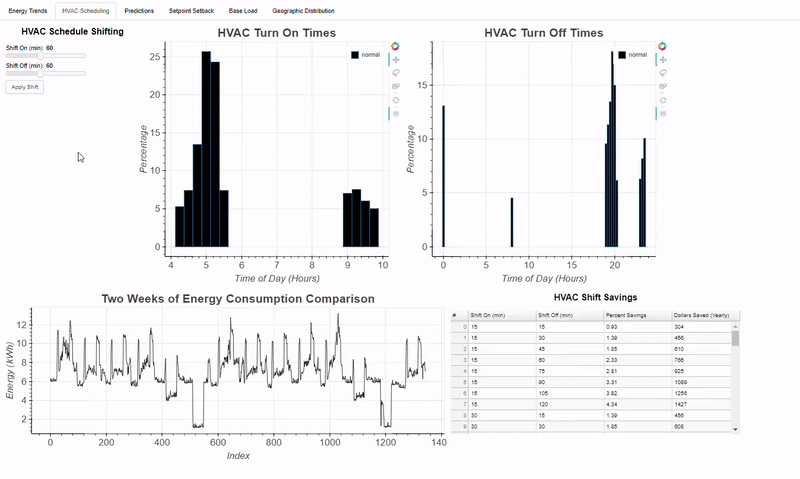 Example of Bokeh Dashboard built for my research
While not every idea you see on Twitter is probably going to be helpful to your career, I think it’s safe to say that knowing more data science techniques can’t possibly hurt. Along these lines, I started this series to share the capabilities of Bokeh, a powerful plotting library in Python that allows you to make interactive plots and dashboards. Although I can’t share the dashboard for my research, I can show the basics of building visualizations in Bokeh using a publicly available dataset. This third post is a continuation of my Bokeh series, with Part I focused on building a simple graph, and Part II showing how to add interactions to a Bokeh plot. In this post, we will see how to set up a full Bokeh application and run a local Bokeh server accessible in your browser!
This article will focus on the structure of a Bokeh application rather than the plot details, but the full code for everything can be found on GitHub. We will continue to use the NYCFlights13 dataset, a real collection of flight information from flights departing 3 NYC airports in 2013. There are over 300,000 flights in the dataset, and for our dashboard, we will focus primarily on exploring the arrival delay information.
To run the full application for yourself, make sure you have Bokeh installed ( using pip install bokeh), download the [bokeh_app.zip](https://github.com/WillKoehrsen/Bokeh-Python-Visualization/blob/master/bokeh_app.zip?) folder from GitHub, unzip it, open a command window in the directory, and type bokeh serve --show bokeh_app. This will set-up a local Bokeh server and open the application in your browser (you can also make Bokeh plots available publicly online, but for now we will stick to local hosting).
Final Product
Before we get into the details, let’s take a look at the end product we’re aiming for so we can see how the pieces fit together. Following is a short clip showing how we can interact with the complete dashboard:
Final Bokeh Flights Application
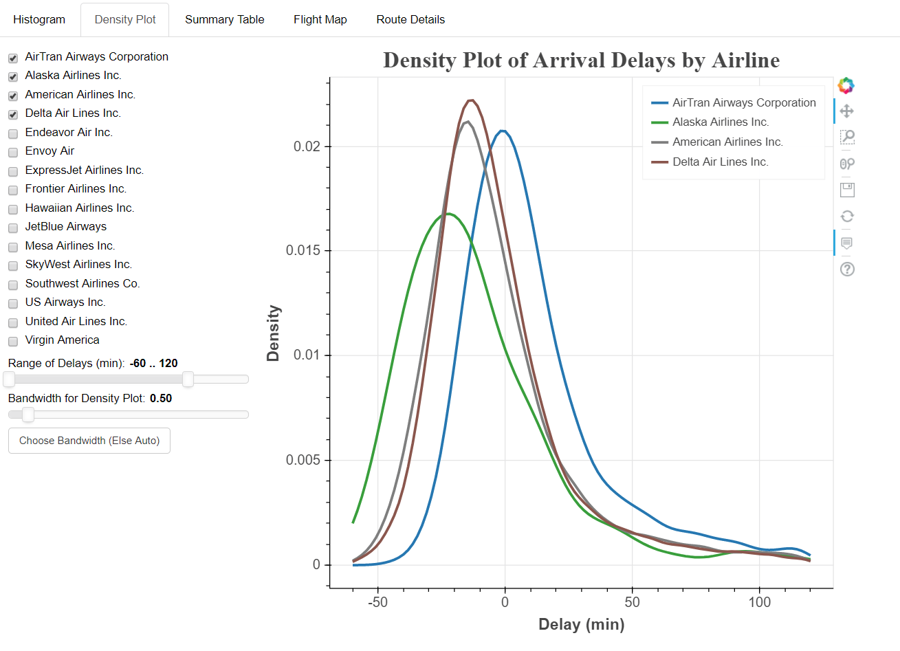
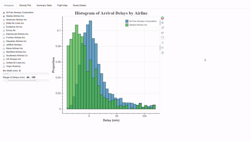
Here I am using the Bokeh application in a browser (in Chrome’s fullscreen mode) that is running on a local server. At the top we see a number of tabs, each of which contains a different section of the application. The idea of a dashboard is that while each tab can stand on its own, we can join many of them together to enable a complete exploration of the data. The video shows the range of charts we can make with Bokeh, from histograms and density plots, to data tables that we can sort by column, to fully interactive maps. Besides the range of figures we can create in Bokeh, another benefit of using this library is interactions. Each tab has an interactive element which lets users engage with the data and make their own discoveries. From experience, when exploring a dataset, people like to come to insights on their own, which we can allow by letting them select and filter data through various controls.
Now that we have an idea of the dashboard we are aiming for, let’s take a look at how to create a Bokeh application. I highly recommend downloading the code for yourself to follow along!
Structure of a Bokeh Application
Before writing any code, it’s important to establish a framework for our application. In any project, it’s easy to get carried away coding and soon become lost in a mess of half-finished scripts and out-of-place data files, so we want to create a structure beforehand for all our codes and data to slot into. This organization will help us keep track of all the elements in our application and assist in debugging when things inevitably go wrong. Also, we can re-use this framework for future projects so our initial investment in the planning stage will pay off down the road.
To set up a Bokeh application, I create one parent directory to hold everything called bokeh_app . Within this directory, we will have a sub-directory for our data (called data), a sub-directory for our scripts (scripts), and a main.py script to pull everything together. Generally, to manage all the code, I have found it best to keep the code for each tab in a separate Python script and call them all from a single main script. Following is the file structure I use for a Bokeh application, adapted from the official documentation.
bokeh_app
|
+--- data
|   +--- info.csv
|   +--- info2.csv
|
+--- scripts
|   +--- plot.py
|   +--- plot2.py
|
+--- main.py
For the flights application, the structure follows the general outline:
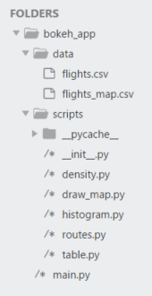 Folder structure of flights dashboard
There are three main parts: data, scripts, and main.py, under one parentbokeh_app directory. When it comes time to run the server, we tell Bokeh to serve the bokeh_app directory and it will automatically search for and run the main.py script. With the general structure in place, let’s take a look at main.py which is what I like to call the executive of the Bokeh application (not a technical term)!
main.py
The main.py script is like the executive of a Bokeh application. It loads in the data, passes it out to the other scripts, gets back the resulting plots, and organizes them into one single display. This will be the only script I show in its entirety because of how critical it is to the application:
We start out with the necessary imports including the functions to make the tabs, each of which is stored in a separate script within the scripts directory. If you look at the file structure, notice that there is an __init__.py file in the scripts directory. This is a completely blank file that needs to be placed in the directory to allow us to import the appropriate functions using relative statements (e.g. from scripts.histogram import histogram_tab ). I’m not quite sure why this is needed, but it works (here’s the Stack Overflow answer I used to figure this out).
After the library and script imports, we read in the necessary data with help from the Python [__file__](https://stackoverflow.com/questions/9271464/what-does-the-file-variable-mean-do/9271617?) attribute. In this case, we are using two pandas dataframes ( flights and map_data ) as well as US states data that is included in Bokeh. Once the data has been read in, the script proceeds to delegation: it passes the appropriate data to each function, the functions each draw and return a tab, and the main script organizes all these tabs in a single layout called tabs. As an example of what each of these separate tab functions does, let’s look at the function that draws the map_tab.
This function takes in map_data (a formatted version of the flights data) and the US state data and produces a map of flight routes for selected airlines:
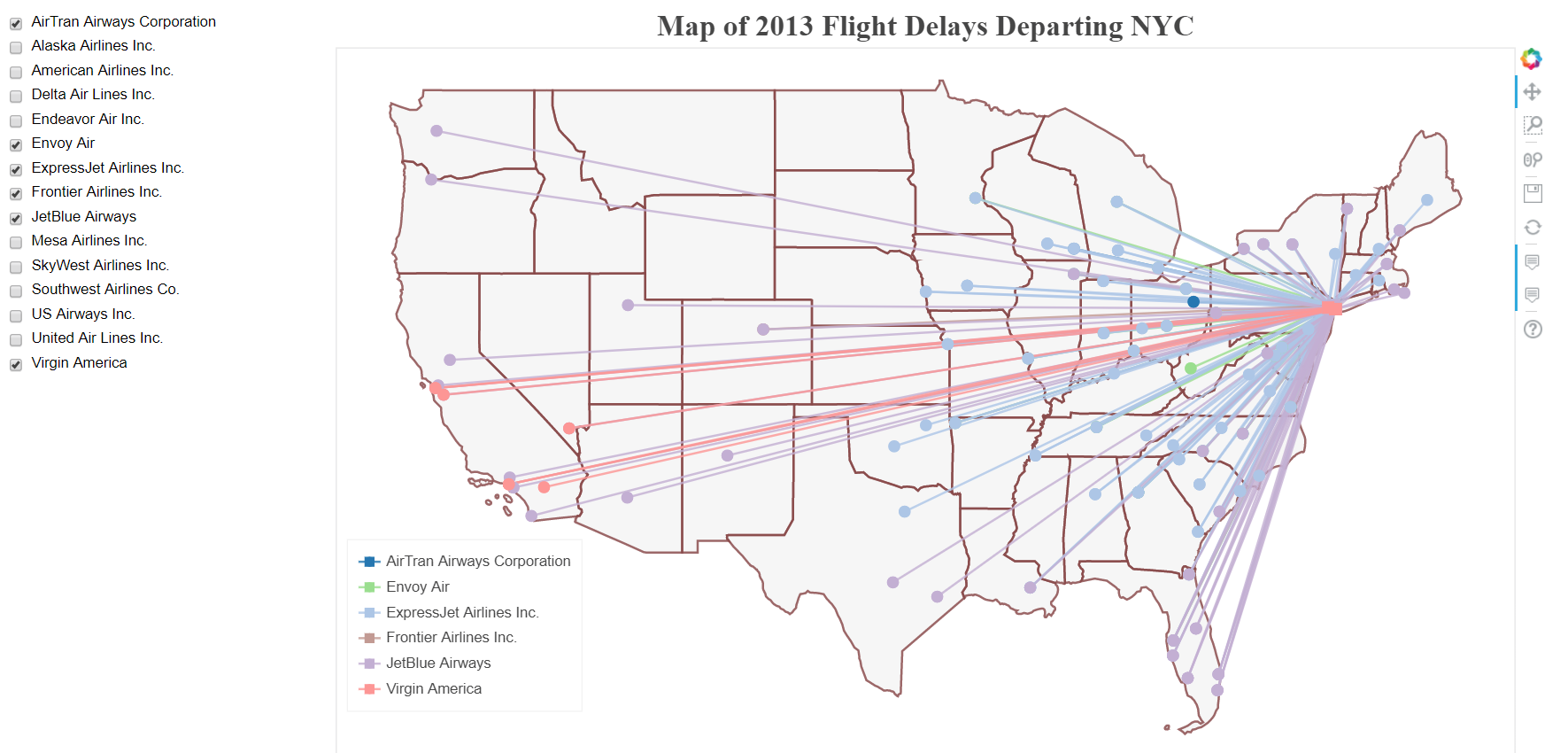 Map Tab
We covered interactive plots in Part II of this series, and this plot is just an implementation of that idea. The overall structure of the function is:
def map_tab(map_data, states):
    ...

    def make_dataset(airline_list):
    ...
       return new_src

def make_plot(src):
    ...
       return p

def update(attr, old, new):
   ...

new_src = make_dataset(airline_list)
      src.data.update(new_src.data)

controls = ...

tab = Panel(child = layout, title = 'Flight Map')

   return tab
We see the familiar make_dataset, make_plot, and update functions used to draw the plot with interactive controls. Once we have the plot set up, the final line returns the entire plot to the main script. Each individual script (there are 5 for the 5 tabs) follows the same pattern.
Returning to the main script, the final touch is to gather the tabs and add them to a single document.
# Put all the tabs into one application
tabs = Tabs(tabs = [tab1, tab2, tab3, tab4, tab5])

# Put the tabs in the current document for display
curdoc().add_root(tabs)
The tabs appear at the top of the application, and much like tabs in any browser, we can easily switch between them to explore the data.
 # Running the Bokeh Server
After all the set-up and coding required to make the plots, running the Bokeh server locally is quite simple. We open up a command line interface (I prefer Git Bash but any one will work), change to the directory containing bokeh_app and run bokeh serve --show bokeh_app. Assuming everything is coded correctly, the application will automatically open in our browser at the address http://localhost:5006/bokeh_app. We can then access the application and explore our dashboard!
 Final Bokeh Flights Application
Debugging in a Jupyter Notebook
If something goes wrong (as it undoubtedly will the first few times we write a dashboard) it can be frustrating to have to stop the server, make changes to the files, and restart the server to see if our changes had the desired effect. To quickly iterate and resolve problems, I generally develop plots in a Jupyter Notebook. The Jupyter Notebook is a great environment for Bokeh development because you can create and test fully interactive plots from within the notebook. The syntax is a little different, but once you have a completed plot, the code just needs to be slightly modified and can then be copied and pasted into a standalone .py script. To see this in action, take a look at the Jupyter Notebook I used to develop the application.
Conclusions
A fully interactive Bokeh dashboard makes any data science project stand out. Oftentimes, I see my colleagues do a lot of great statistical work but then fail to clearly communicate the results, which means all that work doesn’t get the recognition it deserves. From personal experience, I have also seen how effective Bokeh applications can be in communicating results. While making a full dashboard is a lot of work (this one is over 600 lines of code!) the results are worthwhile. Moreover, once we have an application, we can quickly share it using GitHub and if we are smart about our structure, we can re-use the framework for additional projects.
The key points to take away from this project are applicable to many data science projects in general:
- Having the proper framework/structure in place before you start on a data science task — Bokeh or anything else — is crucial. This way, you won’t find yourself lost in a forest of code trying to find errors. Also, once we develop a framework that works, it can be re-used with minimal effort, leading to dividends far down the road.
- Finding a debugging cycle that allows you to quickly iterate through ideas is crucial. The write code —see results — fix errors loop allowed by the Jupyter Notebook makes for a productive development cycle (at least for small scale projects).
- Interactive applications in Bokeh will elevate your project and encourage user engagement. A dashboard can be a stand alone exploratory project, or highlight all the tough analysis work you’ve already done!
- You never know where you will find the next tool you will use in your work or side projects. Keep your eyes open, and don’t be afraid to experiment with new software and techniques!
That’s all for this post and for this series, although I plan on releasing additional stand-alone tutorials on Bokeh in the future. With libraries like Bokeh and plot.ly it’s becoming easier to make interactive figures and having a way to present your data science results in a compelling manner is crucial. Check out this Bokeh GitHub repo for all my work and feel free to fork and get started with your own projects. For now, I’m eager to see what everyone else can create!
As always, I welcome feedback and constructive criticism. I can be reached on Twitter @koehrsen_will.