
Data Visualization With Bokeh In Python Part One Getting Started

##Elevate your visualization game
The most sophisticated statistical analysis can be meaningless without an effective means for communicating the results. This point was driven home by a recent experience I had on my research project, where we use data science to improve building energy efficiency. For the past several months, one of my team members has been working on a technique called wavelet transforms which is used to analyze the frequency components of a time-series. The method achieves positive results, but she was having trouble explaining it without getting lost in the technical details.
Exasperated, she asked me if I could make a visual showing the transformation. In a couple minutes using an R package called gganimate, I made a simple animation showing how the method transforms a time-series. Now, instead of struggling to explain wavelets, my team member can show the clip to provide an intuitive idea of how the technique works. My conclusion was we can do the most rigorous analysis, but at the end of the day, all people want to see is a gif! While this statement is meant to be humorous, it has an element of truth: results will have little impact if they cannot be clearly communicated, and often the best way for presenting the results of an analysis is with visualizations.
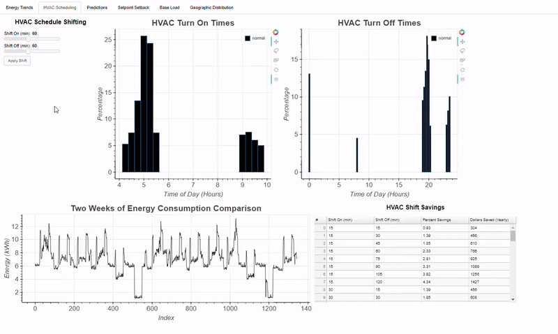
The resources available for data science are advancing rapidly which is especially pronounced in the realm of visualization where it seems there is another option to try every week. With all these advances there is one common trend: increased interactivity. People like to see data in static graphs but what they enjoy even more is playing with the data to see how changing parameters affects the results. With regards to my research, a report telling a building owner how much electricity they can save by changing their AC schedule is nice, but it’s more effective to give them an interactive graph where they can choose different schedules and see how their choice affects electricity consumption. Recently, inspired by the trend towards interactive plots and a desire to keep learning new tools, I have been working with Bokeh, a Python library. An example of the interactive capabilities of Bokeh are shown in this dashboard I built for my research project:
While I can’t share the code behind this project, I can walk through an example of building a fully-interactive Bokeh application using publicly available data. This series of articles will cover the entire process of creating an application using Bokeh. For this first post, we’ll cover the basic elements of Bokeh, which we’ll build upon in subsequent posts. Throughout this series, we’ll be working with the nycflights13 dataset, which has records of over 300,000 flights from 2013. We will first concentrate on visualizing a single variable, in this case the arrival delay of flights in minutes and we’ll start by constructing a basic histogram, a classic method for display the spread and location of one continuous variable. The full code is accessible on GitHub and the first Jupyter notebook can be found here. This post focuses on the visuals so I encourage anyone to check out the code if they want to see the unglamorous, but necessary steps of data cleaning and formatting!
Basics of Bokeh
The major concept of Bokeh is that graphs are built up one layer at a time. We start out by creating a figure, and then we add elements, called glyphs, to the figure. (For those who have used ggplot, the idea of glyphs is essentially the same as that of geoms which are added to a graph one ‘layer’ at a time.) Glyphs can take on many shapes depending on the desired use: circles, lines, patches, bars, arcs, and so on. Let’s illustrate the idea of glyphs by making a basic chart with squares and circles. First, we make a plot using the figure method and then we append our glyphs to the plot by calling the appropriate method and passing in data. Finally, we show our plot (I’m using a Jupyter Notebook which lets you see the plots right below the code if you use the output_notebook call).
This generates the slightly uninspiring plot below:
 While we could have easily made this chart in any plotting library, we get a few tools for free with any Bokeh plot which are on the right side and include panning, zooming, selection, and plot saving abilities. These tools are configurable and will come in handy when we want to investigate our data.
Let’s now get to work on showing our flight delay data. Before we can jump right into the graph, we should load in the data and give it a brief inspection (bold is code output):
# Read the data from a csv into a dataframe
flights = pd.read_csv('../data/flights.csv', index_col=0)

# Summary stats for the column of interest
flights['arr_delay'].describe()

**count    327346.000000
mean          6.895377
std          44.633292
min         -86.000000
25%         -17.000000
50%          -5.000000
75%          14.000000
max        1272.000000**
The summary stats give us information to inform our plotting decisions: we have 327,346 flights, with a minimum delay of -86 minutes (meaning the flight was early by 86 minutes) and a maximum delay of 1272 minutes, an astounding 21 hours! The 75% quantile is only at 14 minutes, so we can assume that numbers over 1000 minutes are likely outliers (which does not mean they are illegitimate, just extreme). I will focus on delays between -60 minutes and +120 minutes for our histogram.
A histogram is a common choice for an initial visualization of a single variable because it shows the distribution of the data. The x-position is the value of the variable grouped into intervals called bins, and the height of each bar represents the count (number) of data points in each interval. In our case, the x-position will represent the arrival delay in minutes and the height is the number of flights in the corresponding bin. Bokeh does not have a built-in histogram glyph, but we can make our own using the quad glyph which allows us to specify the bottom, top, left, and right edges of each bar.
To create the data for the bars, we will use the numpy [histogram](https://docs.scipy.org/doc/numpy-1.14.0/reference/generated/numpy.histogram.html?) function which calculates the number of data points in each specified bin. We will use bins of 5 minute length which means the function will count the number of flights in each five minute delay interval. After generating the data, we put it in a pandas dataframe to keep all the data in one object. The code here is not crucial for understanding Bokeh, but it’s useful nonetheless because of the prevalence of numpy and pandas in data science!
"""Bins will be five minutes in width, so the number of bins
is (length of interval / 5). Limit delays to [-60, +120] minutes using the range."""

arr_hist, edges = np.histogram(flights['arr_delay'],
                               bins = int(180/5),
                               range = [-60, 120])

# Put the information in a dataframe
delays = pd.DataFrame({'arr_delay': arr_hist,
                       'left': edges[:-1],
                       'right': edges[1:]})
Our data looks like this:
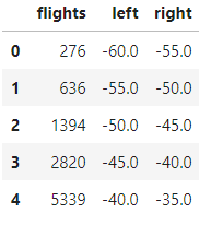 The
The flightscolumn is the count of the number of flights within each delay interval from leftto right. From here, we can make a new Bokeh figure and add a quad glpyh specifying the appropriate parameters:
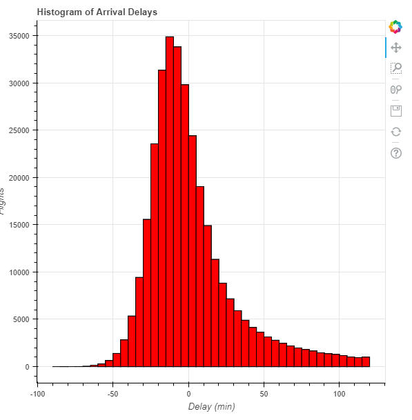 Most of the work in producing this graph comes in the data formatting which is not an unusual occurrence in data science! From our plot, we see that arrival delays are nearly normally distributed with a slight positive skew or heavy tail on the right side.
There are easier ways to create a basic histogram in Python, and the same result could be done using a few lines of [matplotlib](https://en.wikipedia.org/wiki/Matplotlib?). However, the payoff in the development required for a Bokeh plot comes in the tools and ways to interact with the data that we can now easily add to the graph.
Adding Interactivity
The first type of interactivity we will cover in this series is passive interactions. These are actions the viewer can take which do not alter the data displayed. These are referred to as inspectors because they allow viewers to “investigate” the data in more detail . A useful inspector is the tooltip which appears when a user mouses over data points and is called the HoverTool in Bokeh.
 A basic Hover tooltip
In order to add tooltips, we need to change our data source from a dataframe to a ColumnDataSource, a key concept in Bokeh. This is an object specifically used for plotting that includes data along with several methods and attributes. The ColumnDataSource allows us to add annotations and interactivity to our graphs, and can be constructed from a pandas dataframe. The actual data itself is held in a dictionary accessible through the data attribute of the ColumnDataSource. Here, we create the source from our dataframe and look at the keys of the data dictionary which correspond to the columns of our dataframe.
# Import the ColumnDataSource class
from bokeh.models import ColumnDataSource

# Convert dataframe to column data source
src = ColumnDataSource(delays)
src.data.keys()

**dict_keys(['flights', 'left', 'right', 'index'])**
When we add glyphs using a ColumnDataSource, we pass in the ColumnDataSource as the source parameter and refer to the column names using strings:
# Add a quad glyph with source this time
p.quad(source = src, bottom=0, top='flights',
       left='left', right='right',
       fill_color='red', line_color='black')
Notice how the code refers to the specific data columns, such as ‘flights’, ‘left’, and ‘right’ by a single string instead of the df['column'] format as before.
HoverTool in Bokeh
The syntax of a HoverTool may seem a little convoluted at first, but with practice they are quite easy to create. We pass our HoverToolinstance a list of tooltips as Python tuples where the first element is the label for the data and the second references the specific data we want to highlight. We can reference either attributes of the graph, such as x or y position using ‘$’ or specific fields in our source using ‘@’. That probably sounds a little confusing so here’s an example of a HoverTool where we do both:
# Hover tool referring to our own data field using @ and
# a position on the graph using $
h = HoverTool(tooltips = [('Delay Interval Left ', '[@](http://twitter.com/f_interval?)left'),
                          ('(x,y)', '($x, $y)')])
Here, we reference the left data field in the ColumnDataSource (which corresponds to the ‘left’ column of the original dataframe) using ‘@’ and we reference the (x,y) position of the cursor using ‘$’. The result is below:
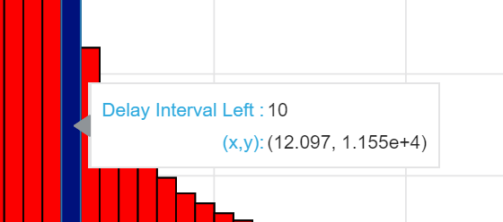 Hover tooltip showing different data references
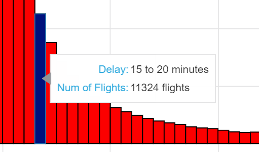
The (x,y) position is that of the mouse on the graph and is not very helpful for our histogram, because we to find the find the number of flights in a given bar which corresponds to the top of the bar. To fix that we will alter our tooltip instance to refer to the correct column. Formatting the data shown in a tooltip can be frustrating, so I usually create another column in my dataframe with the correct formatting. For example, if I want my tooltip to show the entire interval for a given bar, I create a formatted column in my dataframe:
# Add a column showing the extent of each interval
delays['f_interval'] = ['%d to %d minutes' % (left, right) for left, right in zip(delays['left'], delays['right'])]
Then I convert this dataframe into a ColumnDataSource and access this column in my HoverTool call. The following code creates the plot with a hover tool referring to two formatted columns and adds the tool to the plot:
In the Bokeh style, we include elements in our chart by adding them to the original figure. Notice in the p.quad glyph call, there are a few additional parameters, hover_fill_alpha and hover_fill_color, that change the look of the glyph when we mouse over the bar. I also added in styling using a style function (see the notebook for the code). Aesthetics are tedious to type, so I usually write a function that I can apply to any plot. When I use styling, I keep things simple and focus on readability of labels. The main point of a plot is to show the data, and adding unnecessary elements only detracts from the usefulness of a figure! The final plot is presented below:
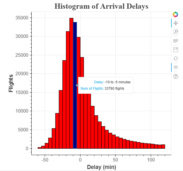 As we mouse over different bars, we get the precise statistics for that bar showing the interval and the number of flights within that interval. If we are proud of our plot, we can save it to an html file to share:
# Import savings function
from bokeh.io import output_file

# Specify the output file and save
output_file('hist.html')
show(p)
Further Steps and Conclusions
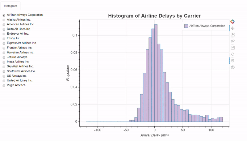
It took me more than one plot to get the basic workflow of Bokeh so don’t worry if it seems there is a lot to learn. We’ll get plenty more practice over the course of this series! While it might seem like Bokeh is a lot of work, the benefits come when we want to extend our visuals beyond simple static figures. Once we have a basic chart, we can increase the effectiveness of the visual by adding more elements. For example, if we want to look at the arrival delay by airline, we can make an interactive chart allowing users to select and compare airlines. We will leave active interactions, those that change the data displayed, to the next post, but here’s a look at what we can do:
 Active interactions require a bit more involved scripting, but that gives us a chance to work on our Python! (If anyone wants to have a look at the code for this plot before the next article, here it is.)
Throughout this series, I want to emphasize that Bokeh or any one library tool will never be a one stop tool for all your plotting needs. Bokeh is great for allowing users to explore graphs, but for other uses, like simple exploratory data analysis, a lightweight library such asmatplotliblikely will be more efficient. This series is meant to show the capabilities of Bokeh to give you another plotting tool you can rely on as needed. The more libraries you know, the better equipped you will be to use the right visualization tool for the task.
As always, I welcome constructive criticism and feedback. I can be reached on Twitter @koehrsen_will .