
Data Visualization Hackathon Style
My effort to liberate data from spreadsheets
Everyone — corporations, governments, individuals — has data, but few people know how to use it effectively. Data can tell us much about how to make better decisions, but often this knowledge is hidden within the numbers. One problem is that most of the data looks something like this:
 Although the information here, global CO2 emissions, is “open data” in the sense that it’s publicly available for anyone to download, it might as well be locked away for all the good it is doing anyone in a spreadsheet. At its core, data science is about taking these meaningless pages of numbers and turning them into useful knowledge. One of the most effective ways of revealing insights within numbers is through data visualization.
 Data from a spreadsheet turned into knowledge
For HackCWRU 2018, a hackathon hosted at Case Western Reserve University, I wanted to explore the public CO2 data and make it accessible to a general audience. For those who haven’t had the experience, a hackathon is where a bunch of passionate makers — coders, artists, hardware specialists, and occasionally data scientists — get together for a weekend to work on projects for 24 or 36 straight hours. Sometimes there are specific problems to solve, but in other cases, such as with HackCWRU, you are free to choose your team and project. With a limited amount of time to accomplish your goal, sleeping is generally discouraged!
There were all sorts of projects done at HackCWRU: phone apps, virtual reality games, motion capture programs, and I choose to do what I enjoy the most: data visualization. I went solo, under the project name emissions explorer, sticking with my habit of adding explorer to all my projects (see the stock explorer and weight explorer). My objective for the weekend was to show how data visualization can take millions of numbers and turn them into meaningful knowledge by building an interactive data exploration website.
The entire website is available online and the code is also freely available on GitHub for anyone to use or improve. (The website works best on desktop as I didn’t quite have time to make it mobile-responsive. That would be a great fix for anyone to implement!).
 I’ll present most of the results below as I go through my process, but I highly recommend anyone check out the website to get the full experience.
Development Process
Before we can get to the fun part of making visuals, we have to find and clean some data. In a normal data science workflow, this make take up to 90% of the time spent on a project. However, working on a limited time schedule, I needed clean data and fast. I pulled together data from three sources: GapMinder (curated by Tom Carden), the climate data online tool, and the World Bank, all in the familiar csv file format.
The data was in good shape, but there were some inconsistencies, mostly to do with country names. I spent quite a bit of time figuring out that South Korea was coded as ‘Korea, Rep.’ and North Korea as ‘Korea, Dem. Rep.’ All the data formatting was done in Python (in Jupyter Notebooks), making use of Pandas and Numpy. Final versions of the data were saved as json (Javascript Object Notation), a machine readable data-interchange format.
While normally I work with Python and R for analysis and visualization, part of data science is knowing the right tools to use for the job, and one of the best options for interactive plots is d3.js. D3, Data-Driven Documents is a JavaScript library that lets you control every aspect of a chart by building it up one element at a time. It has a very steep learning curve, but the end results are worth it!
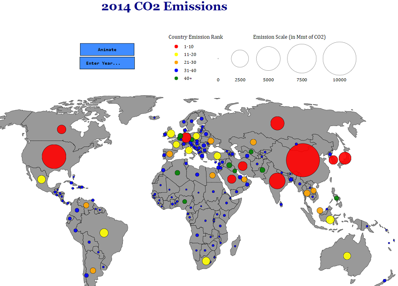
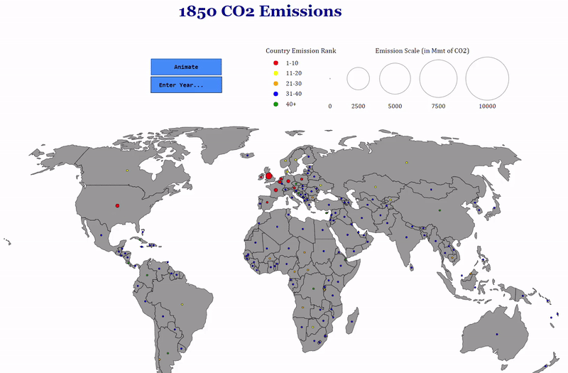
For my first chart, I wanted to do something with a map because I enjoy seeing comparisons between countries in a geographic context. My idea was to create a world map and place circles on countries sized proportional to the amount of CO2 they emitted. The color of the circles would reflect the country’s rank in terms of emissions. As CO2 emissions have changed considerably, especially in the past few decades, I included a time dimension with options to visualize the entire history of the data (1850–2014) and a selection box so users can choose a specific year. The final results are presented in the following animation:
 You can’t make this in Excel
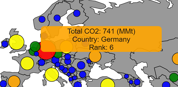
As a finishing touch, I added tooltips showing the exact amount emitted by each country and the country’s ranking in the given year when you mouse over the country. It’s the little details like this that I love about professionally produced charts so I tried to do a little of that on my own!
 After finishing up the map, I wanted to make a better way to compare the top countries over time. There are a lot of details hidden in the map animation, and it’s not great for visualizing trajectories over time. The most common way to show time series is with simple line plots, and I saw no reason to invent a different solution. Again, I kept an interactive element in the chart by allowing users to select specific countries.
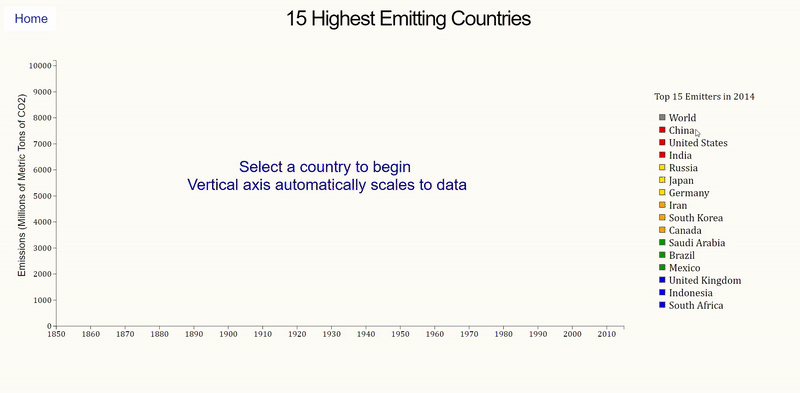 The most difficult part of making this chart was the auto-scaling on the y-axis. Luckily, d3 lets you control every single aspect of a graph, so I was able to specify that the axis scale should update to match the country with the largest emissions. I thought this visual was better for comparing the top 15 countries than the map and playing around with it reveals a number of insights. For example, China surpasses the US in 2005 (not an area in which you want to be #1), and although the United Kingdom initially started out as the largest emitter, by 2014, their output pales in comparison to industrialized nations.
One of the most influential data visualization inspirations to me is the late Hans Rosling, the founder of GapMinder. In particular, his talk showing the demographic changes in countries over time has stuck with me many years after I first watched it, in a way that no spreadsheet ever could.
For a final visual, I wanted to try and recreate the GapMinder style of chart and use some additional socio-economic data in the process. Drawing heavily on Mike Bostock’s The Wealth and Health of Nations Chart, I made my own take on the animated, interactive visual. There were four different variables to represent on the same graph, which I broke up into the following
- X-axis shows the population of a country on a log scale
- Y-axis shows GDP per Capita, a measure of a country’s wealth
- The area of the circles is proportional to the CO2 emissions
- The color of the circles represents the rank of the country
The final version takes some time to absorb because it presents quite a bit of information!
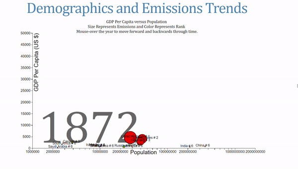 This chart also allows users to change the year by mousing over the label. When I was showcasing this, I had a number of people compare this to Hans Rosling’s work, which might be the highest data visualization complement I’ve gotten!
Once I had all the charts together, I put together a quick home page and about page by copying and pasting existing html/css templates. I then hosted my files and created a static website on Amazon S3, a cloud storage service. (This tutorial was helpful). My formal mechanical engineering/data science education did not include any instruction in web design, so the overall aesthetic clearly needs some work. Nonetheless, the three charts accomplish the goal I set out to achieve: liberate this valuable public data from spreadsheets where it is not benefitting anyone!
Conclusions
One element I made sure to include in all the charts was interactivity. When I look at charts, I enjoy playing with the data myself and changing the parameters to find all the nuances. As this was an exploratory data analysis (EDA) project, I wanted to let users come to some conclusions on their own. While the overall message is that CO2 emissions have undoubtedly been increasing over time, there are other interesting takeaways in the charts that people can find on their own. We think of data as containing objective truth, but even with numbers, different individuals will bring their own interpretations that affect the knowledge they derive from the data. There are certainly times when we want to use data to prove a point, such as with medical trials, but in the case of this public data, I wanted to make it more accessible for people to use as they see fit.
Although I did end up winning two prizes — the civic track and best use of Amazon Web Services — the swag isn’t as important as working on a cool project. Furthermore, the hackathon challenged me to learn another skill, d3.js, that I can add to the toolbox I use for data science. Successful data scientists are always willing to learn and there is no stage at which you have mastered everything. D3.js might not be worth the steep learning curve — plot.ly can be used in Python and is built on d3, and Tableau allows you to make professional charts from clean data very quickly — but I enjoyed the project nonetheless. Hackathons are a great way to get a lot of experience on real problems and I recommend them to anyone who loves to solve problems/ create unique projects. While I choose to take a data science approach, hackathons welcome people from all backgrounds, and I encourage anyone to try one out!
If anyone wants to improve my website, or has any other feedback and constructive criticism, I can be reached on Twitter @koehrsen_will.