Histograms And Density Plots In Python

Visualizing One-Dimensional Data in Python
Plotting a single variable seems like it should be easy. With only one dimension how hard can it be to effectively display the data? For a long time, I got by using the simple histogram which shows the location of values, the spread of the data, and the shape of the data (normal, skewed, bimodal, etc.) However, I recently ran into some problems where a histogram failed and I knew it was time to broaden my plotting knowledge. I found an excellent free online book on data visualization, and implemented some of the techniques. Rather than keep everything I learned to myself, I decided it would helpful (to myself and to others) to write a Python guide to histograms and an alternative that has proven immensely useful, density plots.
This article will take a comprehensive look at using histograms and density plots in Python using the matplotlib and seaborn libraries. Throughout, we will explore a real-world dataset because with the wealth of sources available online, there is no excuse for not using actual data! We will visualize the NYCflights13 data, which contains over 300,000 observations of flights departing NYC in 2013. We will focus on displaying a single variable, the arrival delay of flights in minutes. The full code for this article is available as a Jupyter Notebook on GitHub.
It’s always a good idea to examine our data before we get started plotting. We can read the data into a pandas dataframe and display the first 10 rows:
import pandas as pd

# Read in data and examine first 10 rows
flights = pd.read_csv('data/formatted_flights.csv')
flights.head(10)
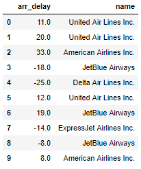 Head of Dataframe
The flight arrival delays are in minutes and negative values mean the flight was early (it turns out flights often tend to arrive early, just never when we’re on them!) There are over 300,000 flights with a minimum delay of -60 minutes and a maximum delay of 120 minutes. The other column in the dataframe is the name of the airline which we can use for comparisons.
Histograms
A great way to get started exploring a single variable is with the histogram. A histogram divides the variable into bins, counts the data points in each bin, and shows the bins on the x-axis and the counts on the y-axis. In our case, the bins will be an interval of time representing the delay of the flights and the count will be the number of flights falling into that interval. The binwidth is the most important parameter for a histogram and we should always try out a few different values of binwidth to select the best one for our data.
To make a basic histogram in Python, we can use either matplotlib or seaborn. The code below shows function calls in both libraries that create equivalent figures. For the plot calls, we specify the binwidth by the number of bins. For this plot, I will use bins that are 5 minutes in length, which means that the number of bins will be the range of the data (from -60 to 120 minutes) divided by the binwidth, 5 minutes ( bins = int(180/5)).
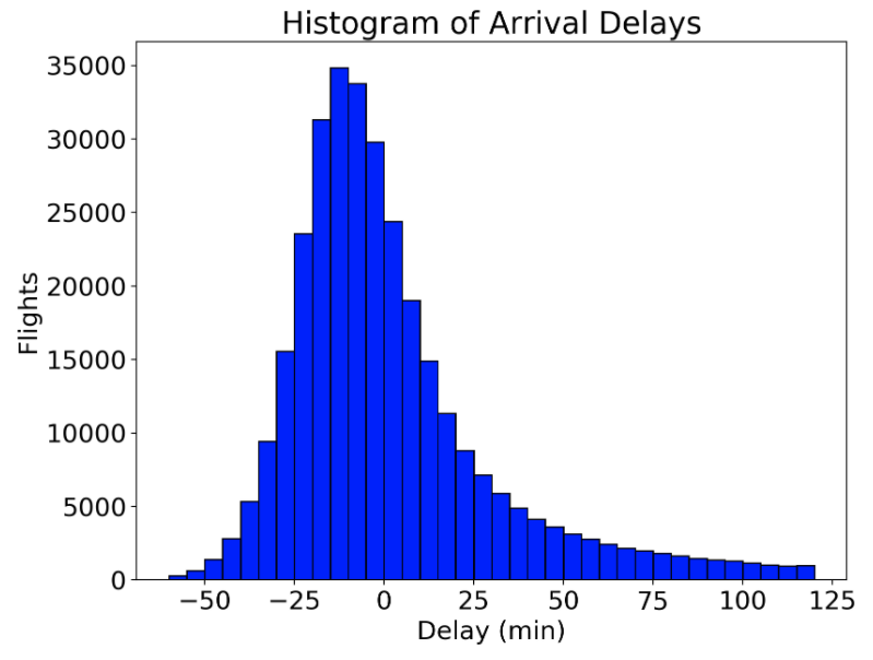 Histogram (equivalent figured produced by both matplotlib and seaborn)
For most basic histograms, I would go with the matplotlib code because it is simpler, but we will use the seaborn distplot function later on to create different distributions and it’s good to be familiar with the different options.
How did I come up with 5 minutes for the binwidth? The only way to figure out an optimal binwidth is to try out multiple values! Below is code to make the same figure in matplotlib with a range of binwidths. Ultimately, there is no right or wrong answer to the binwidth, but I choose 5 minutes because I think it best represents the distribution.
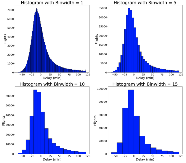 Histograms with Different Binwidths
The choice of binwidth significantly affects the resulting plot. Smaller binwidths can make the plot cluttered, but larger binwidths may obscure nuances in the data. Matplotlib will automatically choose a reasonable binwidth for you, but I like to specify the binwidth myself after trying out several values. There is no true right or wrong answer, so try a few options and see which works best for your particular data.
When Histograms Fail
Histograms are a great way to start exploring a single variable drawn from one category. However, when we want to compare the distributions of one variable across multiple categories, histograms have issues with readability. For example, if we want to compare arrival delay distributions between airlines, an approach that doesn’t work well is to to create histograms for each airline on the same plot:
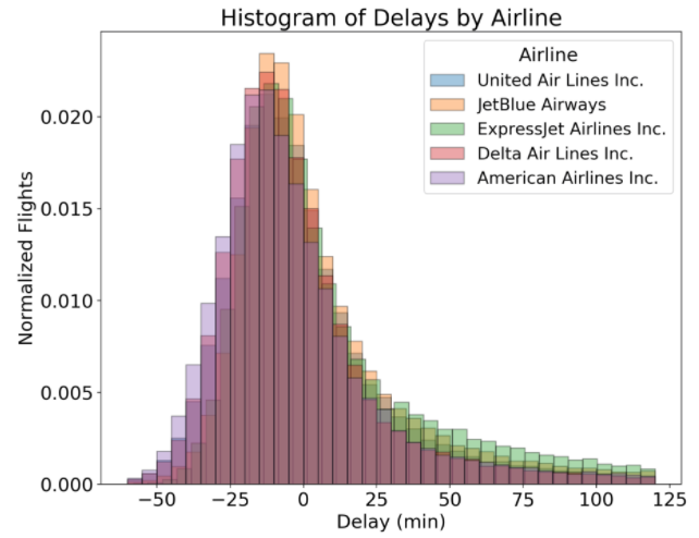 Overlapping Histograms with Multiple Airlines
(Notice that the y-axis has been normalized to account for the differing number of flights between airlines. To do this, pass in the argument norm_hist = True to the sns.distplot function call.)
This plot is not very helpful! All the overlapping bars make it nearly impossible to make comparisons between the airlines. Let’s look at a few possible solutions to this common problem.
Solution #1: Side-by-Side Histograms
Instead of overlapping the airline histograms, we can place them side-by-side. To do this, we create a list of the arrival delays for each airline, and then pass this into the plt.hist function call as a list of lists. We have to specify different colors to use for each airline and a label so we can tell them apart. The code, including creating the lists for each airline is below:
 By default, if we pass in a list of lists, matplotlib will put the bars side-by-side. Here, I have changed the binwidth to 15 minutes because otherwise the plot is too cluttered, but even with this modification, this is not an effective figure. There is too much information to process at once, the bars don’t align with the labels, and it’s still hard to compare distributions between airlines. When we make a plot, we want it to be as easy for the viewer to understand as possible, and this figure fails by that criteria! Let’s look at a second potential solution.
Solution #2: Stacked Bars
Instead of plotting the bars for each airline side-by-side, we can stack them by passing in the parameter stacked = True to the histogram call:
# Stacked histogram with multiple airlines
plt.hist([x1, x2, x3, x4, x5], bins = int(180/15), stacked=True,
         normed=True, color = colors, label=names)
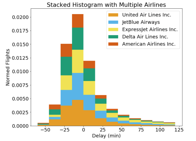 Well, that definitely is not any better! Here, each airline is represented as a section of the whole for each bin, but it’s nearly impossible to make comparisons. For example, at a delay of -15 to 0 minutes, does United Air Lines or JetBlue Airlines have a larger size of the bar? I can’t tell and viewers won’t be able to either. I generally am not a proponent of stacked bars because they can be difficult to interpret (although there are use cases such as when visualizing proportions). Both of the solutions we tried using histograms were not successful, and so it’s time to move to the density plot.
Density Plots
First, what is a density plot? A density plot is a smoothed, continuous version of a histogram estimated from the data. The most common form of estimation is known as kernel density estimation. In this method, a continuous curve (the kernel) is drawn at every individual data point and all of these curves are then added together to make a single smooth density estimation. The kernel most often used is a Gaussian (which produces a Gaussian bell curve at each data point). If, like me, you find that description a little confusing, take a look at the following plot:
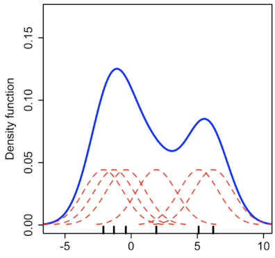 Kernel Density Estimation (Source)
Here, each small black vertical line on the x-axis represents a data point. The individual kernels (Gaussians in this example) are shown drawn in dashed red lines above each point. The solid blue curve is created by summing the individual Gaussians and forms the overall density plot.
The x-axis is the value of the variable just like in a histogram, but what exactly does the y-axis represent? The y-axis in a density plot is the probability density function for the kernel density estimation. However, we need to be careful to specify this is a probability density and not a probability. The difference is the probability density is the probability per unit on the x-axis. To convert to an actual probability, we need to find the area under the curve for a specific interval on the x-axis. Somewhat confusingly, because this is a probability density and not a probability, the y-axis can take values greater than one. The only requirement of the density plot is that the total area under the curve integrates to one. I generally tend to think of the y-axis on a density plot as a value only for relative comparisons between different categories.
Density Plots in Seaborn
To make density plots in seaborn, we can use either the distplot or kdeplot function. I will continue to use the distplot function because it lets us make multiple distributions with one function call. For example, we can make a density plot showing all arrival delays on top of the corresponding histogram:
# Density Plot and Histogram of all arrival delays
sns.distplot(flights['arr_delay'], hist=True, kde=True,
             bins=int(180/5), color = 'darkblue',
             hist_kws={'edgecolor':'black'},
             kde_kws={'linewidth': 4})
 Density Plot and Histogram using seaborn
The curve shows the density plot which is essentially a smooth version of the histogram. The y-axis is in terms of density, and the histogram is normalized by default so that it has the same y-scale as the density plot.
Analogous to the binwidth of a histogram, a density plot has a parameter called the bandwidththat changes the individual kernels and significantly affects the final result of the plot. The plotting library will choose a reasonable value of the bandwidth for us (by default using the ‘scott’ estimate), and unlike the binwidth of a histogram, I usually use the default bandwidth. However, we can look at using different bandwidths to see if there is a better choice. In the plot, ‘scott’ is the default, which looks like the best option.
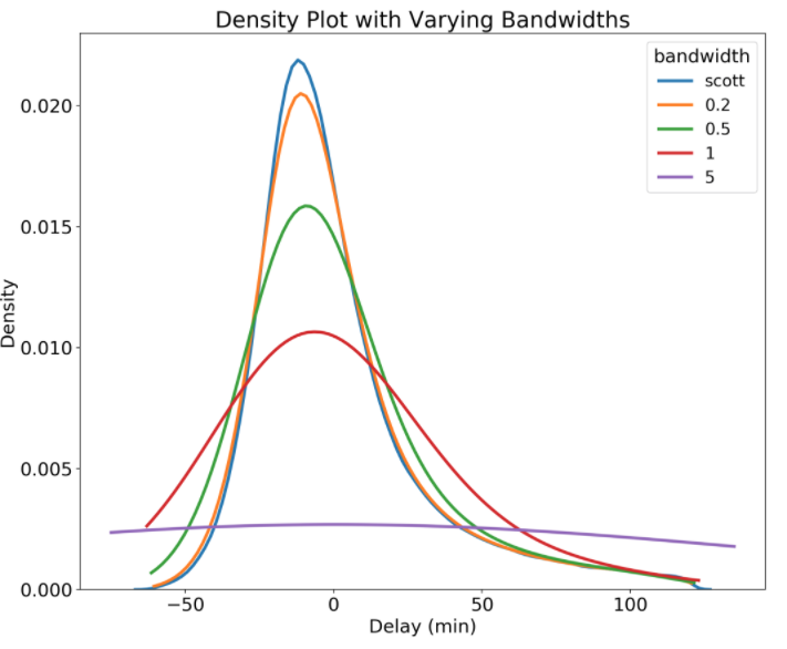 Density Plot Showing different Bandwidths
Notice that a wider bandwidth results in more smoothing of the distribution. We also see that even though we limited our data to -60 to 120 minutes, the density plot extends beyond these limits. This is one potential issue with a density plot: because it calculates a distribution at each data point, it can generate data that falls outside the bounds of the original data. This might mean that we end up with impossible values on the x-axis that were never present in the original data! As a note, we can also change the kernel, which changes the distribution drawn at each data point and thus the overall distribution. However, for most applications, the default kernel, Gaussian, and the default bandwidth estimation work very well.
Solution #3 Density Plot
Now that we understand how a density plot is made and what it represents, let’s see how it can solve our problem of visualizing the arrival delays of multiple airlines. To show the distributions on the same plot, we can iterate through the airlines, each time calling distplot with the kernel density estimate set to True and the histogram set to False. The code to draw the density plot with multiple airlines is below:
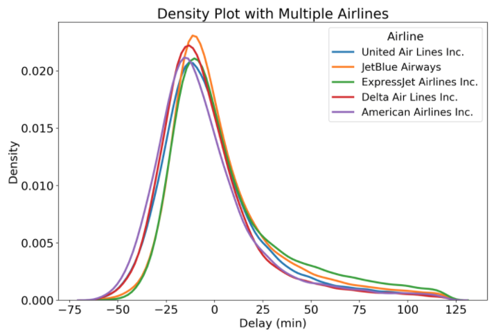 Density Plot with Multiple Airlines
Finally, we have arrived at an effective solution! With the density plot, we can easily make comparisons between airlines because the plot is less cluttered. Now that we finally have the plot we want, we come to the conclusion that all these airlines have nearly identical arrival delay distributions! However, there are other airlines in the dataset, and we can plot one that is a little different to illustrate another optional parameter for density plots, shading the graph.
Shaded Density Plots
Filling in the density plot can help us to distinguish between overlapping distributions. Although this is not always a good approach, it can help to emphasize the difference between distributions. To shade the density plots, we pass in shade = True to the kde_kws argument in the distplot call.
sns.distplot(subset['arr_delay'], hist = False, kde = True,
                 kde_kws = {'shade': True, 'linewidth': 3},
                  label = airline)
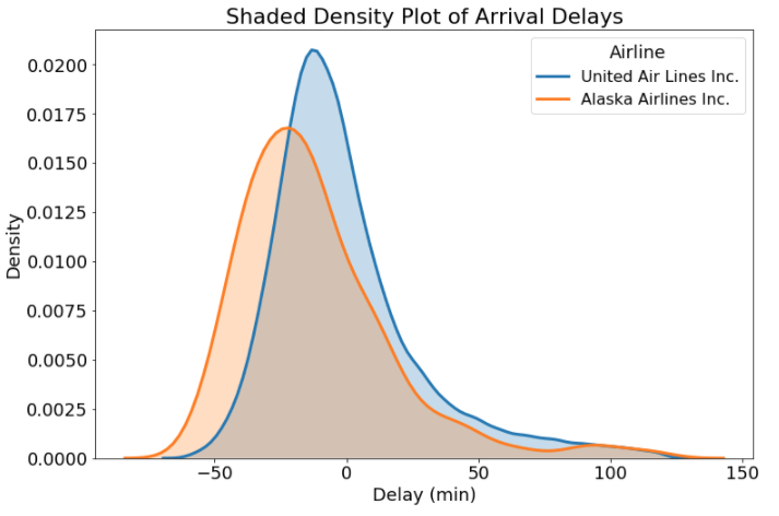 Shaded Density Plot
Whether or not to shade the plot is, like other plotting options, a question that depends on the problem! For this graph, I think it makes sense because the shading helps us distinguish the plots in the regions where they overlap. Now, we finally have some useful information: Alaska Airlines flights tend to be earlier more often than United Airlines. The next time you have the option, you know which airline to choose!
Rug Plots
If you want to show every value in a distribution and not just the smoothed density, you can add a rug plot. This shows every single data point on the x-axis, allowing us to visualize all of the actual values. The benefit of using seaborn’s distplot is that we can add the rug plot with a single parameter call of rug = True (with some formatting as well).
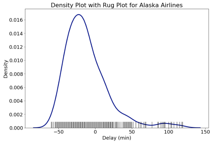 Density Plot with Rug Plot for Alaska Airlines
With many data points the rug plot can become overcrowded, but for some datasets, it can be helpful to view every data point. The rug plot also lets us see how the density plot “creates” data where none exists because it makes a kernel distribution at each data point. These distributions can leak over the range of the original data and give the impression that Alaska Airlines has delays that are both shorter and longer than actually recorded. We need to be careful about this artifact of density plots and point it out to viewers!
Conclusions
This post has hopefully given you a range of options for visualizing a single variable from one or multiple categories. There are even more univariate (single variable) plots we can make such as empirical cumulative density plots and quantile-quantile plots, but for now we will leave it at histograms and density plots (and rug plots too!). Don’t worry if the options seem overwhelming: with practice, making a good choice will become easier, and you can always ask for help if needed. Moreover, often there isn’t an optimal choice and the “right” decision will come down to preference and the objectives of the visualization. The good thing is, no matter what plot you want to make, there is going to be a way to do it in Python! Visualizations are an effective means for communicating results, and knowing all the options available allows us to choose the right figure for our data.
I welcome feedback and constructive criticism and can be reached on Twitter @koehrsen_will.