Data Visualization With Bokeh In Python Part Ii Interactions

Moving beyond static plots

In the first part of this series, we walked through creating a basic histogram in Bokeh, a powerful Python visualization library. The final result, which shows the distribution of arrival delays of flights departing New York City in 2013 is shown below (with a nice tooltip!):

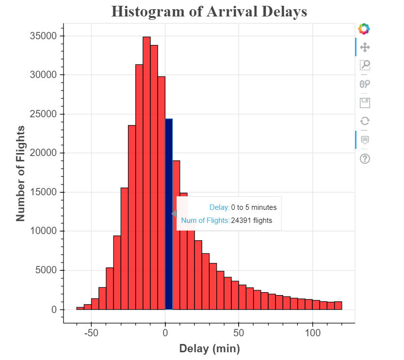
This chart gets the job done, but it’s not very engaging! Viewers can see the distribution of flight delays is nearly normal (with a slight positive skew), but there’s no reason for them to spend more than a few seconds with the figure.

If we want to create more engaging visualization, we can allow users to explore the data on their own through interactions. For example, in this histogram, one valuable feature would be the ability to select specific airlines to make comparisons or the option to change the width of the bins to examine the data in finer detail. Fortunately, these are both features we can add on top of our existing plot using Bokeh. The initial development of the histogram may have seemed involved for a simple plot, but now we get to see the payoff of using a powerful library like Bokeh!

Read More

Data Visualization With Bokeh In Python Part One Getting Started

##Elevate your visualization game

The most sophisticated statistical analysis can be meaningless without an effective means for communicating the results. This point was driven home by a recent experience I had on my research project, where we use data science to improve building energy efficiency. For the past several months, one of my team members has been working on a technique called wavelet transforms which is used to analyze the frequency components of a time-series. The method achieves positive results, but she was having trouble explaining it without getting lost in the technical details.

Exasperated, she asked me if I could make a visual showing the transformation. In a couple minutes using an R package called gganimate, I made a simple animation showing how the method transforms a time-series. Now, instead of struggling to explain wavelets, my team member can show the clip to provide an intuitive idea of how the technique works. My conclusion was we can do the most rigorous analysis, but at the end of the day, all people want to see is a gif! While this statement is meant to be humorous, it has an element of truth: results will have little impact if they cannot be clearly communicated, and often the best way for presenting the results of an analysis is with visualizations.

The resources available for data science are advancing rapidly which is especially pronounced in the realm of visualization where it seems there is another option to try every week. With all these advances there is one common trend: increased interactivity. People like to see data in static graphs but what they enjoy even more is playing with the data to see how changing parameters affects the results. With regards to my research, a report telling a building owner how much electricity they can save by changing their AC schedule is nice, but it’s more effective to give them an interactive graph where they can choose different schedules and see how their choice affects electricity consumption. Recently, inspired by the trend towards interactive plots and a desire to keep learning new tools, I have been working with Bokeh, a Python library. An example of the interactive capabilities of Bokeh are shown in this dashboard I built for my research project:

Read More

Beyond Accuracy: Precision And Recall

Choosing the right metrics for classification tasks

Would you believe someone who claimed to create a model entirely in their head to identify terrorists trying to board flights with greater than 99% accuracy? Well, here is the model: simply label every single person flying from a US airport as not a terrorist. Given the 800 million average passengers on US flights per year and the 19 (confirmed) terrorists who boarded US flights from 2000–2017, this model achieves an astounding accuracy of 99.9999999%! That might sound impressive, but I have a suspicion the US Department of Homeland Security will not be calling anytime soon to buy this model. While this solution has nearly-perfect accuracy, this problem is one in which accuracy is clearly not an adequate metric!

The terrorist detection task is an imbalanced classification problem: we have two classes we need to identify — terrorists and not terrorists — with one category representing the overwhelming majority of the data points. Another imbalanced classification problem occurs in disease detection when the rate of the disease in the public is very low. In both these cases the positive class — disease or terrorist — is greatly outnumbered by the negative class. These types of problems are examples of the fairly common case in data science when accuracy is not a good measure for assessing model performance.

Read More

Controlling The Web With Python

An adventure in simple web automation

Problem: Submitting class assignments requires navigating a maze of web pages so complex that several times I’ve turned an assignment in to the wrong place. Also, while this process only takes 1–2 minutes, it sometimes seems like an insurmountable barrier (like when I’ve finished an assignment way too late at night and I can barely remember my password).

Solution: Use Python to automatically submit completed assignments! Ideally, I would be able to save an assignment, type a few keys, and have my work uploaded in a matter of seconds. At first this sounded too good to be true, but then I discovered selenium, a tool which can be used with Python to navigate the web for you.

Obligatory XKCD

Read More

Unintended Consequences And Goodharts Law

The importance of using the right metrics

In order to increase revenue, the manager of a customer service call center starts a new policy: rather than being paid an hourly wage, every employee is compensated solely based on the number of calls they make. After the first week, the experiment seems like a resounding success: the call center is processing twice the number of calls per day! The manager, who never bothers to listen to his employees’ conversations as long as their numbers are good, is quite pleased. However, when the boss stops by, she insists on going out to the floor and when she does so, both she and the manager are shocked by what they hear: the employees pick up the phone, issue a series of one word answers, and slam the phone down without waiting for a good-bye. No wonder the number of completed calls has doubled! Without intending to, by judging performance only by the volume of calls, the manager has incentivized employees to value speed over courtesy. Unknowingly, he has fallen for the phenomenon known as Goodhart’s Law.

Goodhart’s Law is expressed simply as: “When a measure becomes a target, it ceases to be a good measure.” In other words, when we set one specific goal, people will tend to optimize for that objective regardless of the consequences. This leads to problems when other equally important aspects of a situation are neglected. Our call center manager thought that increasing the number of calls processed was a good objective, and his employees dutifully strove to increase their numbers. However by choosing only one metric to measure success, he motivated employees to sacrifice courtesy in the name of quantity. People respond to incentives, and our natural inclination is to maximize the standards by which we are judged.

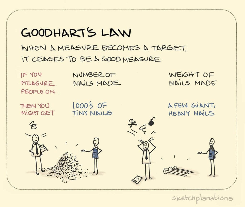
Goodhart’s Law Explained (Source)

Read More