Bayesian Linear Regression In Python Using Machine Learning To Predict Student Grades Part 1

Exploratory Data Analysis, Feature Selection, and Benchmarks

Even after struggling with the theory of Bayesian Linear Modeling for a couple weeks and writing a blog plot covering it, I couldn’t say I completely understood the concept. So, with the mindset that learn by doing is the most effective technique, I set out to do a data science project using Bayesian Linear Regression as my machine learning model of choice.

This post is the first of two documenting the project. I wanted to show an example of a complete data science pipeline, so this first post will concentrate on defining the problem, exploratory data analysis, and setting benchmarks. The second part will focus entirely on implementing Bayesian Linear Regression and interpreting the results, so if you already have EDA down, head on over there. If not, or if you just want to see some nice plots, stay here and we’ll walk through how to get started on a data science problem.

Read More

Introduction To Bayesian Linear Regression

An explanation of the Bayesian approach to linear modeling

The Bayesian vs Frequentist debate is one of those academic arguments that I find more interesting to watch than engage in. Rather than enthusiastically jump in on one side, I think it’s more productive to learn both methods of statistical inference and apply them where appropriate. In that line of thinking, recently, I have been working to learn and apply Bayesian inference methods to supplement the frequentist statistics covered in my grad classes.

One of my first areas of focus in applied Bayesian Inference was Bayesian Linear modeling. The most important part of the learning process might just be explaining an idea to others, and this post is my attempt to introduce the concept of Bayesian Linear Regression. We’ll do a brief review of the frequentist approach to linear regression, introduce the Bayesian interpretation, and look at some results applied to a simple dataset. I kept the code out of this article, but it can be found on GitHub in a Jupyter Notebook.

Read More

Visualizing Data With Pair Plots In Python

How to quickly create a powerful exploratory data analysis visualization

Once you’ve got yourself a nice cleaned dataset, the next step is Exploratory Data Analysis (EDA). EDA is the process of figuring out what the data can tell us and we use EDA to find patterns, relationships, or anomalies to inform our subsequent analysis. While there are an almost overwhelming number of methods to use in EDA, one of the most effective starting tools is the pairs plot (also called a scatterplot matrix). A pairs plot allows us to see both distribution of single variables and relationships between two variables. Pair plots are a great method to identify trends for follow-up analysis and, fortunately, are easily implemented in Python!

In this article we will walk through getting up and running with pairs plots in Python using the seaborn visualization library. We will see how to create a default pairs plot for a rapid examination of our data and how to customize the visualization for deeper insights. The code for this project is available as a Jupyter Notebook on GitHub. We will explore a real-world dataset, comprised of country-level socioeconomic data collected by GapMinder.

Read More

Data Visualization With Bokeh In Python Part Iii A Complete Dashboard

Creating an interactive visualization application in Bokeh

Sometimes I learn a data science technique to solve a specific problem. Other times, as with Bokeh, I try out a new tool because I see some cool projects on Twitter and think: “That looks pretty neat. I’m not sure when I’ll use it, but it could come in handy.” Nearly every time I say this, I end up finding a use for the tool. Data science requires knowledge of many different skills and you never know where that next idea you will use will come from!

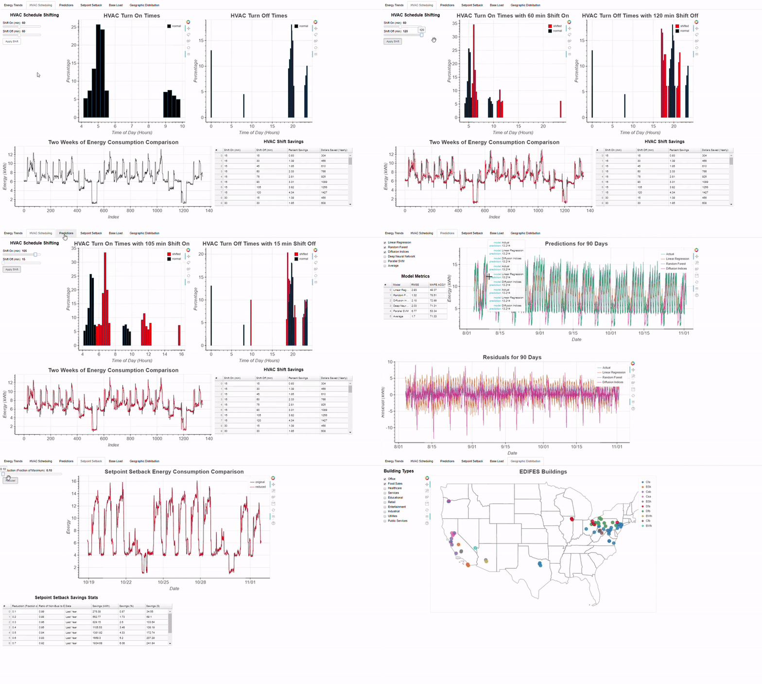
In the case of Bokeh, several weeks after trying it out, I found a perfect use case in my work as a data science researcher. My research project involves increasing the energy efficiency of commercial buildings using data science, and, for a recent conference, we needed a way to show off the results of the many techniques we apply. The usual suggestion of a powerpoint gets the job done, but doesn’t really stand out. By the time most people at a conference see their third slide deck, they have already stopped paying attention. Although I didn’t yet know Bokeh very well, I volunteered to try and make an interactive application with the library, thinking it would allow me to expand my skill-set and create an engaging way to show off our project. Skeptical, our team prepared a back-up presentation, but after I showed them some prototypes, they gave it their full support. The final interactive dashboard was a stand-out at the conference and will be adopted by our team for future use:

Example of Bokeh Dashboard built for my research

Read More

Histograms And Density Plots In Python

Visualizing One-Dimensional Data in Python

Plotting a single variable seems like it should be easy. With only one dimension how hard can it be to effectively display the data? For a long time, I got by using the simple histogram which shows the location of values, the spread of the data, and the shape of the data (normal, skewed, bimodal, etc.) However, I recently ran into some problems where a histogram failed and I knew it was time to broaden my plotting knowledge. I found an excellent free online book on data visualization, and implemented some of the techniques. Rather than keep everything I learned to myself, I decided it would helpful (to myself and to others) to write a Python guide to histograms and an alternative that has proven immensely useful, density plots.

This article will take a comprehensive look at using histograms and density plots in Python using the matplotlib and seaborn libraries. Throughout, we will explore a real-world dataset because with the wealth of sources available online, there is no excuse for not using actual data! We will visualize the NYCflights13 data, which contains over 300,000 observations of flights departing NYC in 2013. We will focus on displaying a single variable, the arrival delay of flights in minutes. The full code for this article is available as a Jupyter Notebook on GitHub.

Read More