
Data Visualization Hackathon Style
My effort to liberate data from spreadsheets
Everyone — corporations, governments, individuals — has data, but few people know how to use it effectively. Data can tell us much about how to make better decisions, but often this knowledge is hidden within the numbers. One problem is that most of the data looks something like this:
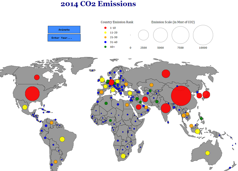
 Although the information here, global CO2 emissions, is “open data” in the sense that it’s publicly available for anyone to download, it might as well be locked away for all the good it is doing anyone in a spreadsheet. At its core, data science is about taking these meaningless pages of numbers and turning them into useful knowledge. One of the most effective ways of revealing insights within numbers is through data visualization.
 Data from a spreadsheet turned into knowledge
For HackCWRU 2018, a hackathon hosted at Case Western Reserve University, I wanted to explore the public CO2 data and make it accessible to a general audience. For those who haven’t had the experience, a hackathon is where a bunch of passionate makers — coders, artists, hardware specialists, and occasionally data scientists — get together for a weekend to work on projects for 24 or 36 straight hours. Sometimes there are specific problems to solve, but in other cases, such as with HackCWRU, you are free to choose your team and project. With a limited amount of time to accomplish your goal, sleeping is generally discouraged!

 If at first you don’t succeed, just keep searching!